The network for creativity
Join 1.25M professional creatives like you
Connect with clients, get discovered, and run your business 100% commission-free
Creatives on Contra have earned over $150M and we are just getting started
Back to feedPost

Established The Mothership Collection from concept through product design, positioning, launch and consumer storytelling.

The network for creativity
Join 1.25M professional creatives like you
Connect with clients, get discovered, and run your business 100% commission-free
Creatives on Contra have earned over $150M and we are just getting started





Related posts

Light or refined - which E-Bike product breakdown section design would you choose?
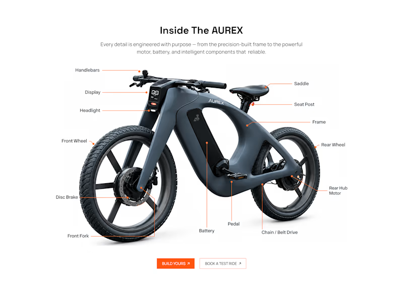
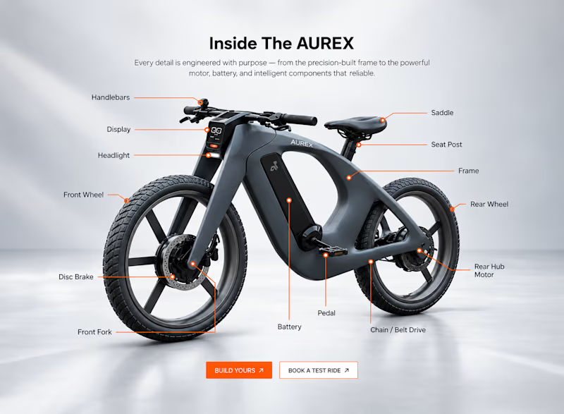
Two concepts for the same AUREX e-bike. Same product, same components, two different presentation styles:
A - Soft Studio: subtle gray depth, larger product focus, and a more premium visual feel.
B - Clean Minimal: bright white background, tighter spacing, and a more technical editorial layout.
Which direction feels stronger for a premium e-bike brand and why?


5 voted
31%
11 voted
69%
16 votes
Closed

A feels more premium to me. The soft gray depth and bigger product focus make the bike feel like something special. B is great for specs, but A sells the feeling

We’re building something new for creators who make serious digital products—playbooks, software, 3D assets, and high-value tools.
Introducing Strum ⚡️
Most marketplaces take huge cuts or flood buyers with low-quality clutter. We’re building a curated, performance-based launchpad designed to put real revenue back into creators' pockets.
• 80% creator revenue split
• Dedicated launch marketing & ad strategy
• Curated catalog of high-impact digital products
We’re currently hand-selecting our 10 Founding Creators for the official launch.
If you build high-converting digital assets or software tools, DM me or comment below.
Big things dropping soon—stay tuned. 👀🚀




MARE — Brand identity, product design, and creative direction for a context-driven visual archive.


So, so cool!