The network for creativity
Join 1.25M professional creatives like you
Connect with clients, get discovered, and run your business 100% commission-free
Creatives on Contra have earned over $150M and we are just getting started
Back to feedPost
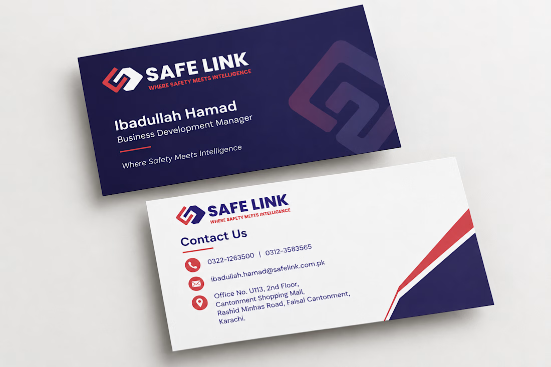
Business cards for Safe Link, a security and networking brand.
The brand already had its logo and colors, so my job was to build a card around them: a deep navy front with the logo and a soft watermark symbol, and a clean white back with the contact details, a red accent line and a diagonal corner shape that echoes the logo.
Small detail, big impression. When you design a business card, what comes first for you: the front or the contact side? 👇


I usually start with the contact side. Once the grid and hierarchy of the details are settled, the front only has to carry the logo, and it comes together much faster.

That's a smart approach. Settling the hierarchy on the contact side first makes the front much easier to balance. Thanks for sharing!
The network for creativity
Join 1.25M professional creatives like you
Connect with clients, get discovered, and run your business 100% commission-free
Creatives on Contra have earned over $150M and we are just getting started











Related posts


One letter. Eight personalities. 🔤
I explored the letter S in 8 different directions: soft and rounded, sharp and angular, bold and blocky, and fast like a bolt.
Same letter, same white-on-black treatment. The only thing that changes is the character.
Each mark could suit a different kind of brand, from tech and sports to fintech and lifestyle.
Which S would you pick, and what kind of brand would it belong to? Drop the number below. 👇
Looking for a logo mark or a full brand identity? My services are on my profile.

S letter designs is the best ❤️
Great job Shahwaiz🔥🔥

The presentation on top. The process below. ⚡
A behind-the-scenes look at my Tesla Cybertruck presentation, with the finished animation playing alongside a sped-up view of how I built it in PowerPoint.
From arranging each slide to fine-tuning the Morph transitions, here’s the work behind the final result.


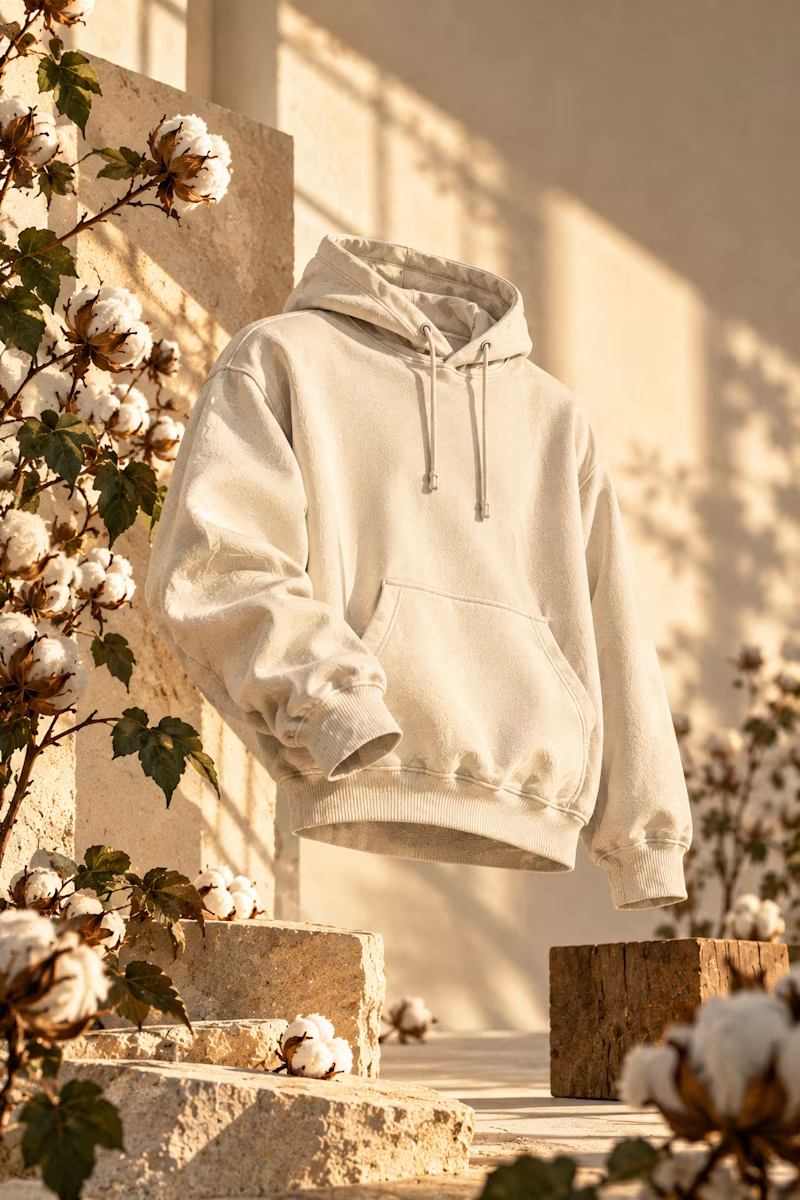
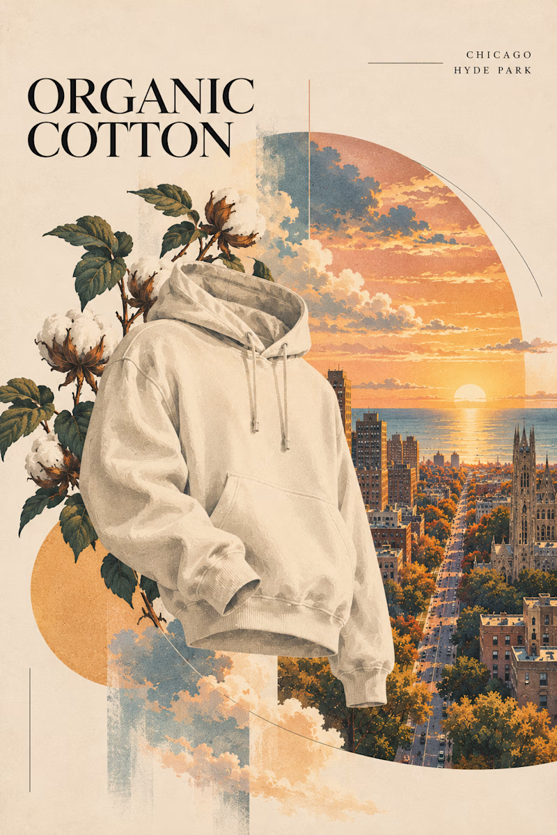
Two directions for an organic cotton apparel campaign. Which style works better?

6 voted
60%
4 voted
40%
10 votes
Closed
Sunlight studio is more stunning 🔥🔥
great job Mitchell❤️