The network for creativity
Join 1.25M professional creatives like you
Connect with clients, get discovered, and run your business 100% commission-free
Creatives on Contra have earned over $150M and we are just getting started
Back to feedPost

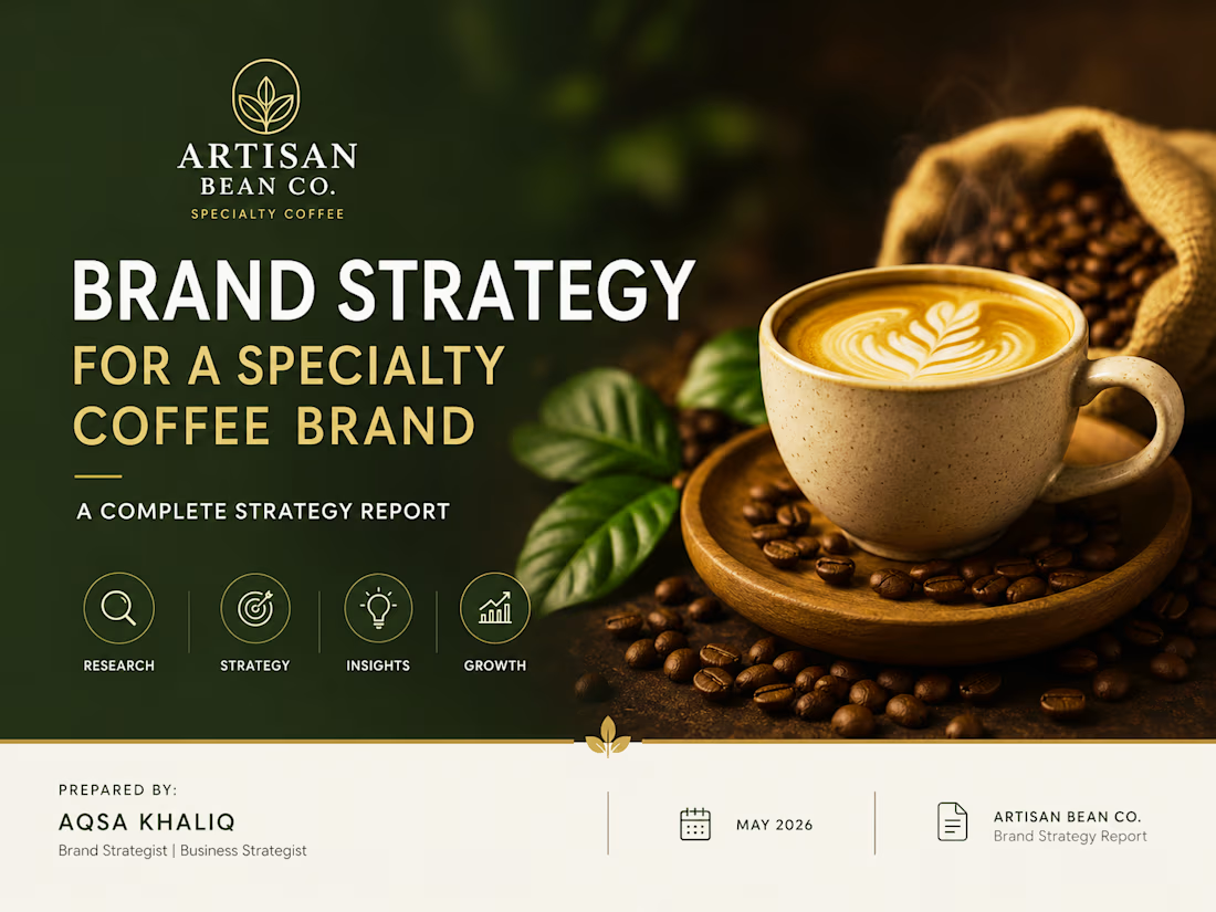
Brand Strategy for Artisan Bean Co. — Specialty Coffee Brand
A strategic branding project focused on building a premium market position for a specialty coffee brand.
Project Overview
Artisan Bean Co. needed a clear brand direction to enter a competitive coffee market and create a stronger connection with modern coffee consumers.
Scope of Work
• Brand Strategy Development
• Market & Competitor Analysis
• Customer Persona Research
• Brand Positioning
• Brand Messaging & Value Proposition
• Go-To-Market Strategy
Strategic Approach
The project focused on understanding customer motivations, identifying market opportunities, analyzing competitors, and creating a differentiated brand identity built around quality, sustainability, and community.
Key Recommendations
• Position the brand as a premium yet approachable specialty coffee experience
• Build emotional connections through storytelling and community-driven branding
• Highlight sustainability and ethical sourcing as core brand values
• Create a focused market entry strategy for long-term growth
Deliverables
✓ Brand Strategy Document
✓ Buyer Persona Profiles
✓ Competitor Analysis
✓ SWOT Analysis
✓ Brand Positioning Framework
✓ Go-To-Market Recommendations
Outcome
A complete strategic foundation designed to help Artisan Bean Co. establish a unique market presence and build a memorable customer experience.

The network for creativity
Join 1.25M professional creatives like you
Connect with clients, get discovered, and run your business 100% commission-free
Creatives on Contra have earned over $150M and we are just getting started











Related posts

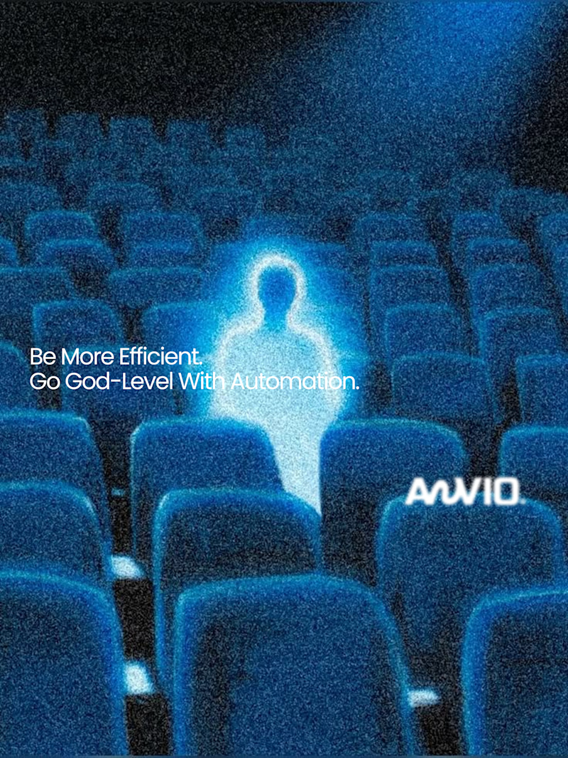
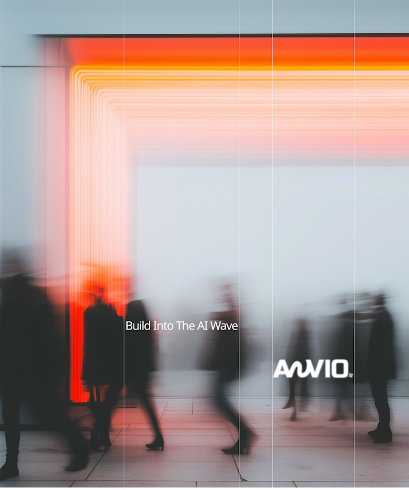
Which creative direction better communicates a Tech-Forward AI Brand Identity for anvio.online ?
25 voted
44%
32 voted
56%
57 votes
Closed

Fast vibrant energy gets my vote. The warm glow feels more human, which is nice for an AI brand.

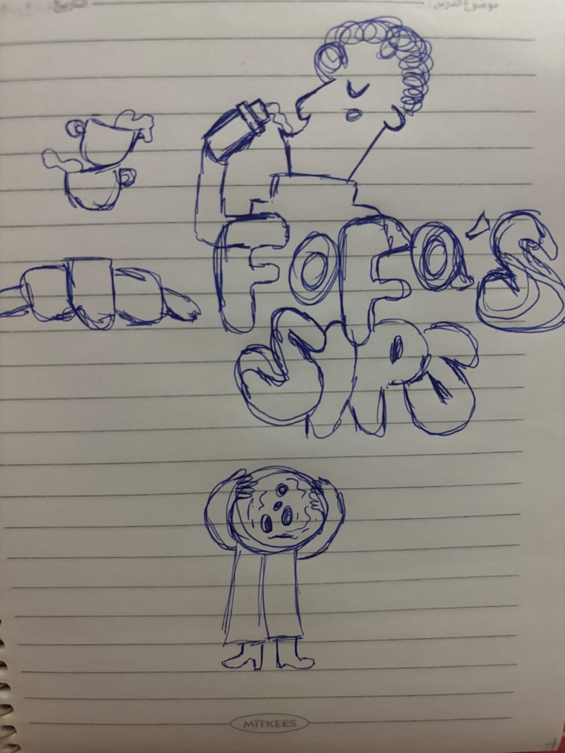
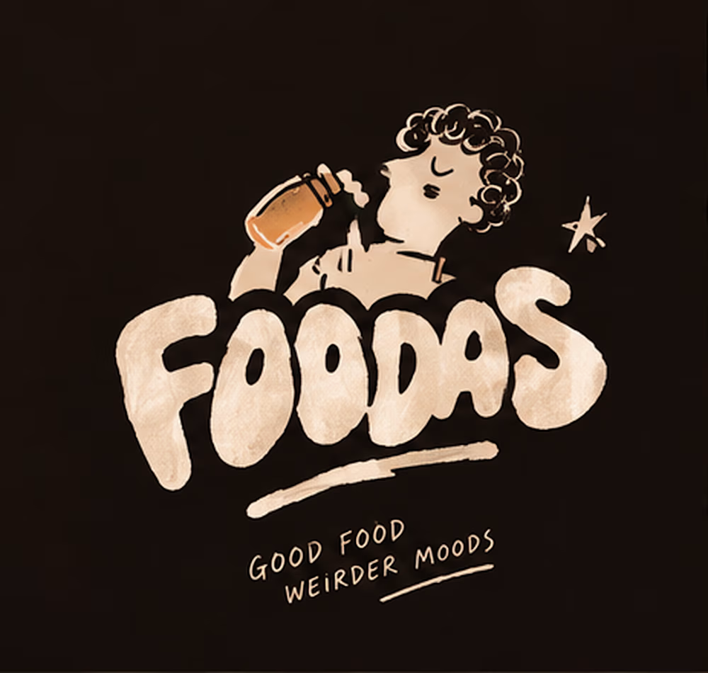
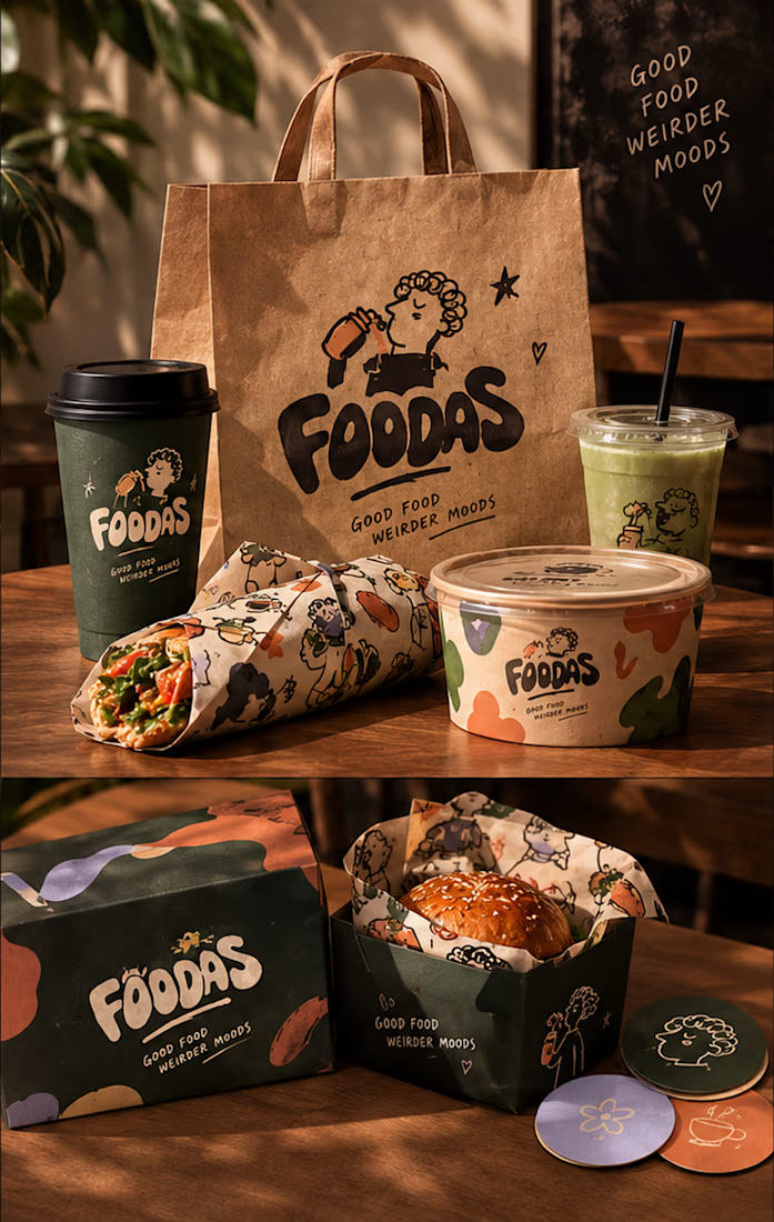
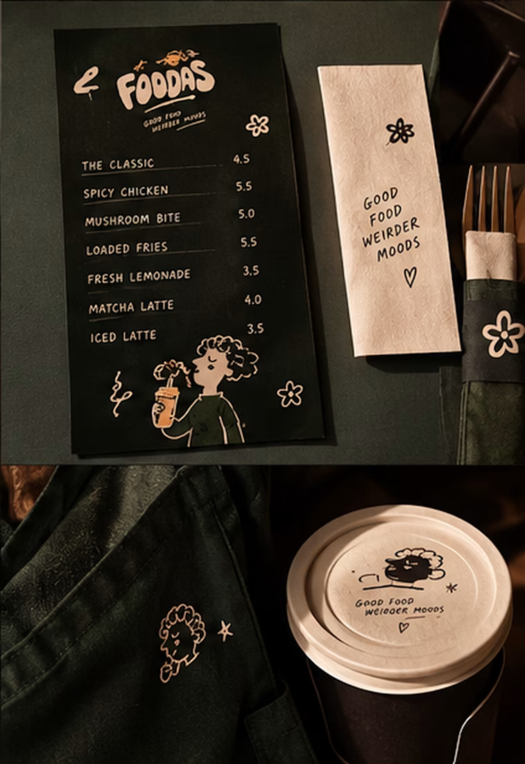
I turned one of my notebook doodles into a whole brand identity. And honestly this was way more fun than I expected I usually work on UI/UX and digital products so I wanted to take a step back from screens and explore something completely different: illustration-led branding.
I took my original FOODAS sketch and built an entire visual world around it from the logo and mascot illustrations to the color palette packaging, cups, and menus
The goal wasn't to make it look perfectly polished and predictable I wanted it to feel playful, a little weird, and still premium.
Now I'm curious about one thing:
Can playful, imperfect illustrations make a brand feel more premium or do you think premium branding needs to be more minimal?
I have a feeling designers will disagree on this one



The most serious brand I’ve ever worked on mails you a phone shaped like a shell.
Deadpan voice. Inflated letters. One strange object a month.
STILL LIFE SERVICE, case study out now.
Would you open the box?

I'd open the box for sure! Inflated letters with a deadpan voice is such a fun mix.