The network for creativity
Join 1.25M professional creatives like you
Connect with clients, get discovered, and run your business 100% commission-free
Creatives on Contra have earned over $150M and we are just getting started
Back to feedPost

A new Webflow project is complete. 💻
I recently built the Ziku Capital website, a professional digital experience designed to clearly present the company’s financial advice, lending, accounting and tax services.
The objective was not simply to create attractive pages. The website needed to make a broad range of information feel organised, accessible and easy to navigate.
My work focused on:
✓ Responsive Webflow development
✓ Clear content structure
✓ Consistent page layouts
✓ Purposeful interactions
✓ Mobile-friendly navigation
✓ A professional and credible visual experience
Projects like this are a reminder that effective web design must balance appearance, usability and communication.
I’m pleased with how the website brings multiple service areas together under one consistent digital identity.
View the completed website:
https://www.zikucapital.com.au/
#Webflow #WebflowDeveloper #WebsiteDesign #ResponsiveDesign #UXDesign #WebDevelopment #DigitalDesign
The network for creativity
Join 1.25M professional creatives like you
Connect with clients, get discovered, and run your business 100% commission-free
Creatives on Contra have earned over $150M and we are just getting started



Related posts

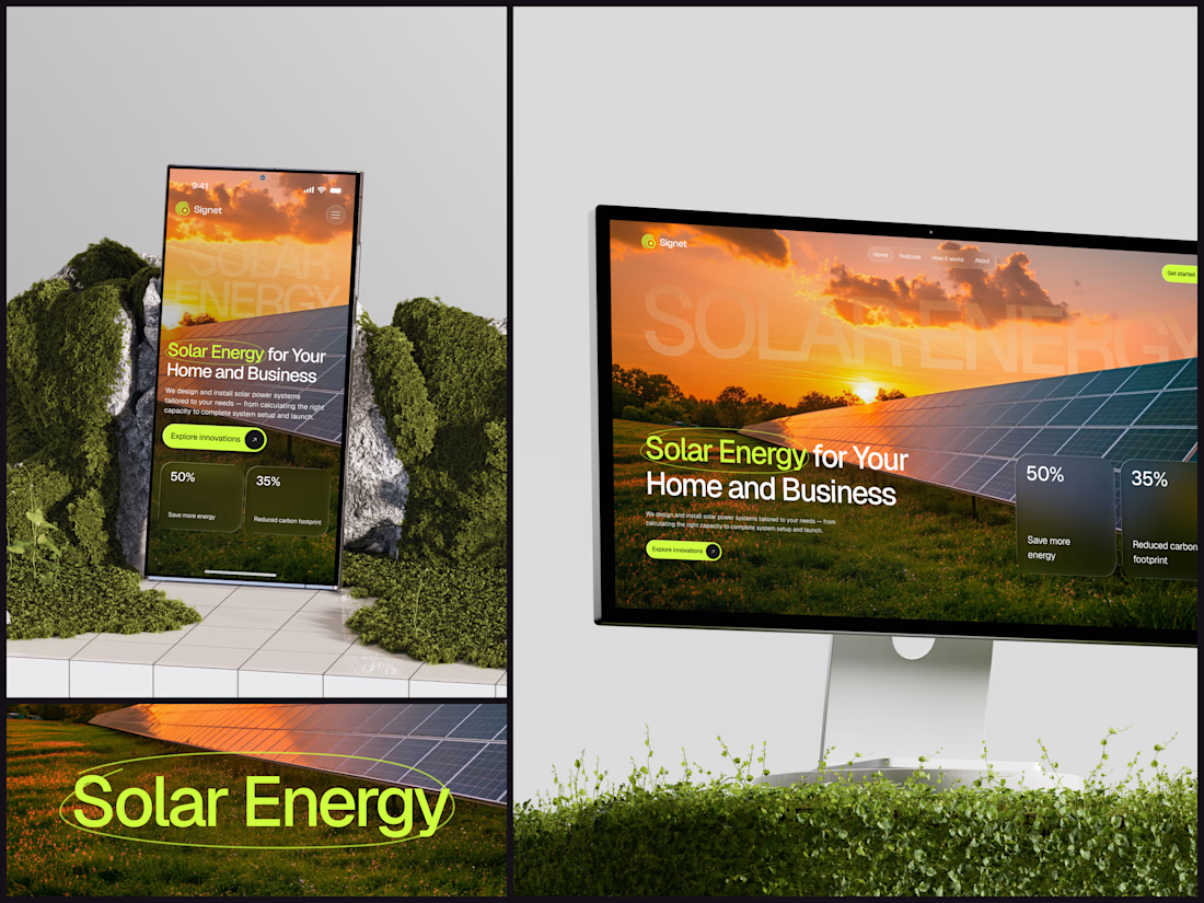
Solar Energy Website
A thin lime circle tells you which two words this page is about.
The headline sits over a sunset photo of a panel field. The "Get started" and "Explore innovations" buttons share the circle's lime, so the eye moves from the circled words straight to the next step.
Large faded capitals repeat those two words across the sky, faint enough to stay inside the photo. On mobile they break onto two lines, and the headline and button stack above two frosted cards.
Only two words of "Solar Energy for Your Home and Business" are lime, and the whole page follows them.
Designed by the Hue & Machine team.
#SolarEnergy #RenewableEnergy #CleanTech #WebDesign #LandingPage #HeroSection #UIDesign #ResponsiveDesign #MobileDesign #FigmaDesign



This is really cool, Nice job Dmytro

The first thing I created for LedgerFlow wasn't a screen.
It was a set of questions.
I'm kicking off a new concept project: **LedgerFlow, an accounting and financial management SaaS platform for small businesses, freelancers and independent business owners.
The goal is to design a website that helps visitors understand what the product does, how it helps their business, and why they should book a demo.
But before opening Figma, I needed to understand the business.
So I created a website discovery and brand strategy questionnaire.
It covers:
→ Brand vision and business goals.
→ Target audience.
→ Website goals and user experience.
→ Branding and visual direction.
→ Services and offers.
→ Project direction and logistics.
I want to understand things like:
Who exactly are we designing for?
What problem does the product solve?
What makes it different from traditional accounting software?
What should visitors understand within the first few seconds?
And what would make them confident enough to book a demo?
Because the answers will influence the website's messaging, content, visual hierarchy and calls to action.
You can't design a clear experience when you don't understand what the business needs to communicate.
LedgerFlow is a concept project, but I'm treating the process like a real client engagement.
I'll be sharing the journey from discovery to website structure, UI design and Webflow development.
And if you're building a SaaS product or need a website that communicates your business value clearly, I'm open to website design and Webflow projects.
Let's talk about what you're building. 🤝
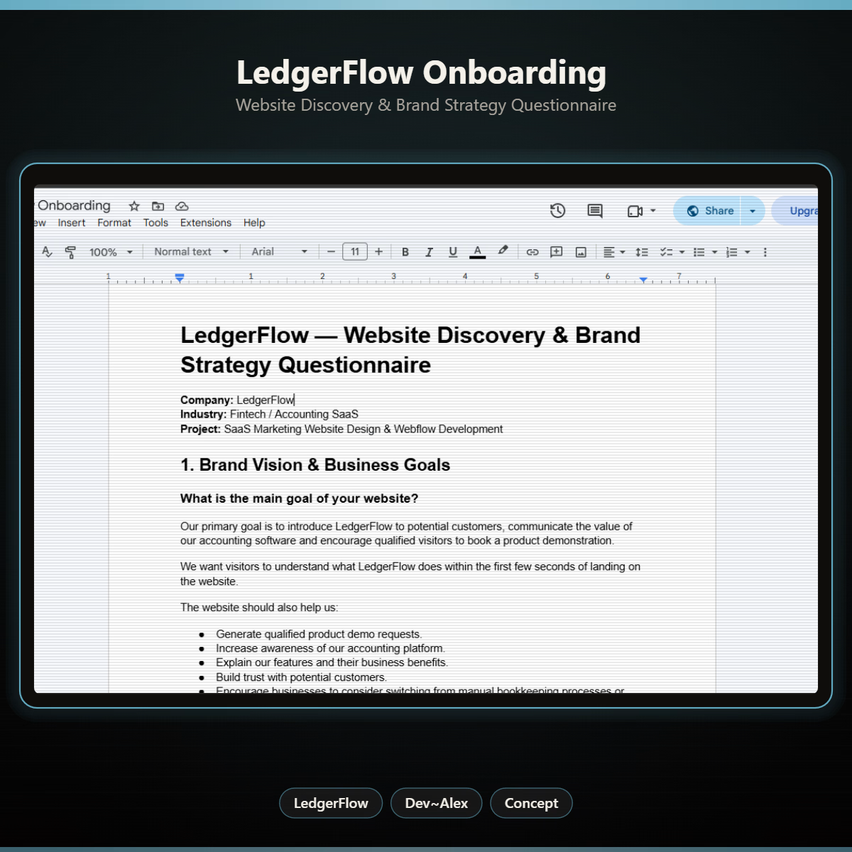

Starting with a discovery questionnaire instead of a screen is how good briefs begin, and "explain what LedgerFlow does in the first seconds" is the right goal to design around. Will the answers become a one page brief?

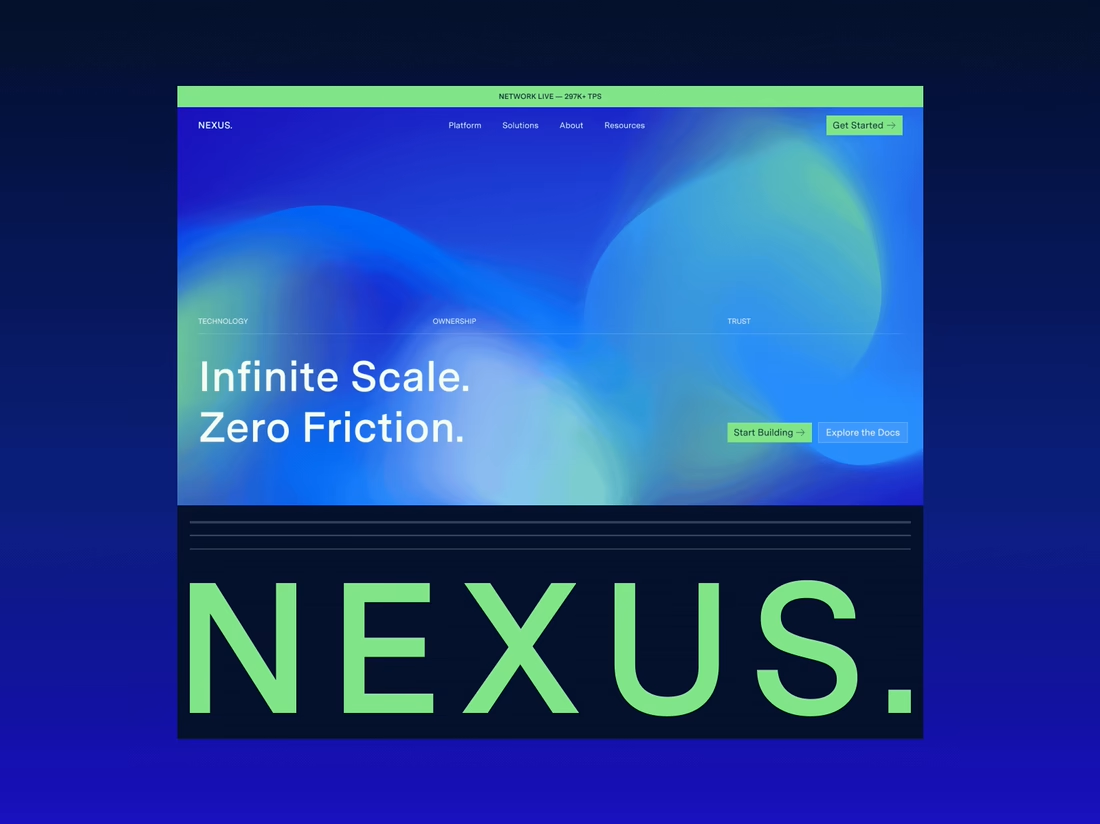
Happy to finally share the full NEXUS project 🙌
A few days ago I posted a small motion teaser. Now the whole thing is live on my profile: 12 pages designed in Figma, a design system, and a homepage I built in HTML, CSS and JS with every interaction working.


12 pages in Figma plus a design system, then hand coding the homepage with every interaction working is a great way to show the concept holds up, Sofiia. Nice to see the teaser turn into the full project.