The network for creativity
Join 1.25M professional creatives like you
Connect with clients, get discovered, and run your business 100% commission-free
Creatives on Contra have earned over $150M and we are just getting started
Back to feedPost

Built a smoother booking experience for LensCrew Studio 📸
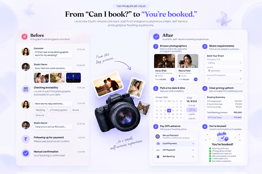
The problem: customers had to message the agency, ask for photographer samples, wait for availability checks, share requirements manually, and follow up for payment confirmation.
The solution: customers can now browse photographer portfolios, choose the right photographer, add shoot requirements, check live availability, see clear pricing, pay a 30% advance, and get instantly confirmed.
The goal was simple: less back-and-forth for the owner, faster decisions for customers, and a much clearer booking experience.
🔗 Live project:
https://screenshot-perfect-display-78.lovable.app/

The network for creativity
Join 1.25M professional creatives like you
Connect with clients, get discovered, and run your business 100% commission-free
Creatives on Contra have earned over $150M and we are just getting started





Related posts

I already submitted my Lovable challenge but I decided to update the landing page and make it look a little bit better by introducing more images to make the page a little bit more interactive especially on the services section, which one do you like: the old one or the new one?
You can test it here: https://carmobifix.lovable.app/
submitted project: https://contra.com/community/KUoCqygQ-i-built-mobi-fix-nairobi-a
43 voted
74%
15 voted
26%
58 votes
Closed

you had credit left ? mine finished...like 4, 5 credits left..😂

Which hero direction feels right for this founder-focused brand?
While working on the homepage for Sean Parsons, a brand focused on empowering non-technical founders to launch tech startups, I explored two different visual directions for the hero section. Same message, same structure, just a different mood and color system.
Option 1 - Warm Olive. Dark, grounded, and editorial, giving a warm, established, expert feel.
Option 2 - Light Purple. Clean, modern, and vibrant, giving a fresh, SaaS-like, approachable feel.
Would love your honest UX/UI take, which direction feels more trustworthy, engaging, and aligned with a founder-focused brand, and why?
25 voted
69%
11 voted
31%
36 votes
Closed

I like worm Olive most because it has different personality

LumaClean was losing hours to manual quoting, scheduling, confirmations, rescheduling, and follow-up. LumaFlow turns that entire process into one automated booking workflow.
I built LumaFlow for a fictional Chicago cleaning business, LumaClean.
The problem was simple: too much back-and-forth just to turn a customer inquiry into a confirmed booking.
So I built a workflow that handles the journey:
→ Instant quote
→ Smart availability
→ $40 deposit
→ Booking confirmation
→ Reminders
→ Rescheduling
→ Booking recovery
The goal wasn't to build another pretty booking page.
It was to give the owner less work to do.

Vert nice