The network for creativity
Join 1.25M professional creatives like you
Connect with clients, get discovered, and run your business 100% commission-free
Creatives on Contra have earned over $150M and we are just getting started
Back to feedPost

Introducing AutoMarket. Your AI workforce, one click away.
I built a personal automation storefront on Zo Computer where every product is a live, tested AI workflow running on my Zo 24/7.
The idea is simple: I built the automations, packaged each one with a personalised Zo installation prompt, and put them up for sale. You buy, receive your prompt by email in 60 seconds, paste it into your Zo, and your AI starts working that same day. No code. No setup. No maintenance. Ever.
Five products are live today, running on my Zo: 📬 Daily Gmail Digest, 📅 Calendar Briefing Bot, 🔍 Competitor Watch Alert,📊 Social Listening Report, ⭐Productivity Stack. Everything runs on Zo.
The automations, the storefront, the live demo widget, order fulfilment, and Telegram notifications. Zo is the warehouse, the server, and the workforce all at once.
There’s even a hidden terminal on the site. Type 'zo --status' to see all five automations running live. Try 'sudo rm -rf /' for a surprise.
AutoMarket is not a portfolio. It is a business model built entirely on Zo. It sells while I work, delivers while I’m offline, and keeps running around the clock.
Built for founders, freelancers, and operators who run on information and want leverage without the setup.


The network for creativity
Join 1.25M professional creatives like you
Connect with clients, get discovered, and run your business 100% commission-free
Creatives on Contra have earned over $150M and we are just getting started



Related posts


Crenaly: a booking SaaS I designed and built end-to-end for appointment-based businesses in France: salons, barbers, beauty and wellness.
The core idea: when a client cancels, the freed slot is automatically offered to clients who asked for an earlier time. The first to accept gets it, their appointment moves in place, and the slot they leave is offered next. No double booking, no manual work.
Around it, a full product:
→ Branded booking page for each business, embeddable on their own site
→ Mobile-first booking flow, no account needed
→ Agenda, client management, team roles & permissions
→ Verified reviews, analytics, Stripe billing
Product, UX/UI, frontend and backend.
Next.js · TypeScript · NestJS · PostgreSQL · Redis


Automatically offering a cancelled slot to the next client is such a practical feature for salons and barbers. Designing and building Crenaly end to end must have made those flows much tighter.

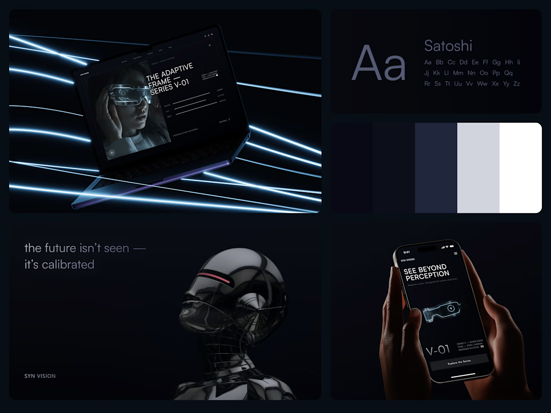
Smart Glasses Landing Page
"See beyond perception." Three words on the phone, and the whole page had to earn them.
On desktop, the headline starts over the edge of a tall portrait of the glasses being worn, so the product name and the product in use read as one image. Next to it, reaction, light and depth sit as three thin gauge lines, each with a one-word reading. Specs, without a spec table.
On mobile, a 3D render of the frame sits between the headline and a single Explore the Series button. One image, one next step.
The palette stays in deep navy and soft gray, so the cool light on the frame stands out on every screen.
Designed by the Hue & Machine team.
#WebDesign #LandingPage #ProductDesign #WearableTech #DarkUI #UIDesign #TechProduct #ResponsiveDesign #UXDesign #FigmaDesign



Good work


Check out Drift Cassette, one of the many instruments we designed for NOVA by Lunacy Audio this year.

Outstanding Creation