The network for creativity
Join 1.25M professional creatives like you
Connect with clients, get discovered, and run your business 100% commission-free
Creatives on Contra have earned over $150M and we are just getting started
Back to feedPost
KIN - Luxury Supplement Packaging Design | Premium Brand Identity


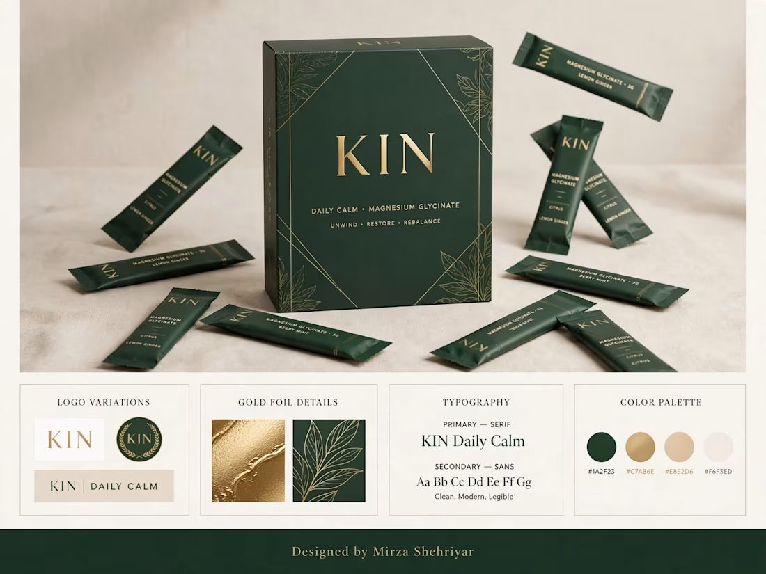

The botanical line art in gold foil on deep green does a lot of the premium work here without adding any extra elements. Is the foil planned for the flow-wrap sachets too, or only the carton? Foil on small flexible packs is where the print spec usually gets tricky.

Thanks Artur! Appreciate it.
Foil is for the carton only (matte + gold foil). For sachets I'm using gold ink on matte green film - avoids cracking on flex film & keeps costs down.
What do you think?
Sounds like a smart trade-off. Gold ink on matte film also keeps sachets and carton in one colour family. I'd just check the ink's opacity on the film, since it can read flatter than foil next to the carton.
Absolutely, great point on opacity. I'll bump it with a double hit of gold + a subtle varnish to keep the luster close to the carton foil. Thanks for the feedback!
The network for creativity
Join 1.25M professional creatives like you
Connect with clients, get discovered, and run your business 100% commission-free
Creatives on Contra have earned over $150M and we are just getting started



Related posts


Branding & Visual Identity for AirCon West based in London.
Designers! Present your work with motion! It breathes life into your work and conveys your ideas in a dynamic way.
Use free online motion tools to do it.
My favorites:
https://animos.app/
https://arqe.ai/
https://orelin.app/editor
https://openvid.dev/en
(Or animate it yourself, like I did here using EffectCraft!)


Nice work!!

New case study for the brand and digital work we did for Seeper Studios.
Go Check it out


Evolving a brand with almost 30 years of history is the hard version of brand work. You have to keep what people already trust while making it feel current. Nice job balancing both.




Both look great, but Violet & Black gets my vote! The purple accents give it a more modern, premium feel while keeping the design clean and focused on conversions. Amazing how a color change can create such a different brand personality. Have you tested which version performs better with visitors?


