The network for creativity
Join 1.25M professional creatives like you
Connect with clients, get discovered, and run your business 100% commission-free
Creatives on Contra have earned over $150M and we are just getting started
Back to feedPost
A founder from Silicon Valley came to us with a product that was already working.
The AI logic was solid. The backend did what it was supposed to. DataScoop could analyze metric changes, find the root causes and explain them in plain language - which, honestly, is genuinely hard to build.
The problem was everything the user actually saw.
The interface hadn't kept up with the product. There were Figma designs ready, a completely new visual direction, but no one had translated them into a working frontend yet. The existing code wasn't built to carry them. And the data visualization layer, the part that makes analytics actually readable, needed to be rebuilt from scratch.
So the ask was clear on the surface: rebuild the frontend, implement the new design, make it fast.
In practice, it was more nuanced than that.
Complex data files needed to be parsed and turned into charts that told a story, not just displayed numbers. Performance had to hold up so that insights landed in seconds, not after a loading spinner that made you forget what you were looking at. And all of it had to feel like it belonged together: the AI output, the visualizations, the interface, the Slack and email delivery.
We rebuilt the frontend in React.js and TypeScript, applied strict code quality standards from the start and worked through the Figma designs screen by screen, not just implementing them, but pressure-testing how they behaved with real data.
The hardest part wasn't any single technical problem. It was maintaining coherence, making sure that as the pieces came together, they felt like one product, not a patchwork.
The result is a platform where a data analyst can open it, see a metric move, and understand why, in plain language, in seconds, delivered wherever they actually work.
That's the version DataScoop's users have now.
Check it out
Huge respect to the team 🚀🚀 Great job!
Thanks a lot!🙌
Fantastic case study! It’s the perfect example of how crucial a powerful frontend is for complex AI products. The data visualization layer looks incredibly polished, and the story-driven presentation is spot on. Great job! 💻🔥
Thank you so much! Really appreciate it!🙌
Great so cool job.
Thanks so much! Glad you like it😊
Great job, guys!
The network for creativity
Join 1.25M professional creatives like you
Connect with clients, get discovered, and run your business 100% commission-free
Creatives on Contra have earned over $150M and we are just getting started

Related posts
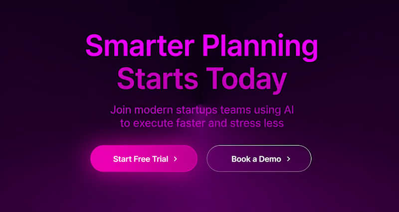
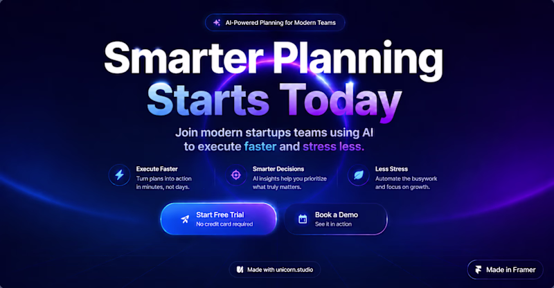
I have been running a tournament on different styles for a SaaS landing page, these are the final 2. Witch are you picking for the win?
2 voted
22%
7 voted
78%
9 votes
Closed
This design has energy. Option B.
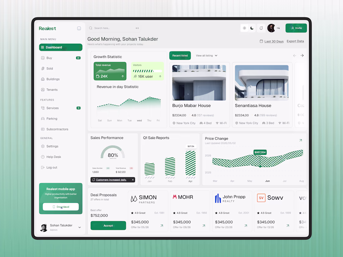
Managing properties, tenants, and revenue should feel simple, not overwhelming.
We designed this Real Estate Property Management SaaS Dashboard to help real estate teams track listings, monitor performance, manage deals, and gain valuable business insights from one centralized workspace. The clean layout, modern data visualization, and fresh green accents create a professional experience that makes complex operations easier to manage.
Because better visibility leads to better decisions.
𝗢𝘂𝗿 𝗦𝗲𝗿𝘃𝗶𝗰𝗲𝘀:
UI/UX Design | Website Design | Product Design | Mobile App Design | Brand Identity Design
Looking to build a real estate or SaaS platform?
Let's create something exceptional together.
This deserves more than just a like
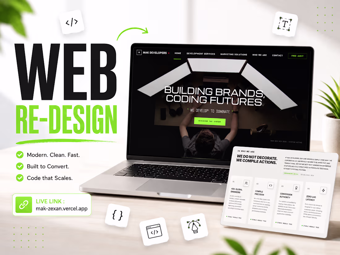
Client's Website Re-Designed - live on https://mak-zexan.verel.app/
One of the best designs I’ve seen today. Really solid work 👏 keep pushing.
Trending
Claude
Claude has entered the design space. How are you using Claude Design?
Contra University
Learn from expert creatives how to earn more using next-gen AI tools.
MagicPath
The canvas is infinite, and exploration is becoming the workflow. How are you using MagicPath?
creativeaiflow
Creative AI workflows are evolving. What tools do you use, and what are their strengths and weaknesses?
freelancerlife
Freelancer life is wins, pivots, and everything in between. What’s yours right now?