The network for creativity
Join 1.25M professional creatives like you
Connect with clients, get discovered, and run your business 100% commission-free
Creatives on Contra have earned over $150M and we are just getting started
Back to feedPost
Client's Website Re-Designed - live on https://mak-zexan.verel.app/


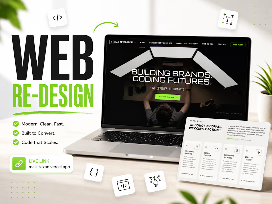

The software team asked me for a website re-design , the styling was totally on me + I've completed the whole work in just 2 business days . They just ask for a design but I've provided them a live functioning site for better output and understanding♥️


Here is a quick comparison


The network for creativity
Join 1.25M professional creatives like you
Connect with clients, get discovered, and run your business 100% commission-free
Creatives on Contra have earned over $150M and we are just getting started



Related posts




We are testing two ways to browse a large template library.
Load More
Users initially see 9 cards. After clicking the button, 9 more are added while the previous results remain visible. Browsing feels continuous, but the page gradually becomes longer.
Pagination
The catalog is divided into numbered groups. When users select the next page, the current 9 cards are replaced with a new set. They can jump to a specific part of the catalog and easily return to where they were.
Load More creates a smoother browsing experience, while pagination offers greater control.
Which option would you choose for a template library?

17 voted
68%
8 voted
32%
25 votes
Closed

Load more

EchoMind is live on the Framer Marketplace.
It’s a calm, editorial shop template for brands that make physical things: hardware, objects, small product lines. I designed the brand, generated the product photography and built every page in Framer.
What’s inside:
20 pages, each designed for desktop, tablet and phone
CMS-driven shop with working price sort
Product pages with gallery, specs and FAQs
A build-your-own configurator with live pricing
A bag with quantities and discount codes
Journal with hover image previews
Launch, studio, support and gift card pages
The product itself is fictional: a modular mixing desk where one core listens to your mix and suggests one fix at a time. I wanted the template to feel like a real brand from day one, so it’s been built and photographed like one.
Get the template: https://www.framer.com/marketplace/templates/echomind/


Congrats on the launch, Jonathan. Designing the brand, the photography and every page yourself gives it a clear voice. What was the hardest part of building a shop template in Framer?