The network for creativity
Join 1.25M professional creatives like you
Connect with clients, get discovered, and run your business 100% commission-free
Creatives on Contra have earned over $150M and we are just getting started
Back to feedPost

Showing services, features, or portfolio projects?
Instead of another static card grid, try something people can interact with.
Built Spring Card to make content sections a little more playful without sacrificing usability.


Ye le Jani:
Brilliant idea Shruti! Love the thinking behind Spring Card - static grids get so boring, making it interactive + playful while keeping it usable is exactly what portfolio/service sections need. The expandable project list interaction looks super clean. Definitely grabbing this Framer link!
The network for creativity
Join 1.25M professional creatives like you
Connect with clients, get discovered, and run your business 100% commission-free
Creatives on Contra have earned over $150M and we are just getting started











Related posts

Exploring a clean, modern SaaS dashboard UI. Focused on simple layouts, smooth interactions, and a better user experience 🚀


i had to like this, it got my attention, very nice build mate.
A modern SaaS website concept designed in Figma, featuring clean layouts, intuitive navigation, consistent visuals, and a user-friendly experience across different screen sizes.


Design Exploration: Hero Section of Architecture Website. Which one do you think much better?

12 voted
43%
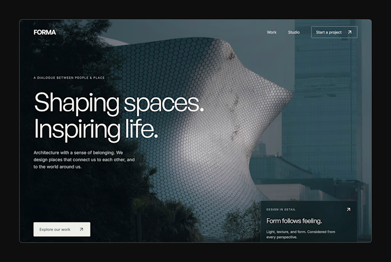
16 voted
57%
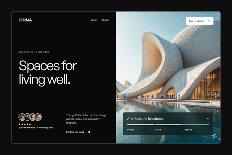
28 votes
Closed