The network for creativity
Join 1.25M professional creatives like you
Connect with clients, get discovered, and run your business 100% commission-free
Creatives on Contra have earned over $150M and we are just getting started
Back to feedPost

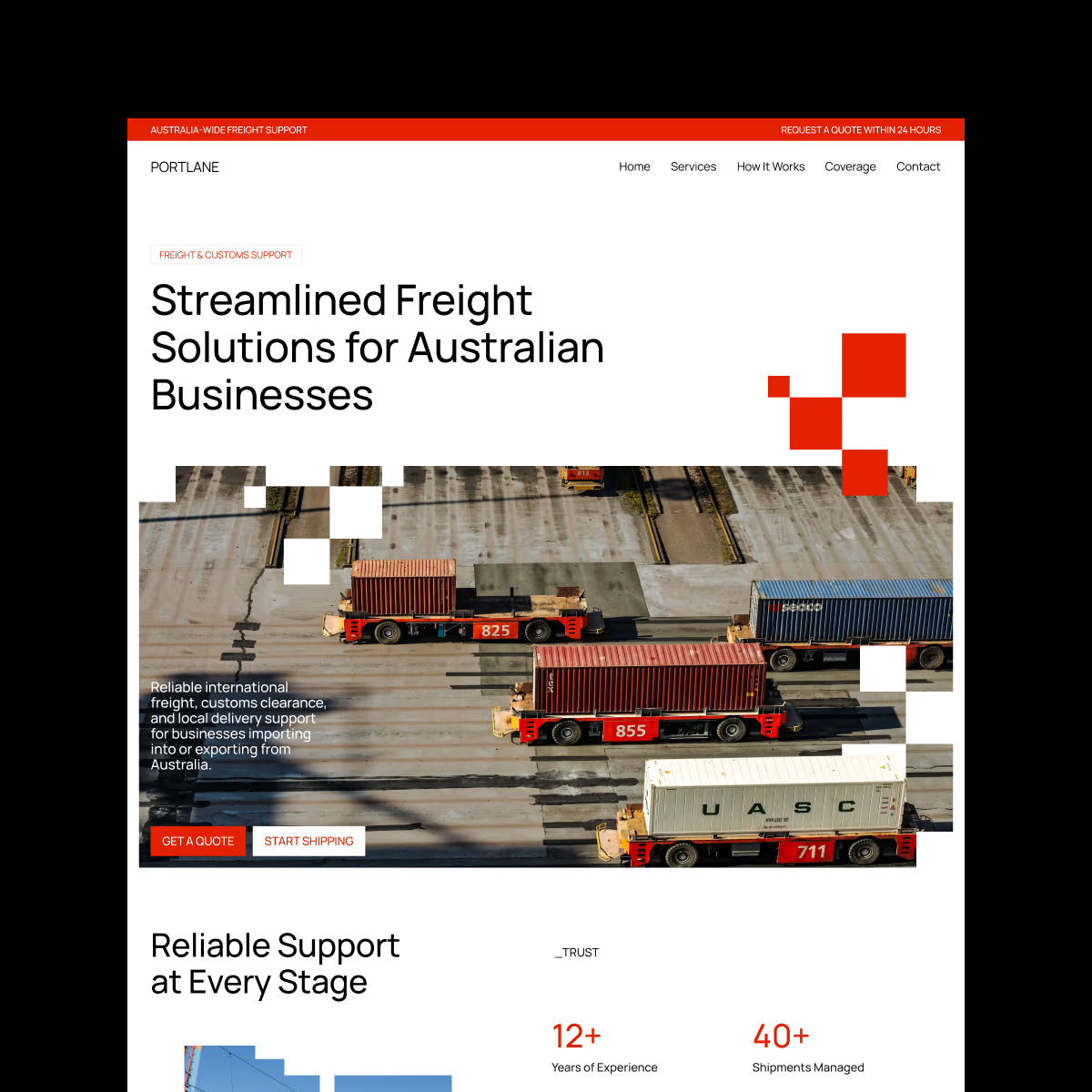
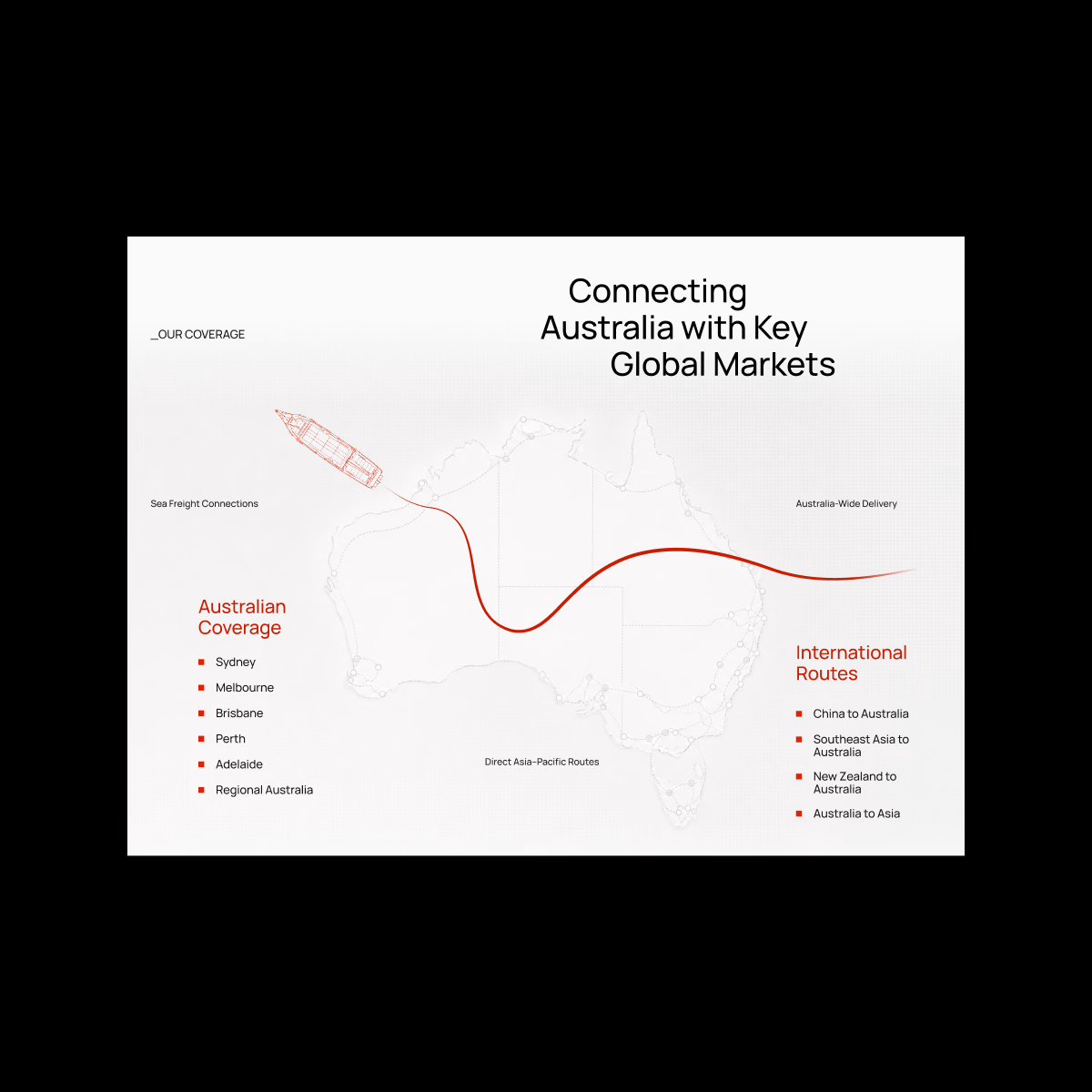
Portlane — Logistics Landing Page. Industrial, bold, and straight to the point.
I explored a more editorial direction for logistics, mixing strong typography, industrial photography, and sharp red accents to make the brand feel more distinctive.
The network for creativity
Join 1.25M professional creatives like you
Connect with clients, get discovered, and run your business 100% commission-free
Creatives on Contra have earned over $150M and we are just getting started

Challenges
View all


Related posts

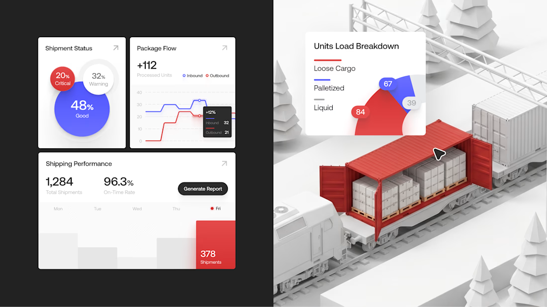
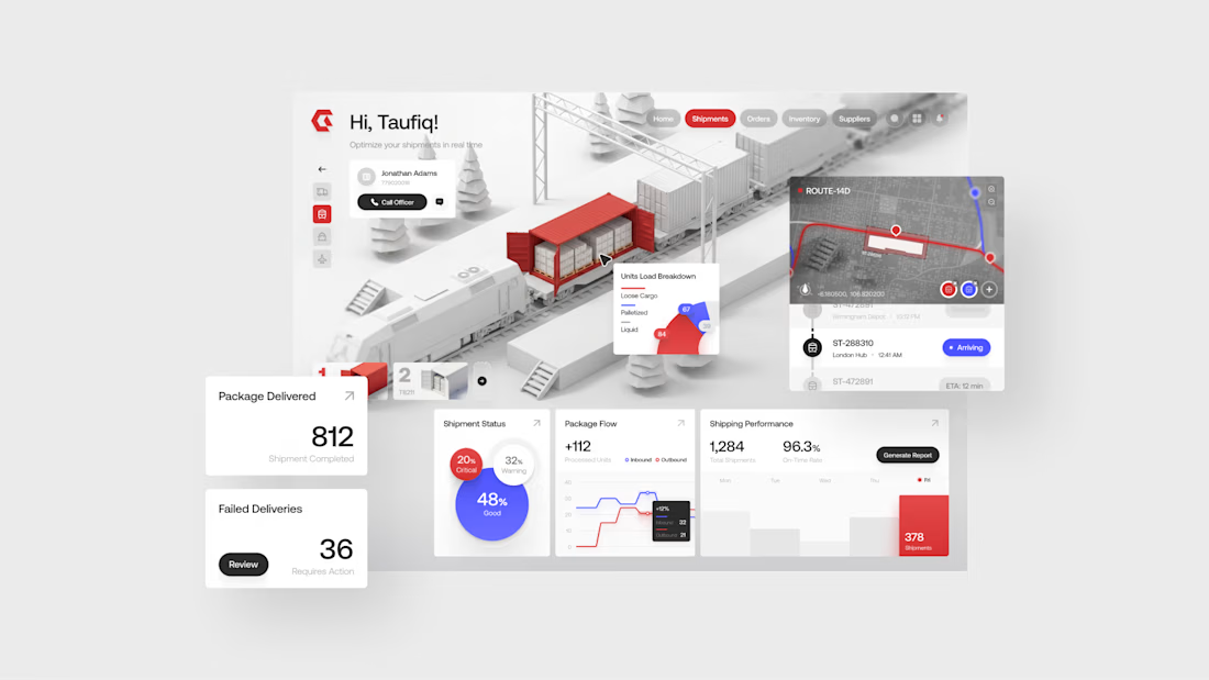
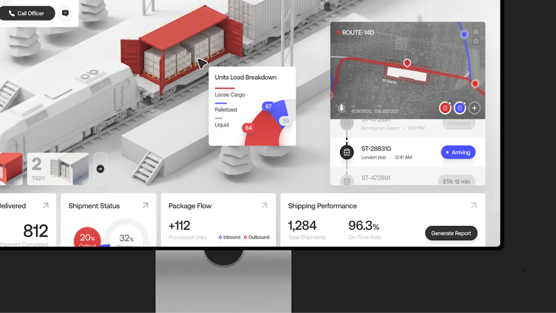
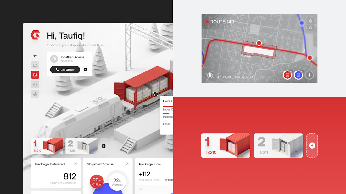
Gaze — Logistics & Supply Chain Dashboard
A clean dashboard for tracking shipments and operations, with bold red accents and structured data for a clearer workflow.
Want to create something like this?
Let's Talk!

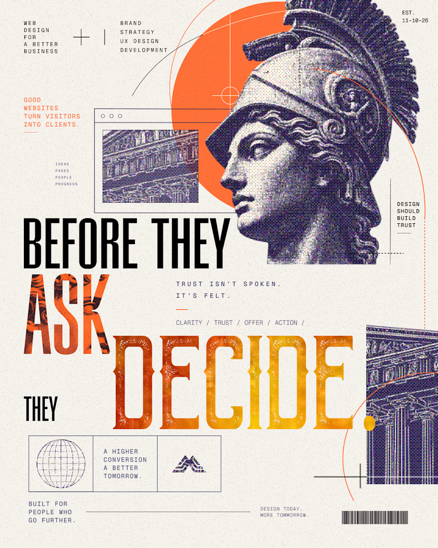
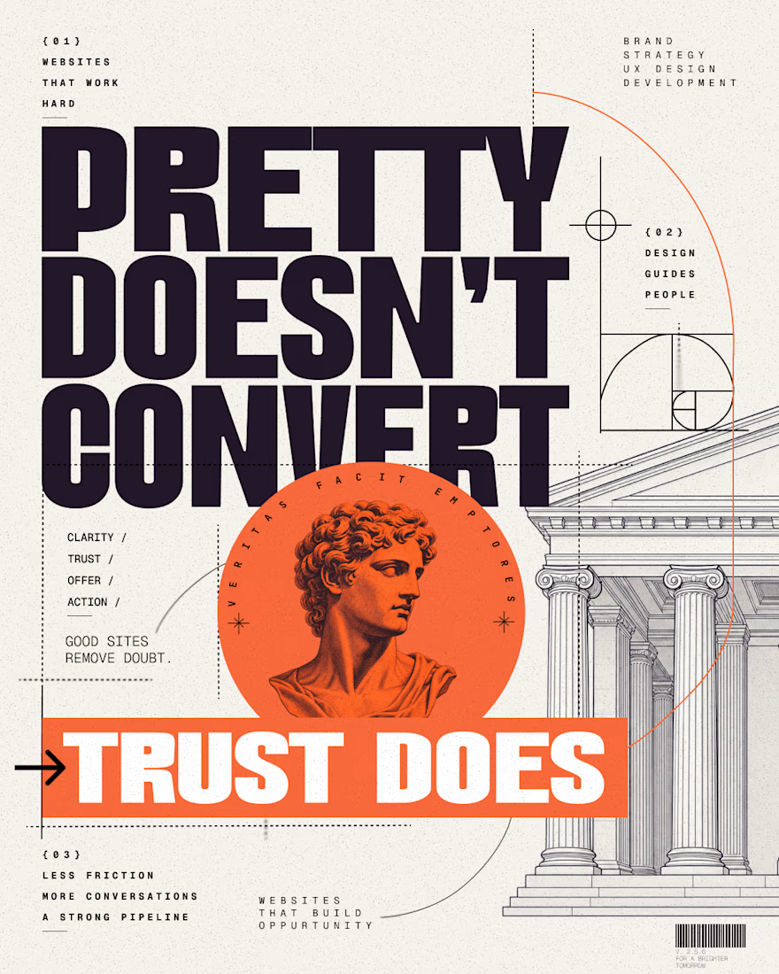
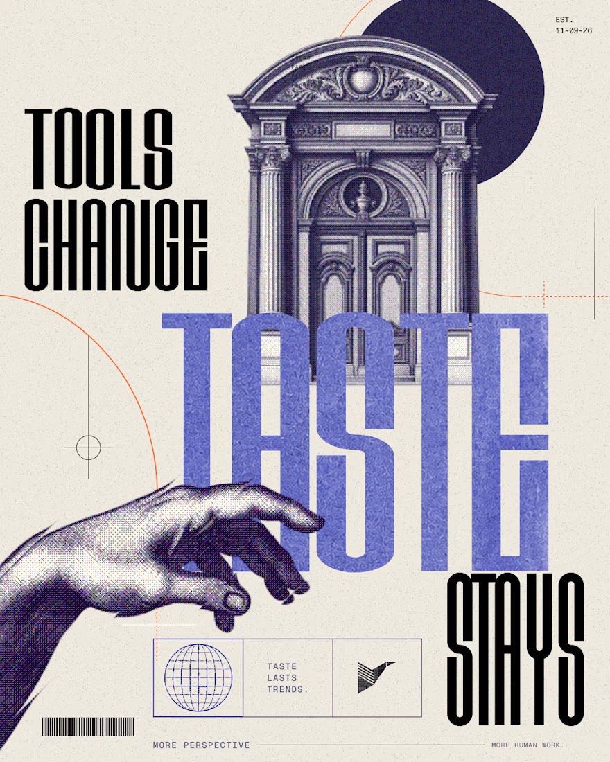
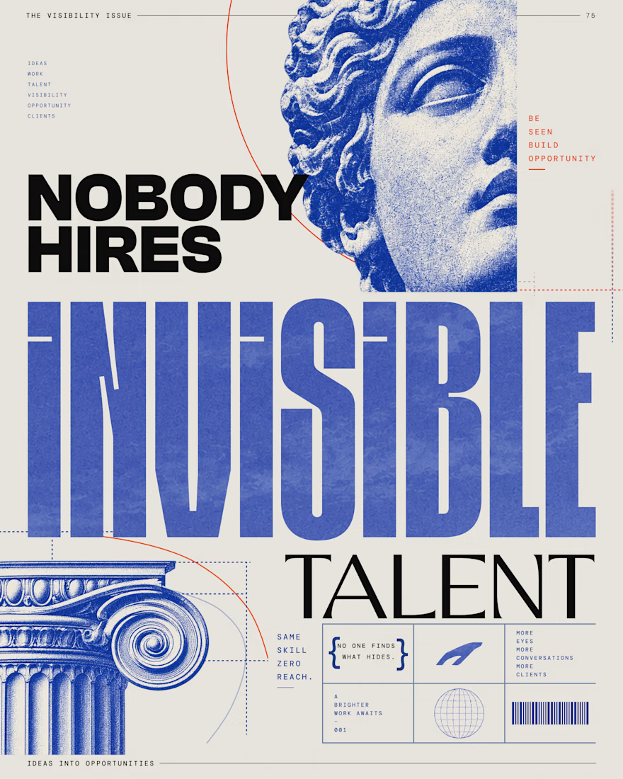
Editorial Social Campaigns for Web & Creative Brands
A series of bold editorial posters created for LinkedIn, Instagram, and Pinterest — combining typography, classical imagery, halftone texture, and strong visual hierarchy.
The goal was to create scroll-stopping social visuals that feel more like campaign art than generic marketing graphics.

Same copy, two designs - does layout really change how it reads?
What's your first reaction - left or right?

1 voted
33%
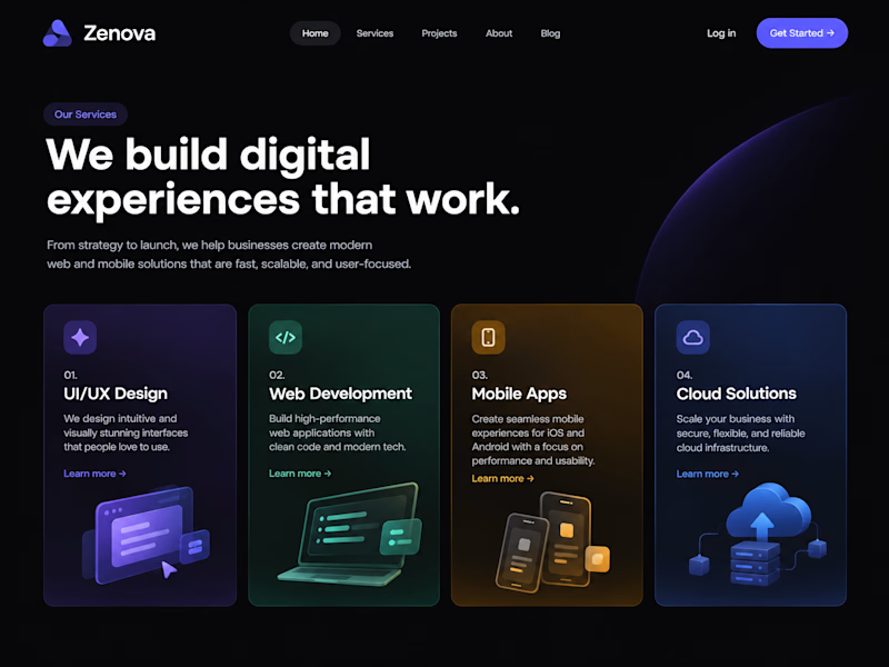
2 voted
67%
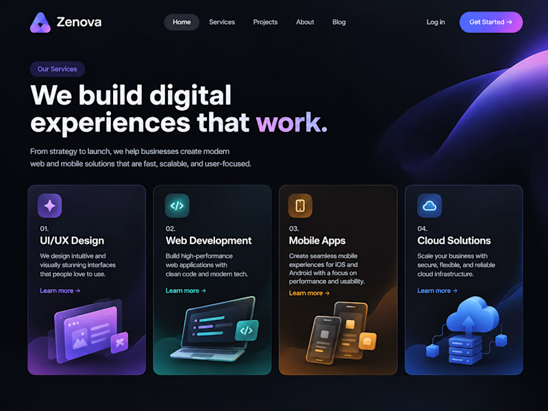
3 votes
Closed

The copy stays constant, but the type scale and card rhythm make the two directions feel genuinely different. I’m leaning left—the tighter headline width gives the first screen a calmer reading path.