The network for creativity
Join 1.25M professional creatives like you
Connect with clients, get discovered, and run your business 100% commission-free
Creatives on Contra have earned over $150M and we are just getting started
Back to feedPost

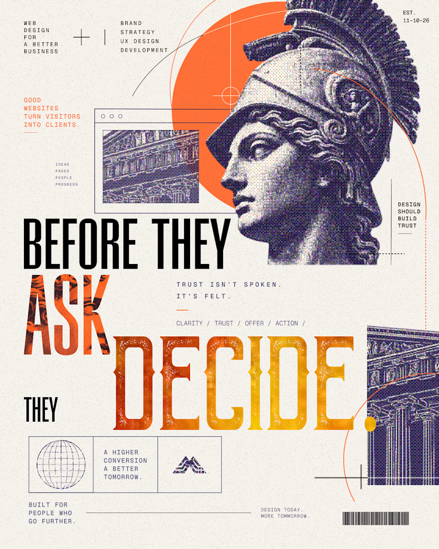
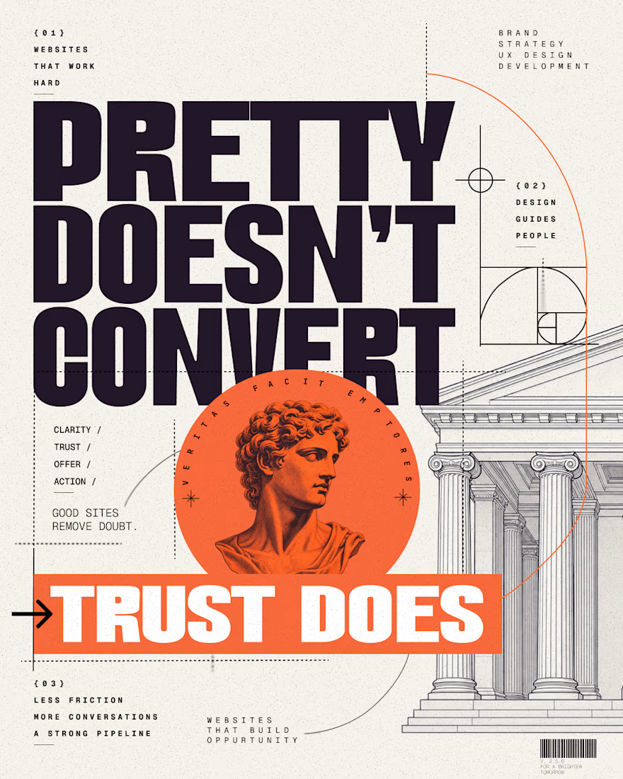
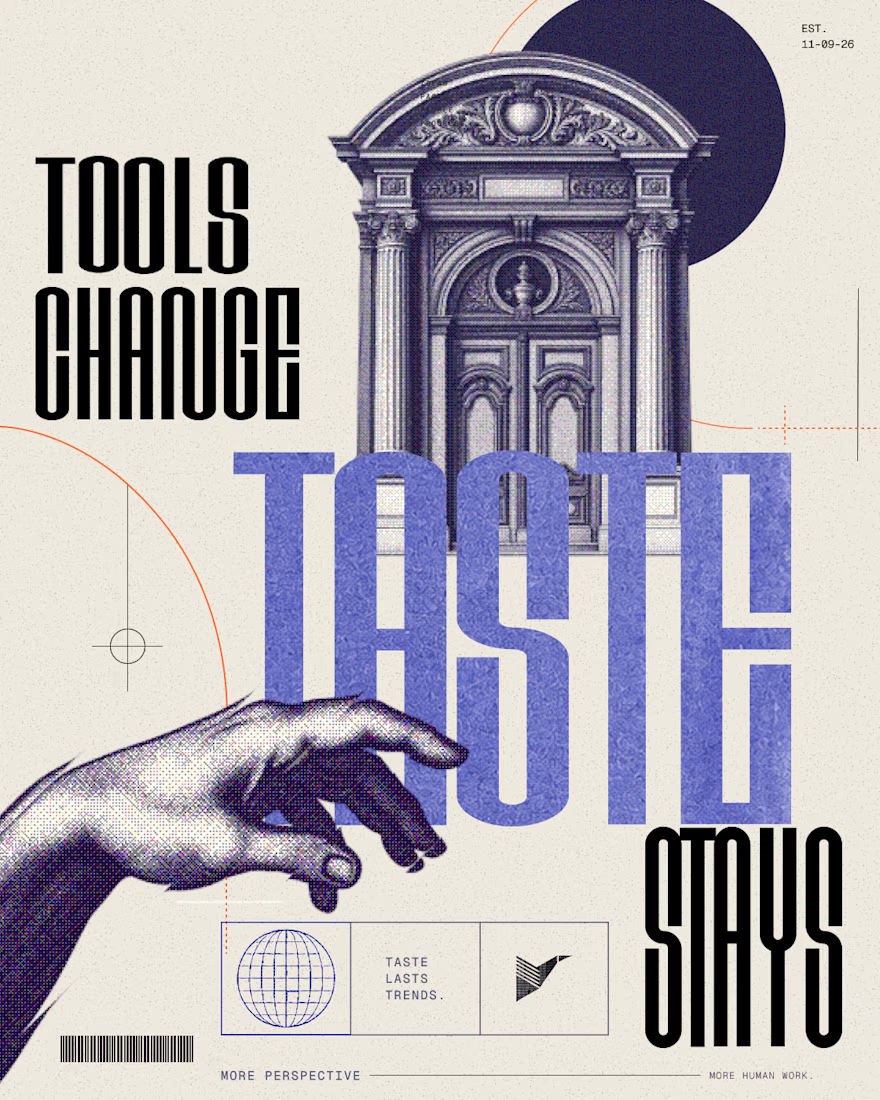
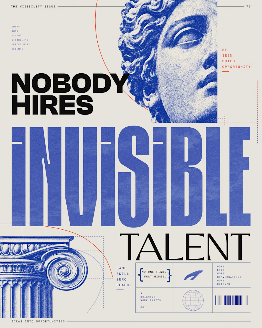
Editorial Social Campaigns for Web & Creative Brands
A series of bold editorial posters created for LinkedIn, Instagram, and Pinterest — combining typography, classical imagery, halftone texture, and strong visual hierarchy.
The goal was to create scroll-stopping social visuals that feel more like campaign art than generic marketing graphics.

The network for creativity
Join 1.25M professional creatives like you
Connect with clients, get discovered, and run your business 100% commission-free
Creatives on Contra have earned over $150M and we are just getting started







Related posts

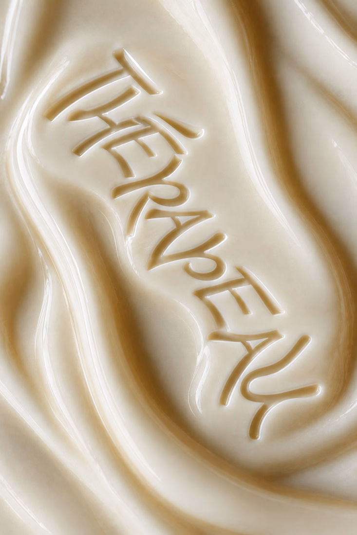
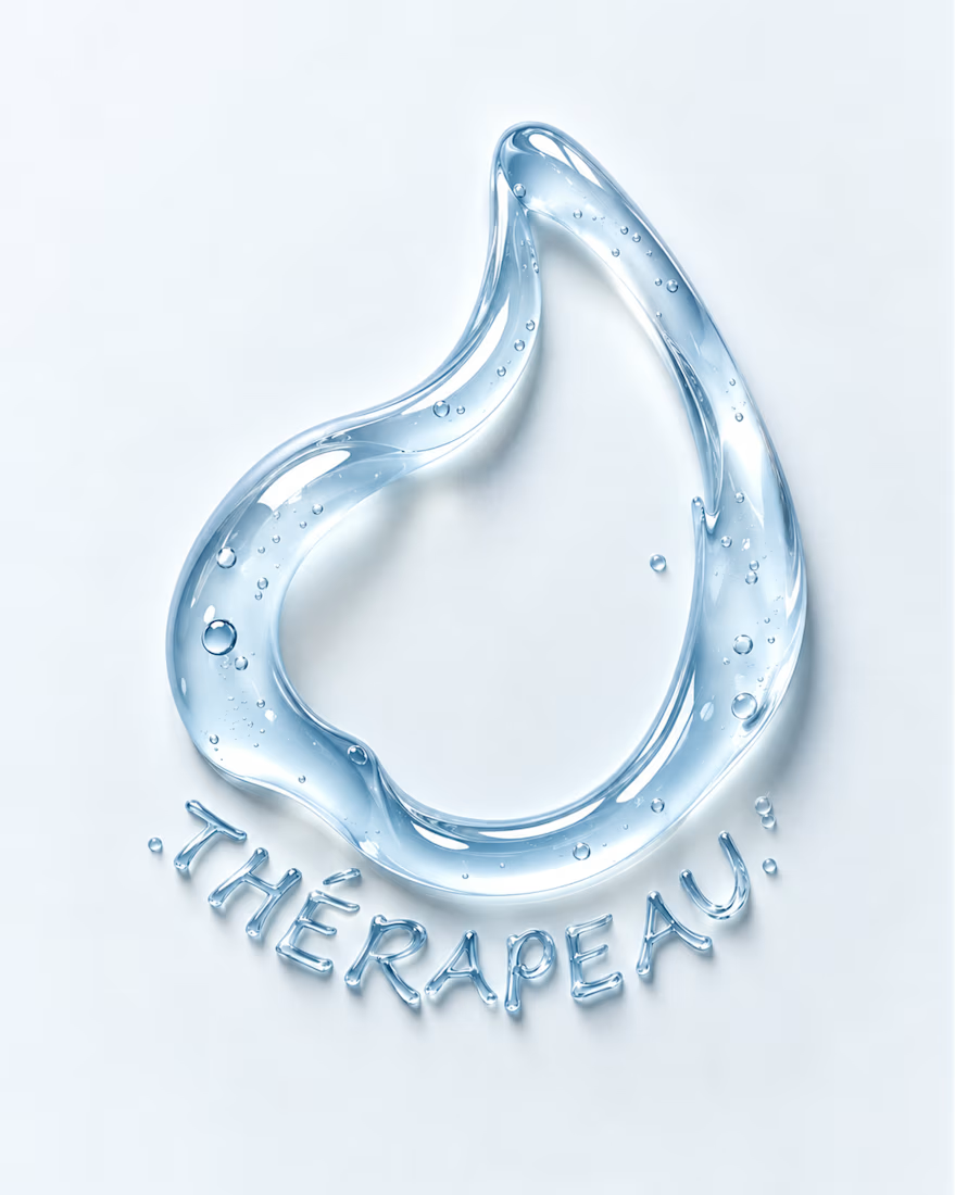
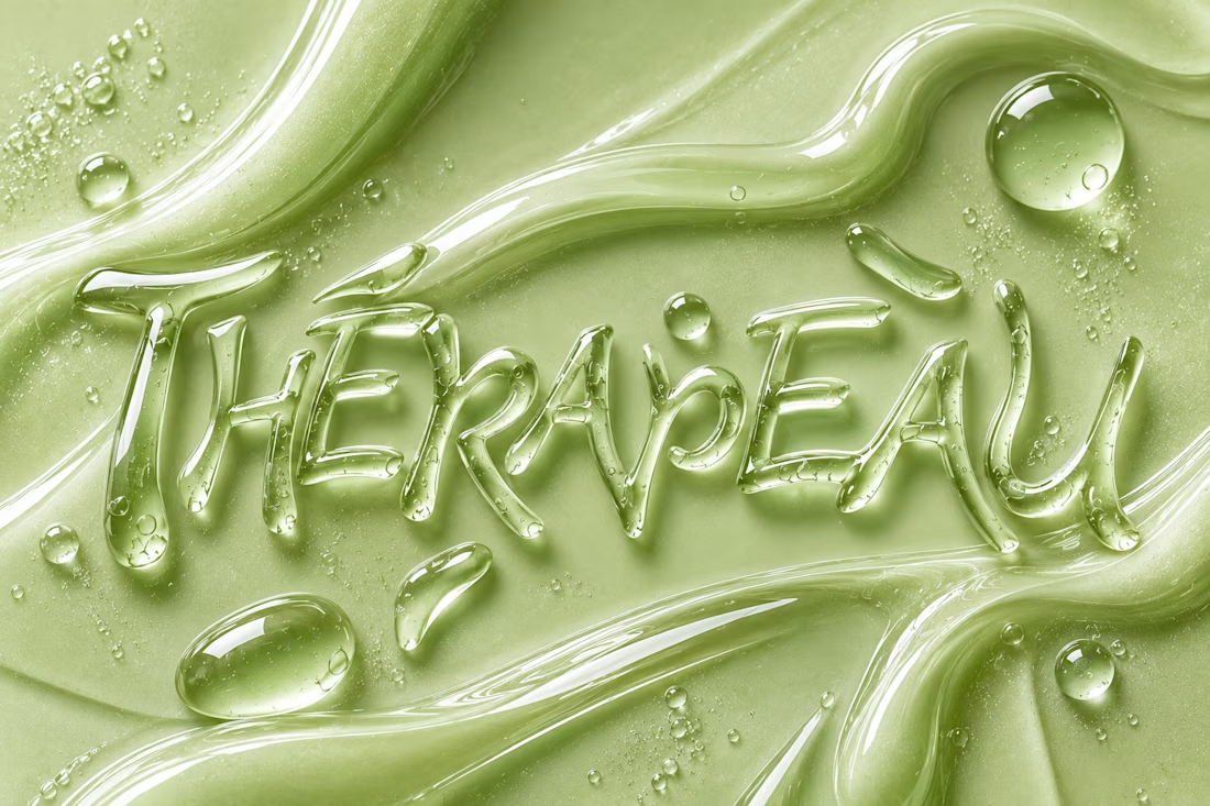
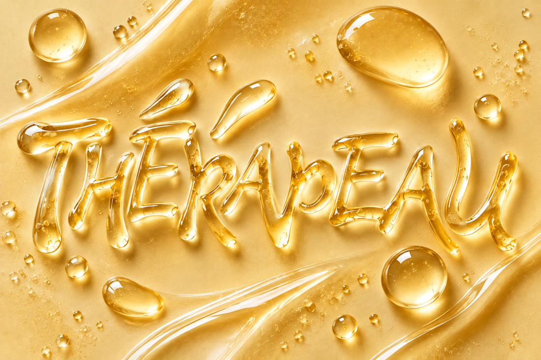
Exploring imagination through texture, typography and skincare. ✨
For THÉRAPEAU, I wanted to push the visual identity beyond packaging and explore how serum, gel and cream could become part of the brand language itself.
Using the core wordmark as a starting point, I experimented with different materials, colours and tactile expressions — turning skincare textures into typography and visual studies.
These explorations were created together with ChatGPT as part of the creative process, helping me test ideas quickly while keeping the final brand direction grounded in my own identity system and design decisions.
A small study in how texture can become communication. 💧
#ChatGPT #AIinDesign #Branding #VisualIdentity #SkincareBranding


Letting the wordmark turn into the material itself is a strong idea. Did you set a limit for how far a texture can distort the letters before it stops reading as THÉRAPEAU?

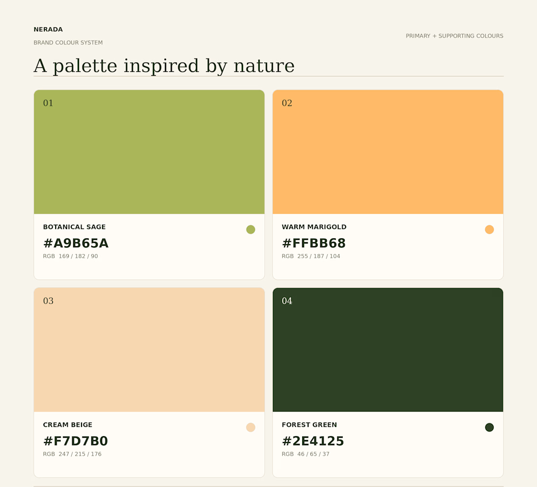
Created the complete brand identity for Nerada, a natural tea brand — developing the visual direction and design elements that shape how the brand looks and feels across every touchpoint. The goal was a clean, organic aesthetic that reflects the brand's natural positioning and builds a consistent, recognizable identity.

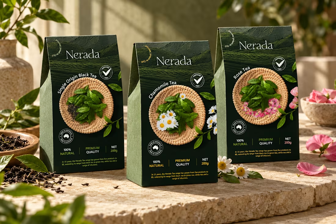
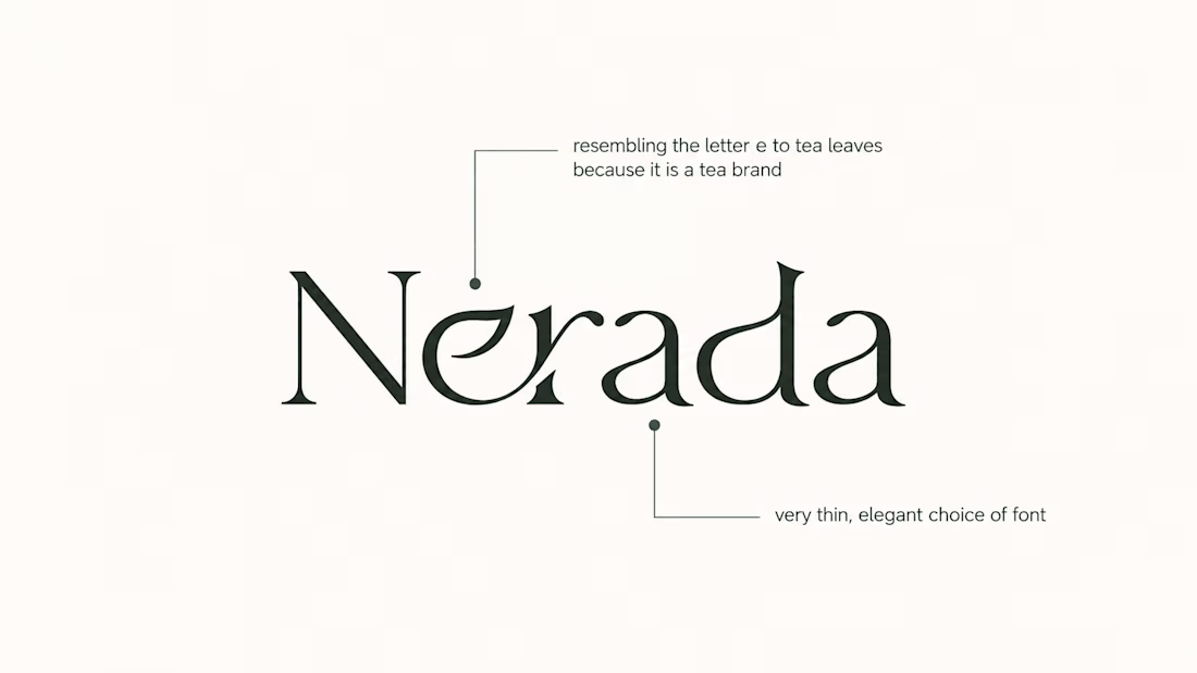
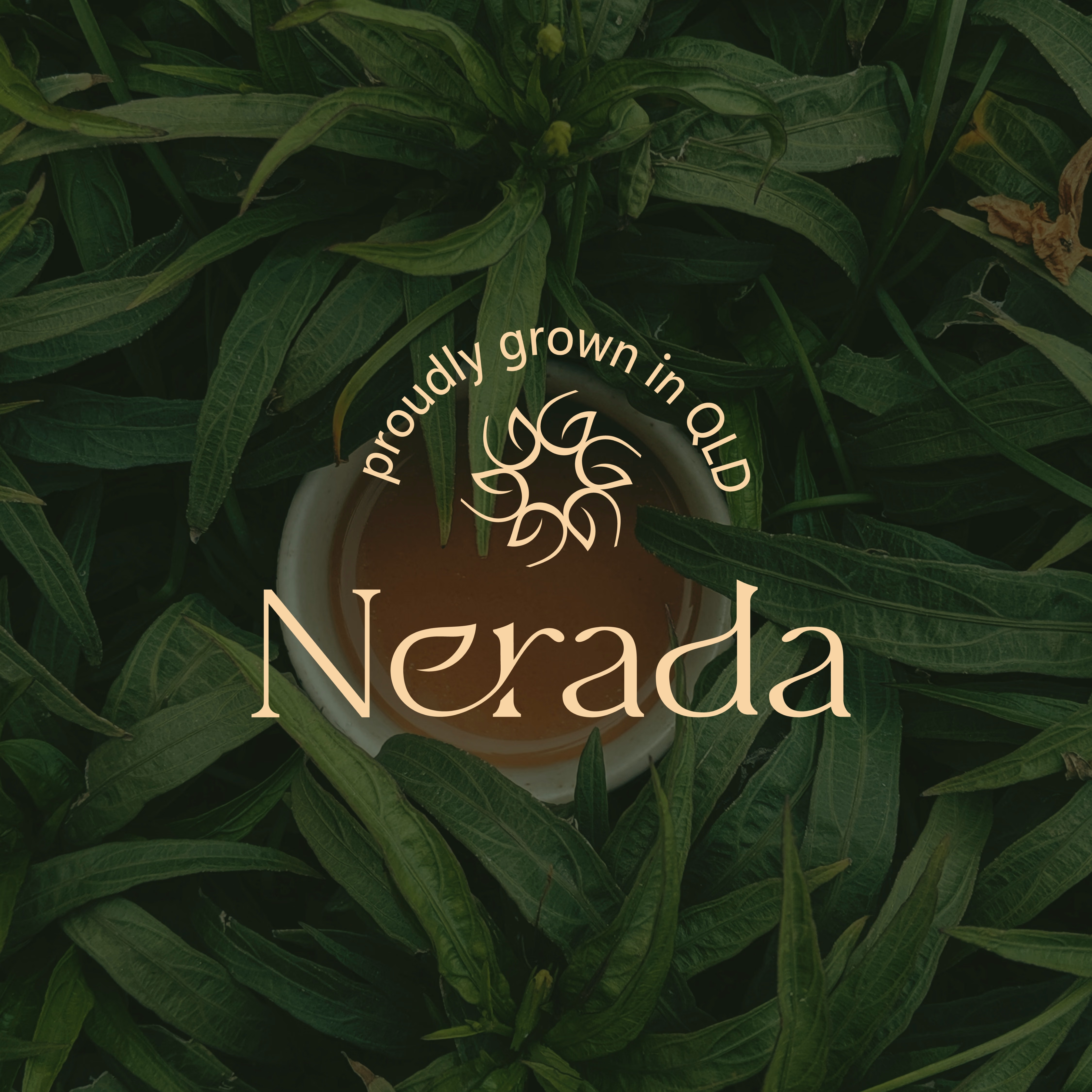

The mark feels grown rather than drawn, which is exactly right for a natural tea brand. Packaging is where tea brands win or lose. Does the identity change tone across blends, or stay one voice with different colours?


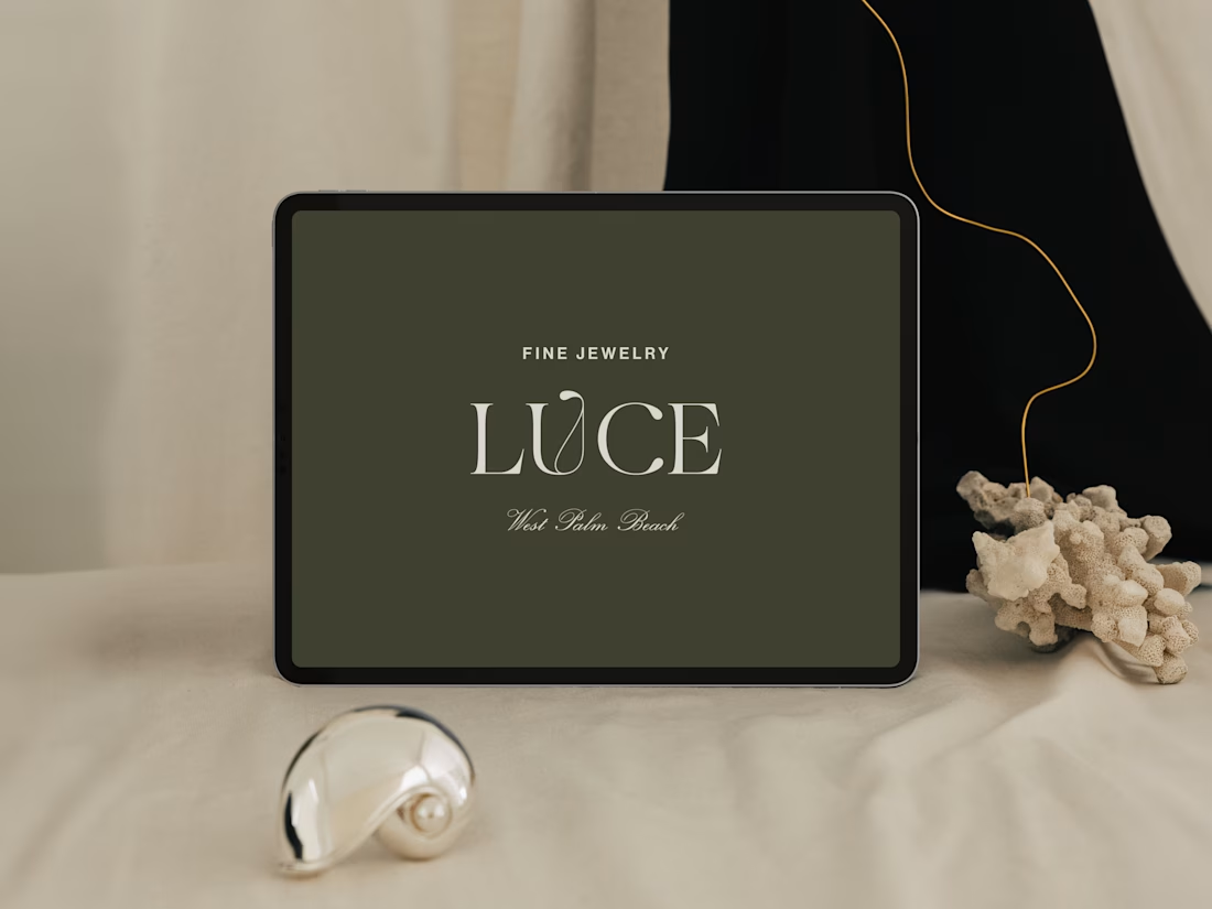
Introducing LUCE, a fresh chapter in four generations of fine jewelry.
Earthy greens, expressive typography, and thoughtful packaging bring warmth and personality to a brand rooted in heritage.
I worked with LUCE across brand strategy, visual identity, packaging experience, and full Shopify website design and development, bringing every detail into one cohesive world.


NEAT