The network for creativity
Join 1.25M professional creatives like you
Connect with clients, get discovered, and run your business 100% commission-free
Creatives on Contra have earned over $150M and we are just getting started
Back to feedPost
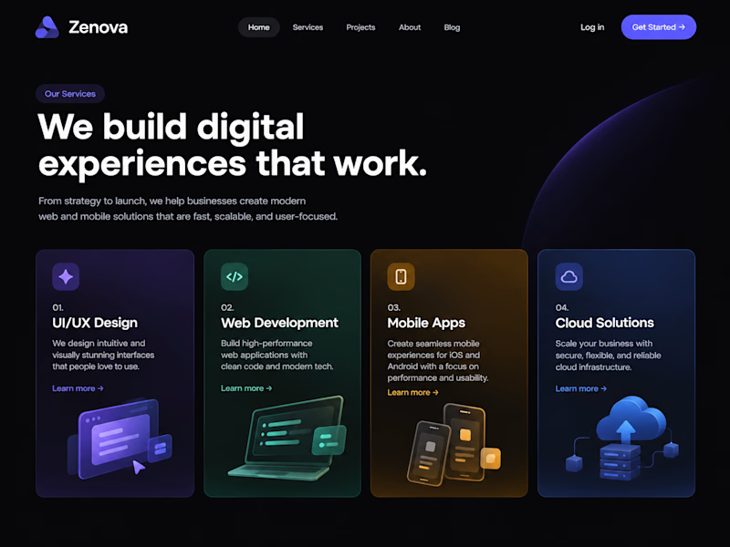
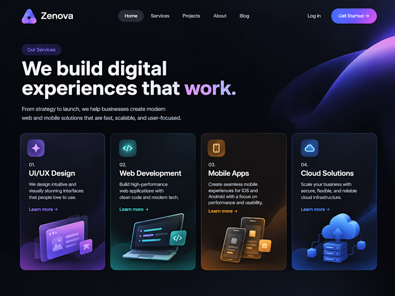
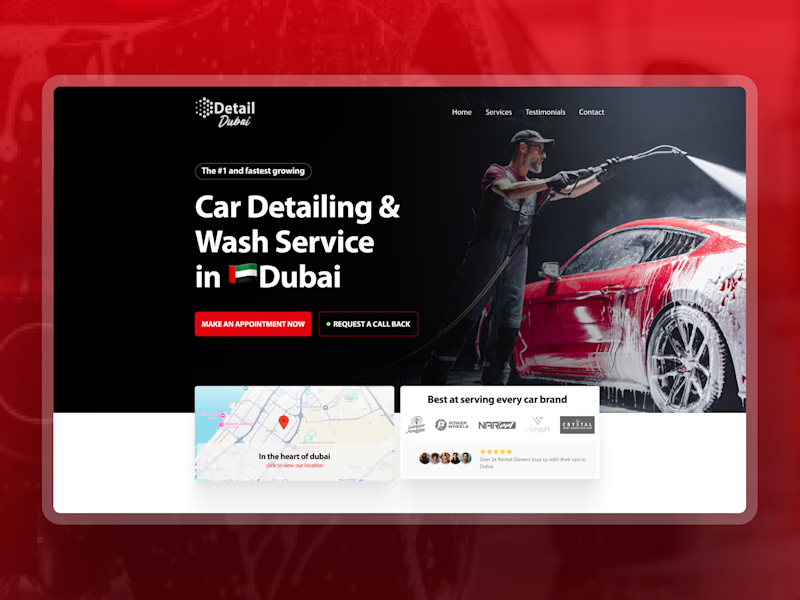
Taste Test
Same copy, two designs - does layout really change how it reads?
What's your first reaction - left or right?

1 voted
33%
2 voted
67%
3 votes
Closed

The copy stays constant, but the type scale and card rhythm make the two directions feel genuinely different. I’m leaning left—the tighter headline width gives the first screen a calmer reading path.

Exactly Rohan, the smaller details change the overall rhythm.
Appreciate your feedback😍

Right, mostly because of the CTA button and the color pull on work, the left version reads fine but leaves you nowhere to go after the headline lands.
The network for creativity
Join 1.25M professional creatives like you
Connect with clients, get discovered, and run your business 100% commission-free
Creatives on Contra have earned over $150M and we are just getting started

Challenges
View all


Related posts
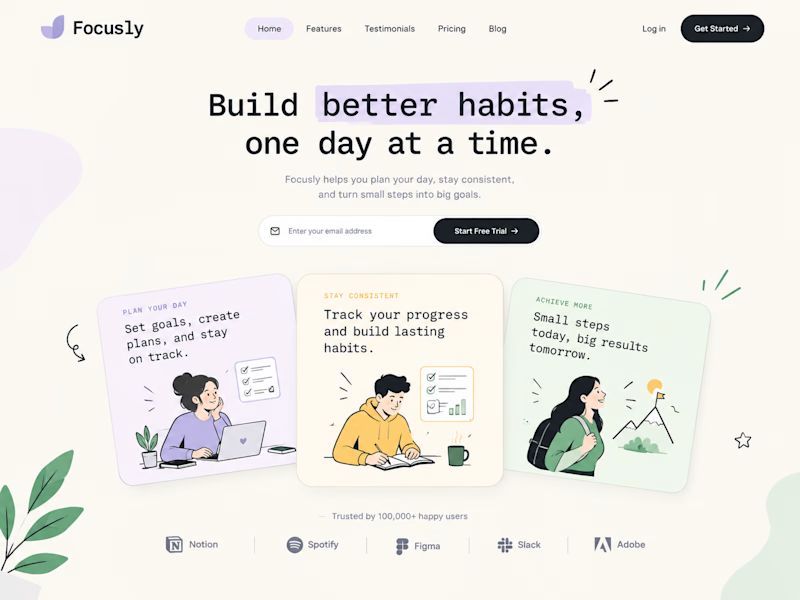
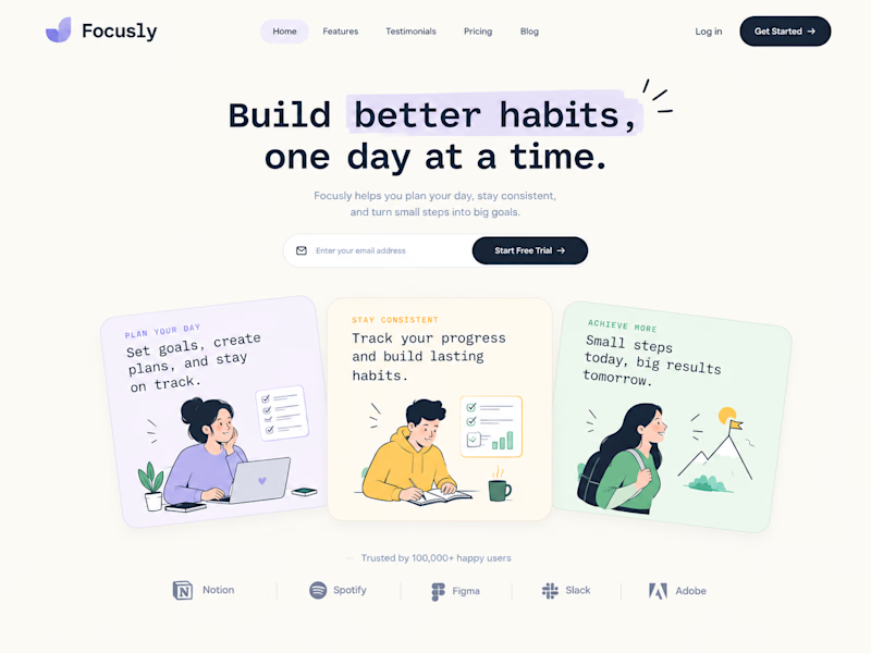
Same headline, two layouts fighting for attention.
Which one wins the first 3 seconds?
3 voted
75%
1 voted
25%
4 votes
Closed

I’m picking B. The visual details make it feel more distinctive.


New cover, new visual taste test.
As a visual director, the hardest choice is choosing between your own creations.
Two covers. Two directions. One choice.
Which one gets your vote?


34 voted
79%
9 voted
21%
43 votes
Closed


the blue background makes the orange shapes pop



The left one is much clearer and better to watch as a customer. Clean execution.