The network for creativity
Join 1.25M professional creatives like you
Connect with clients, get discovered, and run your business 100% commission-free
Creatives on Contra have earned over $150M and we are just getting started
Back to feedPost
Pitchplan.io is a London-based business consultancy helping founders find investors and prepare stronger business plans for interested parties.
The challenge was to build a visual identity that could feel credible for investment conversations without becoming cold, generic, or overly corporate. Since the brand speaks to founders, investors, and business clients, it needed to communicate trust, structure, and connection in a simple way.
The logo direction started from two core ideas.
The first was the hashtag: a symbol of numbers, trends, targeting, and discoverability. This connected back to the startup and business side of the brand, where visibility, positioning, and market relevance matter.
The second was the interlock: a visual reference for connection, PR, strategy, and relationships. Pitchplan is not just about documents or business plans. It is about connecting businesses with the right investors and helping founders present themselves with more confidence.
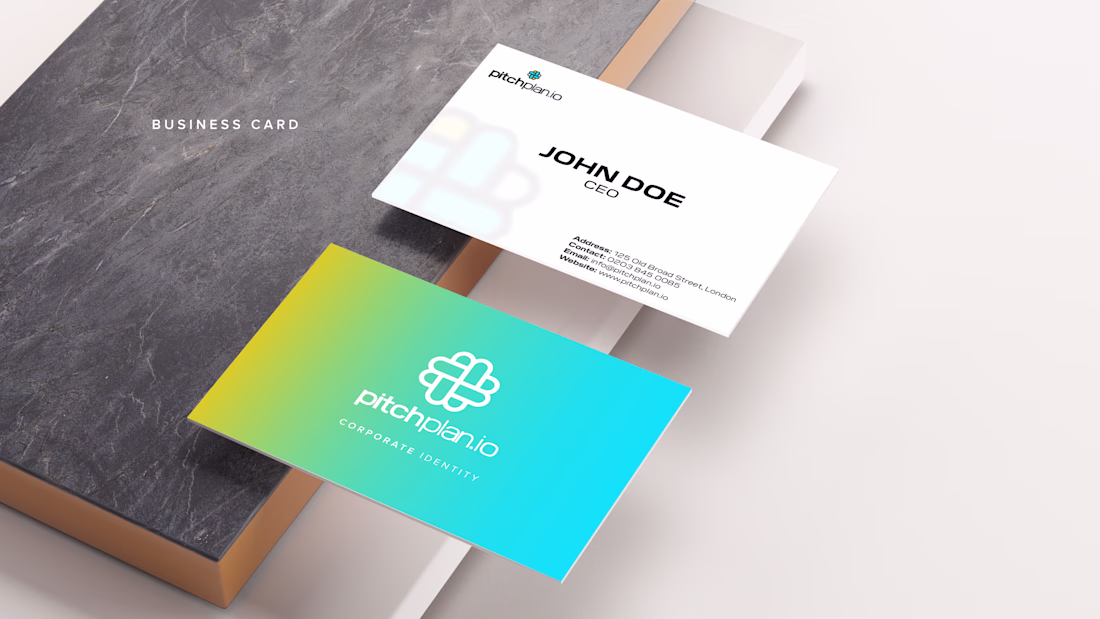
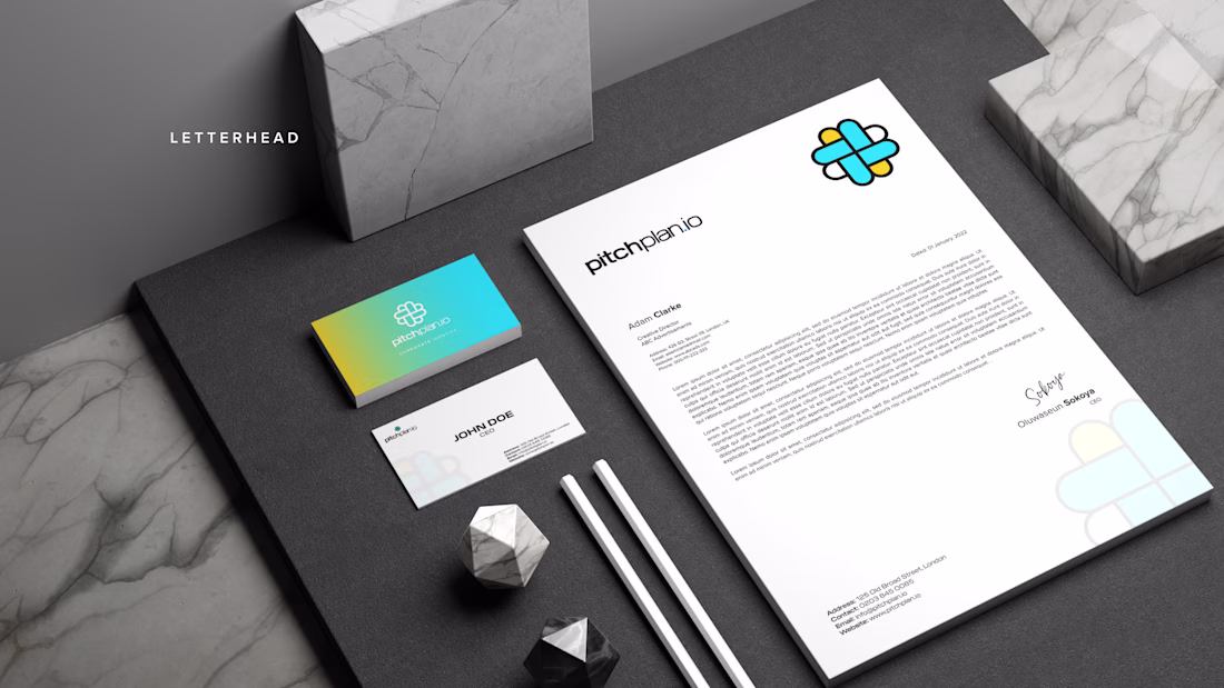
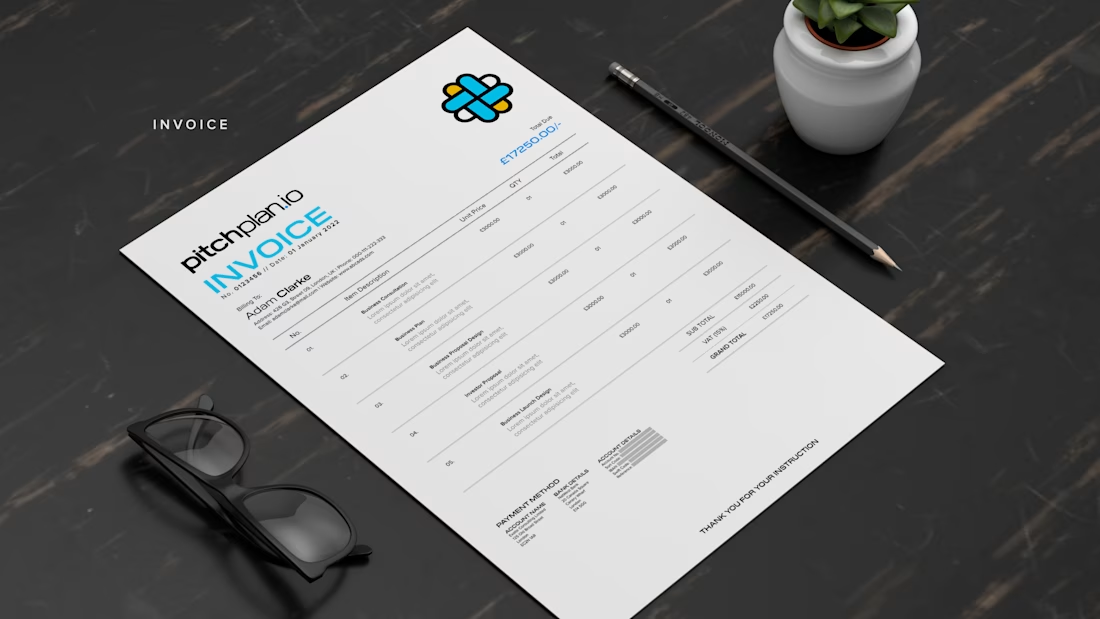
By combining these two ideas, the final mark became a clean interlocked symbol. It feels structured, balanced, and connected, while still being simple enough to work across stationery, pitch documents, invoices, business cards, and digital touchpoints.
The color palette was intentionally kept bright and optimistic. Mikado Yellow brings energy, ambition, and forward movement, while Sky Blue adds clarity, openness, and a more dependable business tone. Together, the gradient creates a brand that feels modern and startup-friendly, but still professional enough for consultancy work.
Typography was kept clean and wide to support the same feeling: modern, open, and clear. It gives the brand a confident voice without making it feel aggressive or overly formal.
The wider identity system was then applied across business cards, letterheads, invoices, corporate stationery, and digital presentation touchpoints. This was important because Pitchplan’s trust does not come from the logo alone. It comes from consistency. Every touchpoint needed to feel organized, polished, and ready for serious business communication.
The final identity positions Pitchplan as a consultancy that can help founders move from idea to opportunity with clarity, structure, and the right connections.
The network for creativity
Join 1.25M professional creatives like you
Connect with clients, get discovered, and run your business 100% commission-free
Creatives on Contra have earned over $150M and we are just getting started
Related posts
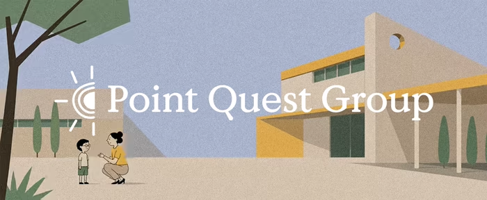
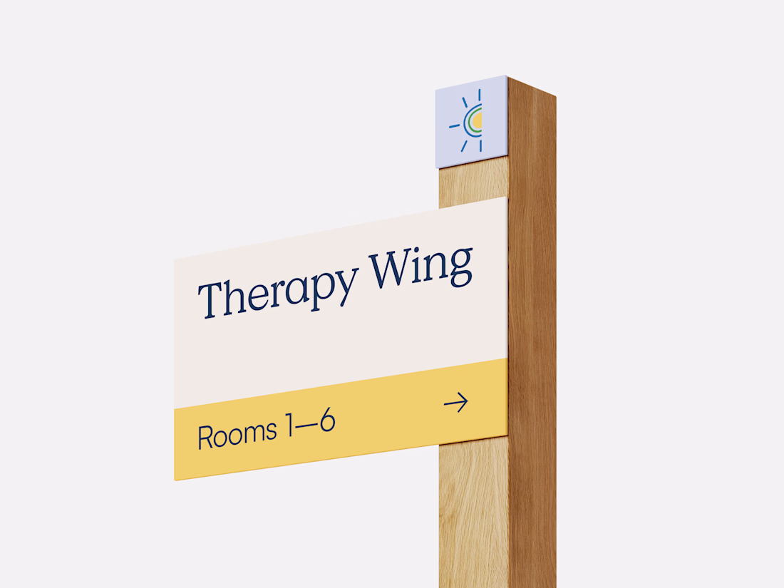
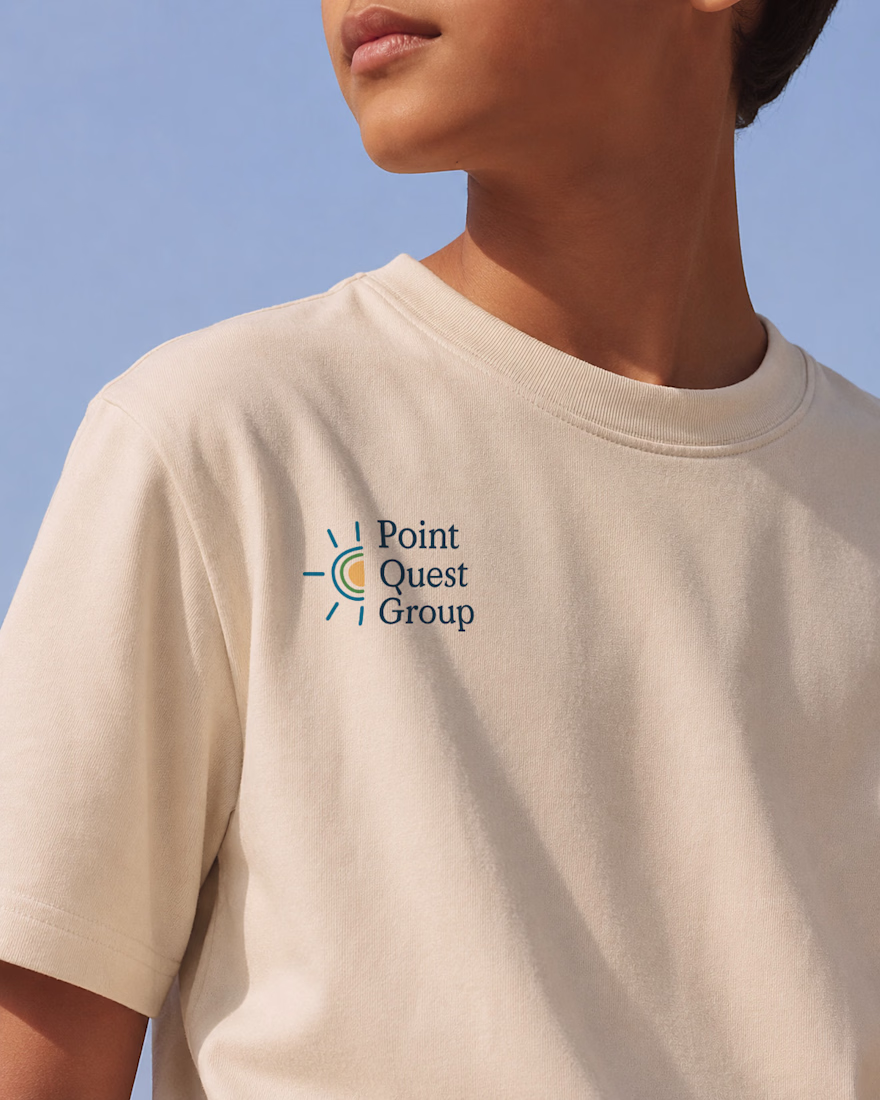
As Lead Brand Designer at Case Study Brands, I led the brand identity for Point Quest Group, an education organization. Starting with positioning and brand strategy, I translated the organisation’s goals into a cohesive visual identity designed to resonate with both school leaders and families. The final identity system balances credibility with warmth while providing a scalable foundation for future growth.
Great Work
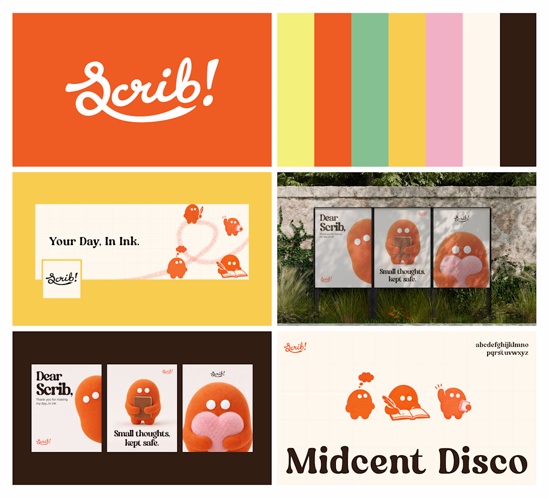
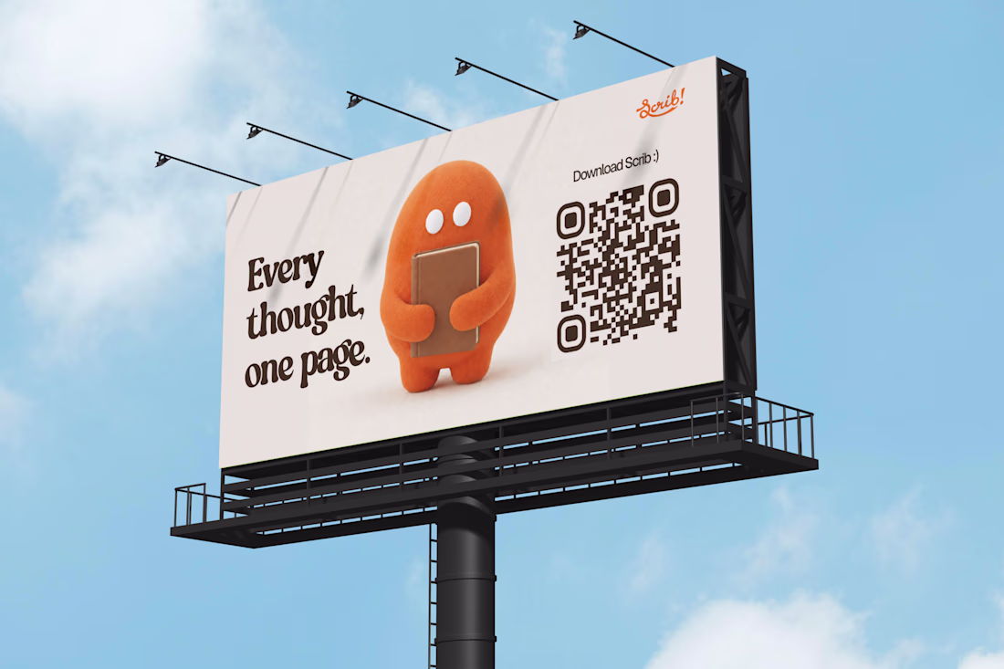
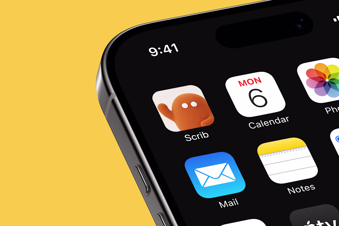
Creating a brand identity for Scrib - A Journaling App
I liked the title 'Human by Design' for this @Contra HQ x @Envato challenge. I thought why not create something that could be made before AI arrived but also use the opportunity to show how AI helps our workflow when used right, amidst the negative news we sometimes here about it.
So I decided on a brand identity. The process of this wasn't linear, there were times I had to decide if I had to use an asset or if it followed what I wanted to communicate in the design.
I had a number of sketches and ideas penned down before I started on creating the assets so I knew, to get the right assets, I had to give the right instructions.
When it came to fonts, mockups, images, sound, illustrations (mascot). All were generated in @Envato.
I pictured the brand as one a client would use so I worked with clarity on the project.
This is my first use of Envato and I'm really impressed with the output.
I made the decisions but Envato definitely helped with ideating and creation.
This was fun!
P.S.: It was my first time using envato so I had to watch a couple of YouTube videos and read a couple of articles to get started 😆
Video tryouts :)
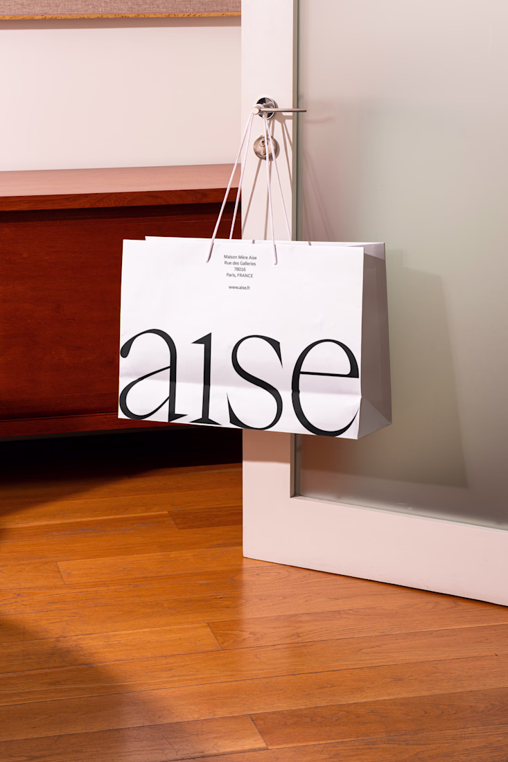
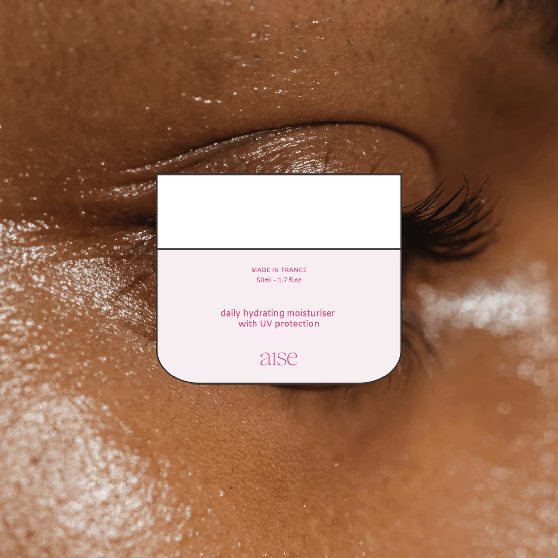
Aise is a conceptual skincare brand built around a simple premise: wellness should simplify your life, not add to it. Inspired by growing consumer overwhelm and decision fatigue, I developed a reduction-led brand strategy and visual identity that transforms minimalism into a functional system rather than a stylistic trend. Through restrained typography, intentional spacing, refined packaging, and clear product architecture, the brand is designed to reduce cognitive load and make skincare feel calm, intuitive, and effortless.
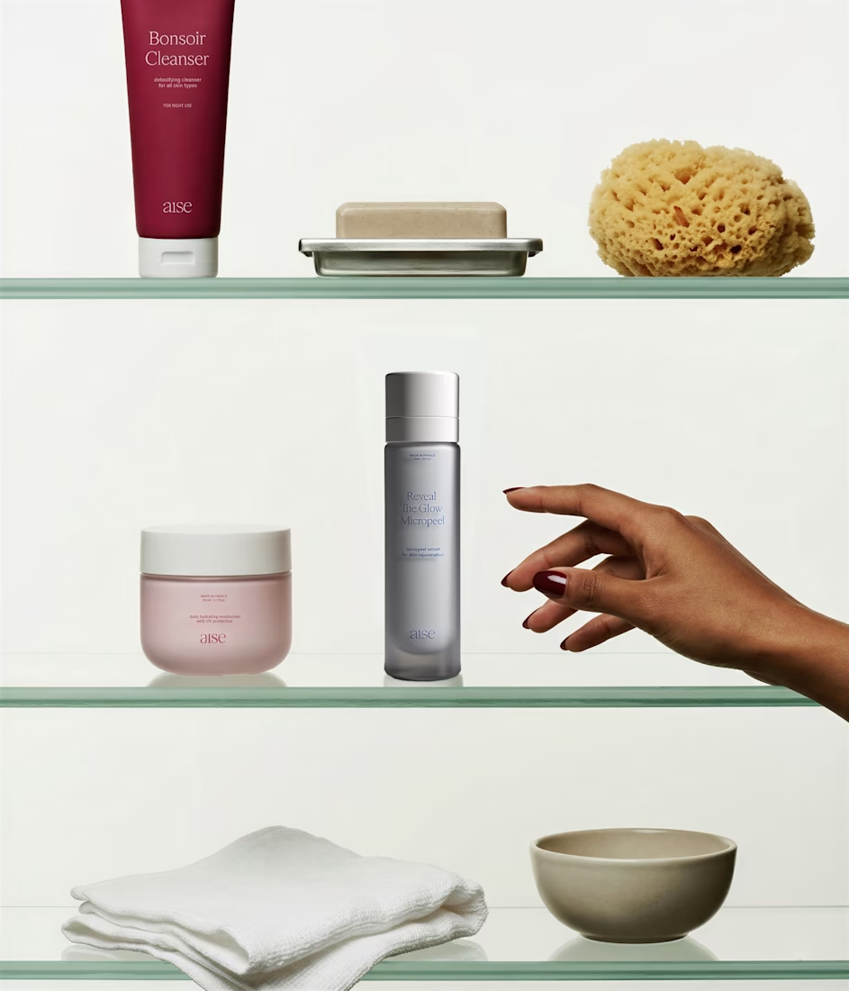
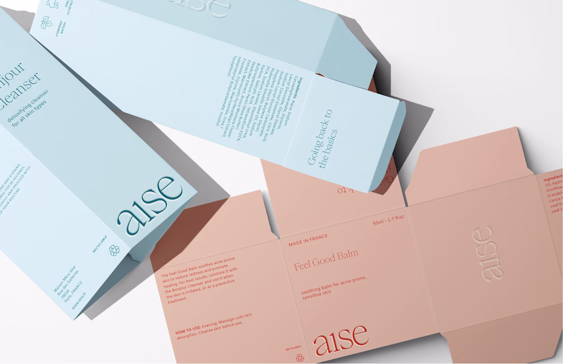
Love how restrained the packaging feels, that wordmark on the outer box doing double duty as texture is a nice touch. Did you test other color combos before landing on the pink and sage, or was that pairing there from the start?
Trending
Claude
Claude has entered the design space. How are you using Claude Design?
Contra University
Learn from expert creatives how to earn more using next-gen AI tools.
creativeaiflow
Creative AI workflows are evolving. What tools do you use, and what are their strengths and weaknesses?
freelancerlife
Freelancer life is wins, pivots, and everything in between. What’s yours right now?