The network for creativity
Join 1.25M professional creatives like you
Connect with clients, get discovered, and run your business 100% commission-free
Creatives on Contra have earned over $150M and we are just getting started
Back to feedPost
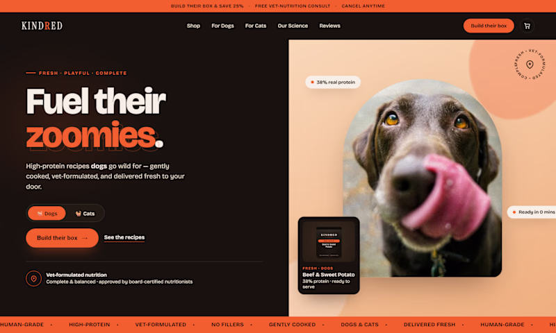
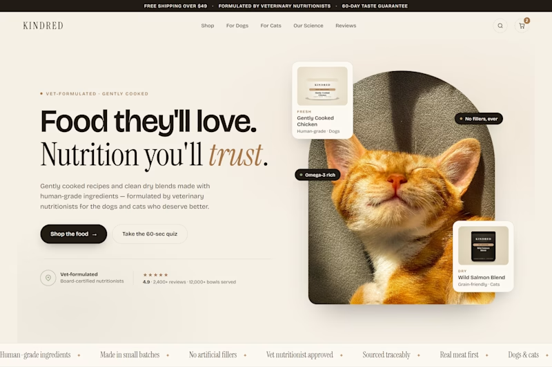
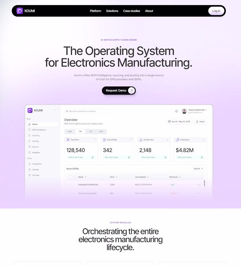
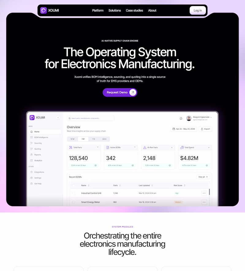
Taste Test
Same brand. Same product. Which one sells more?
Two heroes. Two completely different directions.
V1 — dark, bold, high energy. Orange hits hard. The kind of hero that stops a scroll.
V2 — clean, editorial, refined. Cream and serif. Feels like a brand you'd trust with your pet's health.
I'll let you vote. Drop your answer below.
7 voted
24%
22 voted
76%
29 votes
Closed
Excellent Work
Appreciate it. Glad the contrast between the two made the decision easier.
V2 🔥
Thankyou
To be sincere both actually make sense but the v2 looks more cleaan and simple so am going for it
Thankyou
You are most welcome
The Dark
Thankyou for voting
Thankyou for voting
Whichever was built by following UX principles better 😊
And what do you think which one is following principles better?
It's hard to tell just by looking at it. They both are very similar.
Dark mode will be the best!
Thankyou
The design systems here are beautifully distinct.
Thanks, that's the goal. Same brand brief, two completely different design languages. That tension is what makes the test worth running.
V1 is what i choose
Good eye! that orange on black is hard to argue with.
Can you try the V1 - dark but with white backgrounds? I would like to see how it is.
Pretty sure it will rock !
That's actually a great call the typography and energy of V1 would hit differently on white. Might get the best of both worlds.
Not something I can test here, but that's a solid next build if the votes lean V1.
I like clean mood
V2 was made for you then. Clean always ages better.
When people are buying premium food for their pets, they want safety, health, and clean transparency I think V2 is communicating well on that portion.
Exactly right. V2 earns trust before you read a single word. That's what premium pet food needs, the design has to feel as clean as the ingredients.
I will prefer v2. This is very clean and minimalist.
V2 has that effect on people. Clean design and premium product are a natural match.
The typography choices add a lot of character while preserving readability.
That's the balance worth chasing. Character without sacrificing clarity, especially on a hero where you have seconds to land the message.
The network for creativity
Join 1.25M professional creatives like you
Connect with clients, get discovered, and run your business 100% commission-free
Creatives on Contra have earned over $150M and we are just getting started
Related posts
Hi everyone,
I’m showing GiveAFck365, a tiny daily ritual for giving a damn. In a world where it feels like no one gives a f*ck anymore, I wanted something simple and human; just one intentional act of care per day.
So I created this little app for the Config Makeathon.
GiveAF*ck365 gives you 365 f*cks at the start of the year, one for each day. You can drag a token from the Unsent jar into the Given jar as a personal acknowledgment, or send one to someone else as a small digital care token.
No streak pressure. No gamification guilt. Just a quiet, physical-feeling daily ritual.
The entire experience lives inside two glass jars on screen. Tokens pile up with satisfying physics, and when you send one, you choose from seven different types of care (Tough Love, Pure Care, Gratitude Bomb, and more). Each send returns a small random impact message that makes the interaction feel surprisingly meaningful.
I built this as my first public project for the Config Makeathon, mostly because I wanted to stop watching everyone else's incredible projects and finally ship something myself.
What it does
🧠 Two-jar drag-and-drop system with spring physics and satisfying landing bounce
🎯 7 unique care token types with custom names and descriptions
🔥 Gentle streak tracking + weekly counts focused on awareness, not pressure
💬 Random impact messages after every send
"This one hit different."
🎉 Confetti bursts and interaction feedback when a token lands
📜 History drawer with token thumbnails, token types, and CSV export
💾 Automatic local saving via localStorage
How I Built It
The entire app - from blank canvas to working React prototype - was created and iterated entirely inside Figma Make, with zero context switching.
Figma Make generated the complete React + TypeScript scaffold, component structure, and Tailwind-based design system.
Using MCP tools and aesthetic-stance skills, I defined the visual language: a dark charcoal interface accented with warm orange highlights.
Every iteration happened directly inside Make:
- Fixed Radix forwardRef issues
- Replaced random token positioning with a deterministic seeded system (eliminating visual jitter)
- Redesigned the send experience into a visual 7-token selection grid
- Added streak tracking and weekly insights
- Implemented spring bounce physics on the Given jar
- Added confetti interactions and motion polish
- Unified history and token data structures for maintainability
- Claude served as an AI pair programmer throughout the process, helping with debugging, feature implementation, and iteration directly inside the canvas.
- The jar illustrations and token assets were sourced from Figma, and the entire workflow - design, code, debugging, and refinement - remained in a single environment from start to finish.
What It Could Grow Into
This foundation maps surprisingly well to an on-chain experience.
Each daily token could become a unique ERC-1155 NFT (or similar on a better fit chain), with only 365 minted per year. Instead of simply sending a digital gesture, users could send actual care tokens directly to friends' wallets. The app already includes a stubbed "Connect Wallet" flow, making that evolution feel like a natural next step rather than a complete rebuild.
Longer term, active participants who consistently give could receive airdrops of a playful GiveAF*ck meme token, unlock limited-edition token variants, or earn rare legendary "f*cks" tied to community milestones.
What excites me most is the possibility of creating something unusual in web3: a product built around generosity rather than speculation. A wholesome social ritual that sits somewhere between meme culture, habit-building, and meaningful human connection.
I'm genuinely open to collaborating with builders, designers, and web3 developers who would like to help turn this into a real on-chain experience.
If this little ritual resonates with you or if you have your own version of wanting to give a fuck more intentionally I’d love to hear about it in the comments.
Huge thanks to everyone sharing their work during Config Makeathon. Seeing your projects inspired me to stop overthinking and finally ship something.
Links
Live Prototype: https://giveafck365.figma.site
Video Walkthrough: https://www.loom.com/share/99cdc09f767940f1b5eb48dc4080391f
Figma Community File: https://www.figma.com/community/file/1649359320060581320/give-a-f-ck-365
The two-jar mechanic is doing something most habit apps miss entirely. Drag to give, not drag to log, that shift in framing makes it feel much more like a gesture than a task. Congrats on shipping your first public project.
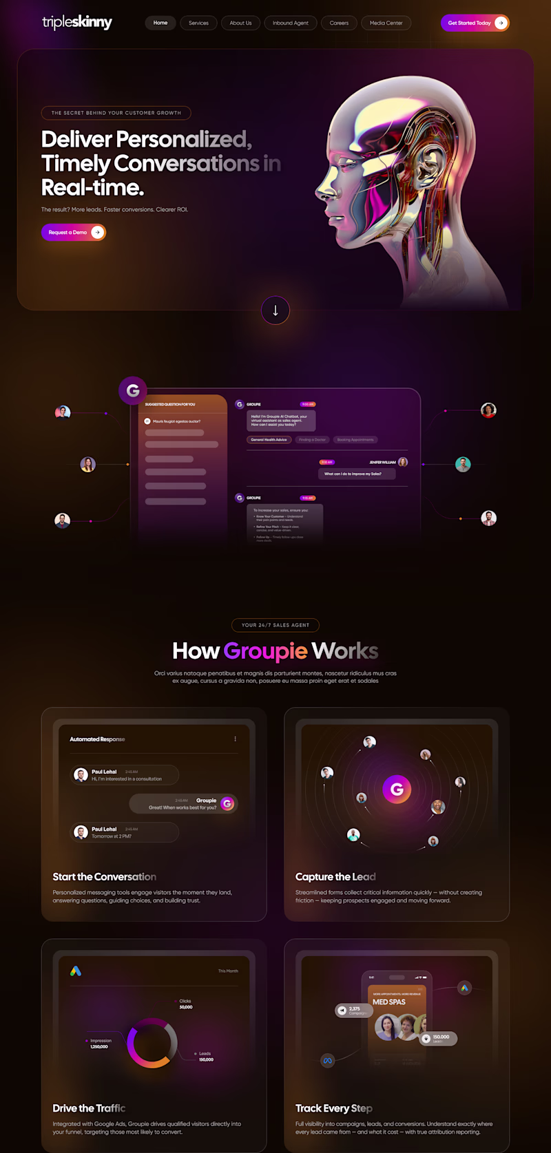
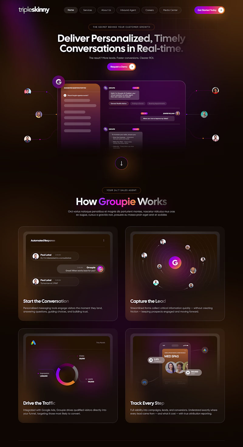
🎨 Design Poll: Which direction would you choose? 👀
I explored two hero concepts for the same AI marketing landing page, each with a different approach to grabbing attention and guiding users.
✨ Option A puts storytelling first with a bold 3D visual to create an immersive first impression.
🚀 Option B leads with the product experience, helping users instantly understand the value and functionality.
Both are designed for the same audience, but they create two completely different experiences.
👇 If you were the client, which one would you launch?
💜 Option A: Storytelling First
🧡 Option B: Product First
Drop your vote and tell me what influenced your decision🎯, conversions, 🎨 aesthetics, 🧠 UX, or 📈 clarity. I'd love to hear your perspective!
19 voted
79%
5 voted
21%
24 votes
Closed
Nice design
Exploring two visual directions.
Which feels more refined?
A. Contained hero
B. Open hero
34 voted
55%
28 voted
45%
62 votes
Closed
Will go for B
Trending
Claude
Claude has entered the design space. How are you using Claude Design?
Contra University
Learn from expert creatives how to earn more using next-gen AI tools.
MagicPath
The canvas is infinite, and exploration is becoming the workflow. How are you using MagicPath?
creativeaiflow
Creative AI workflows are evolving. What tools do you use, and what are their strengths and weaknesses?
freelancerlife
Freelancer life is wins, pivots, and everything in between. What’s yours right now?