The network for creativity
Join 1.25M professional creatives like you
Connect with clients, get discovered, and run your business 100% commission-free
Creatives on Contra have earned over $150M and we are just getting started
Back to feedPost

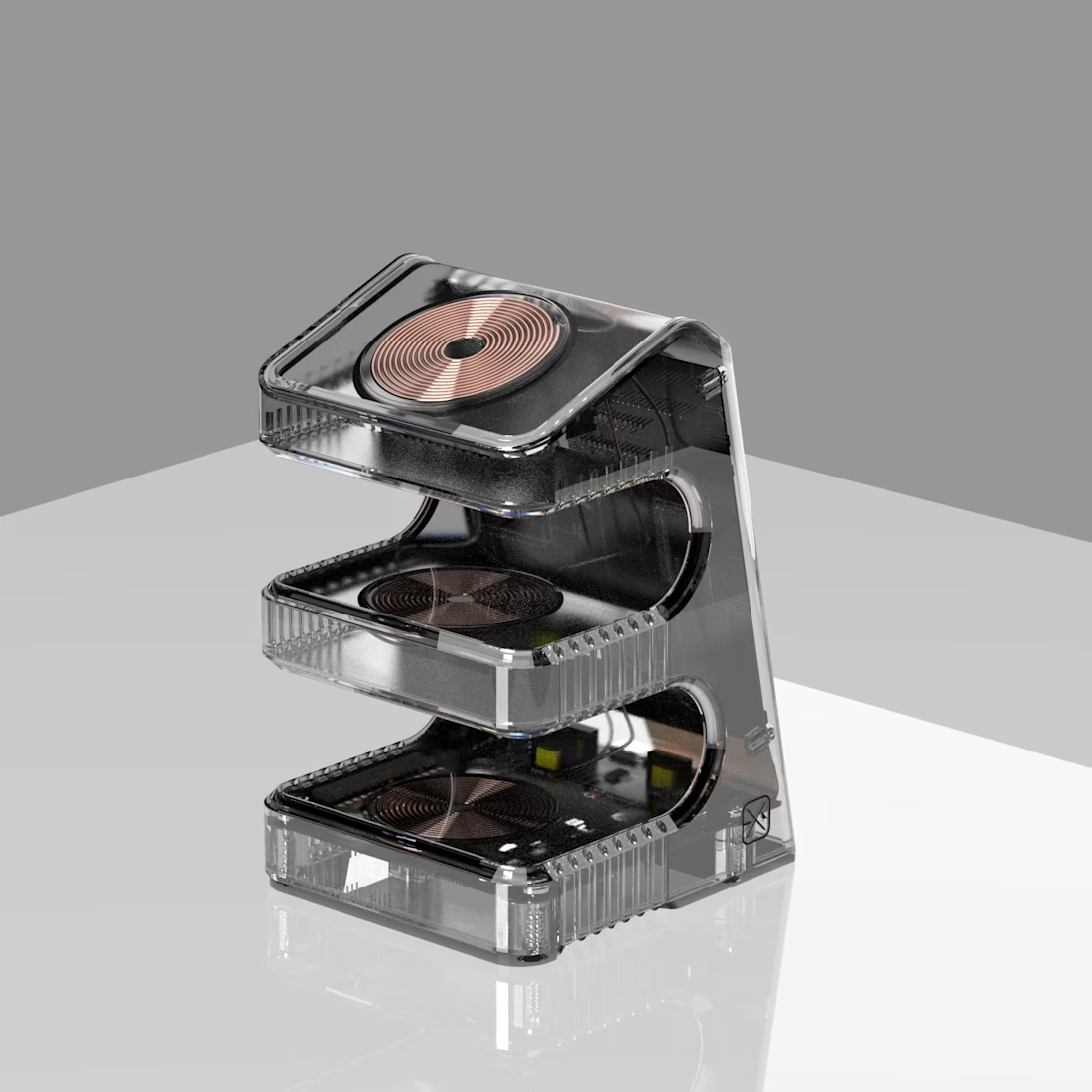
Three coils, one housing, and a phone that docks two ways — upright when you want the screen, hidden when you don't.
The detail worth flagging: the USB-C port originally sat exactly where the phone lands in the hidden position. Caught it in review. Cheap to move on a model. Expensive once the mold is cut.
Passive cooling only — 40.7°C peak under full load, no fan, no heat sink.


That USB-C interference is exactly the kind of detail that's easy to miss in CAD and painfully obvious once you prototype it 😭. Really nice example of why design validation matters
The network for creativity
Join 1.25M professional creatives like you
Connect with clients, get discovered, and run your business 100% commission-free
Creatives on Contra have earned over $150M and we are just getting started








Related posts

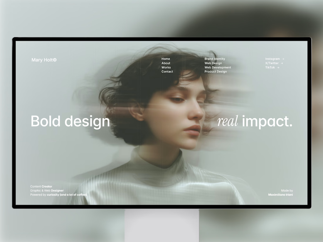
i built this portfolio template in framer a few months ago, and it’s been exciting to see how much traction it’s been gaining lately!
it’s now #81 overall and #25 in the designer category on the framer marketplace, bringing in more views, reach, and commissions along the way.
sharing the case study here if you want to take a closer look at the project and see how it came together! 🙌


Huge congrats Max! #81 overall and #25 in designer category on Framer marketplace is no small feat 🚀 Framer templates that actually get traction + commissions is the dream. Well deserved!


The lime and purple pairing with the mono type works nicely for Remotlin.


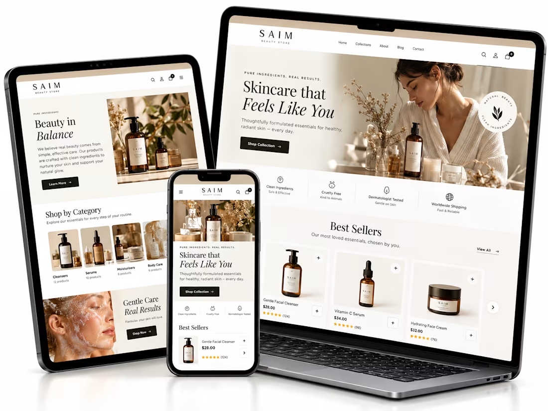
Shopify website setup project, I created a premium eCommerce homepage concept for a startup beauty brand.
Using Lovable, I developed a responsive design framework featuring elegant product showcases, intuitive navigation, clear shopping CTAs, ingredient storytelling, product benefits, customer review sections, FAQs, and email capture.
The goal was to establish a professional brand presence, simplify product discovery, and create a conversion-focused foundation for Shopify development.


The soft neutral palette suits the skincare angle really well, and the best sellers section with the star ratings reads cleanly across all three device mockups. Building the whole concept in Lovable is interesting. Did the generated layout hold up responsively out of the box, or did you rework parts of it by hand?