The network for creativity
Join 1.25M professional creatives like you
Connect with clients, get discovered, and run your business 100% commission-free
Creatives on Contra have earned over $150M and we are just getting started
Back to feedPost

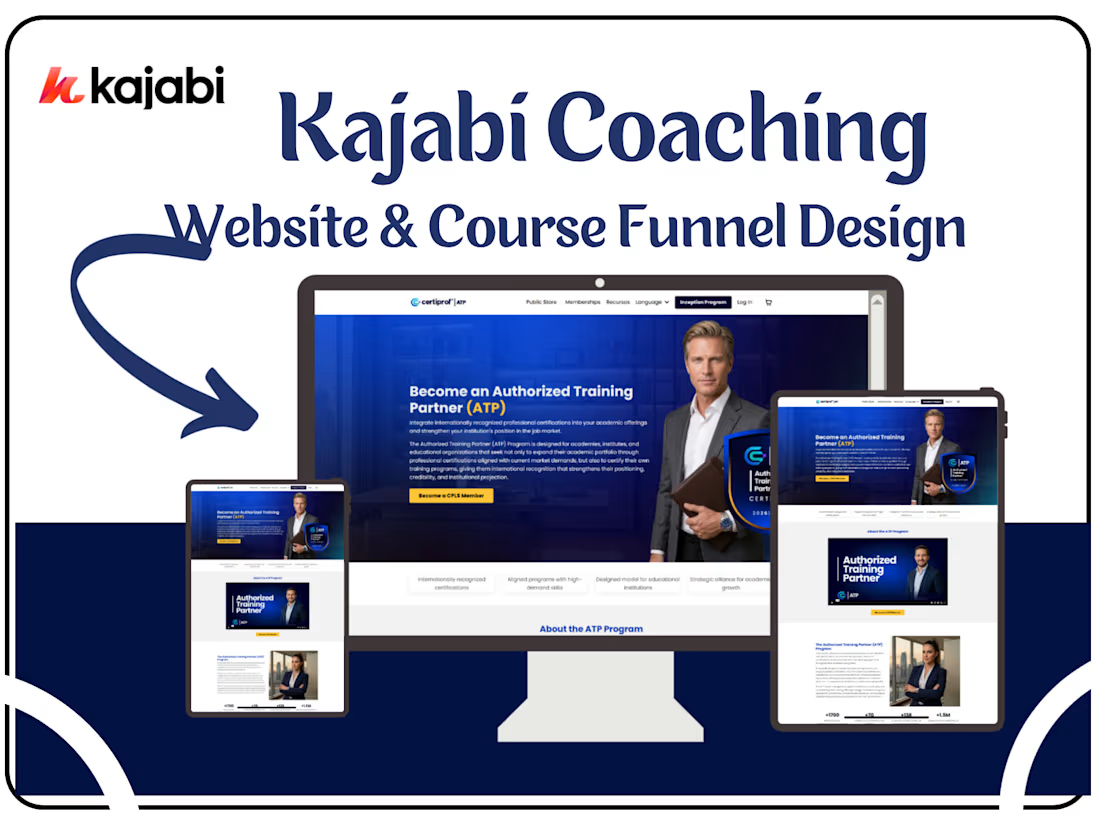
Kajabi Case Study: Certiprof Authorized Training Partner (ATP) Program Website & Certification Funnel
Project Overview
Industry: Professional Certification & Education
Platform: Kajabi
Project Goal: Redesign the website and create a streamlined funnel for educational institutions to become Authorized Training Partners (ATP), promoting globally recognized certifications and institutional growth.
The Problem
Certiprof needed a website that could:
Clearly communicate the benefits of the ATP Program to educational institutions worldwide
Provide a structured process for application, evaluation, and activation
Showcase credibility through global metrics, certifications, and partnerships
Increase adoption of the program by simplifying navigation and clarifying eligibility criteria
The challenge was to make the program appealing, credible, and easy for institutions to engage with while maintaining a professional, global-facing presentation.
The Strategy
Audience Segmentation
Educational Institutions: Vocational academies, technical institutes, digital learning platforms
Administrators & Decision Makers: Academic leaders looking to expand their portfolio and institutional recognition
Content & UX Optimization
Structured website content to reflect benefits, eligibility, application process, and accreditations
Highlighted metrics and social proof: +1.5M people certified, +1700 training centers, global presence in 100+ countries
Clear CTA buttons for “Apply for ATP”, leading users through a step-by-step funnel
Funnel & Engagement Optimization
Stepwise process: Application → Evaluation → Activation
Resources and FAQs available to reduce friction and answer institutional queries
Integration of accreditations and partnerships (ISO, Agile Alliance, Credly) to reinforce trust
Visual & Design Enhancements
Professional and global-themed visuals reflecting credibility
Infographics and metrics to communicate impact effectively
Clean, structured layout supporting ease of navigation for busy institutional decision-makers
What I Did
Designed a conversion-focused homepage emphasizing ATP program benefits
Structured content to guide institutions through the application funnel
Integrated visual metrics to showcase global reach and success stories
Developed lead capture forms for applications and inquiries, fully integrated into Kajabi
Optimized UX for clarity, responsiveness, and trust-building
Highlighted accreditations and strategic alliances for credibility

The network for creativity
Join 1.25M professional creatives like you
Connect with clients, get discovered, and run your business 100% commission-free
Creatives on Contra have earned over $150M and we are just getting started








Related posts

Designed for people who want the journey to feel as good as the destination.
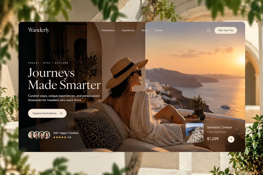
Created a premium travel website concept for Wanderly, combining cinematic imagery with an editorial-style digital experience.
The goal was to make the website feel less like a typical travel booking platform and more like a luxury travel magazine you can interact with.
What I focused on:
• Premium travel brand direction
• Cinematic hero experience
• Editorial typography
• Destination and experience cards
• Strong visual storytelling
• Clear booking-focused CTA
• Social proof and traveler ratings
• Responsive web layout
• Luxury hospitality-inspired UI
The design uses warm neutrals, deep shadows, soft typography, and immersive imagery to create a sense of escape before the user even starts planning the trip.
Designed with a strong Figma + Framer-style approach, focusing on visual hierarchy, interaction, and conversion.
#WebDesign #TravelDesign #Figma #Framer #UIUX #LandingPage #LuxuryTravel #BrandDesign #WebDesignInspiration #Contra



Elegance hero

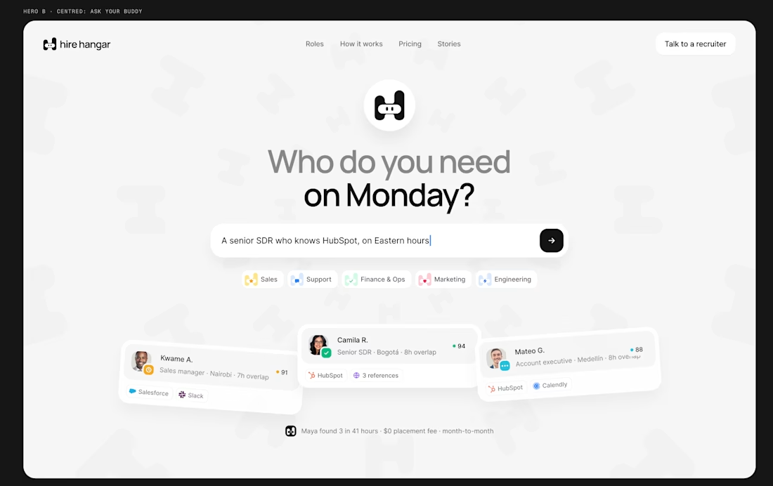
A good landing page shouldn’t make you work to understand it.
Been working on a new project where the goal was simple:
Make a complex product feel simple, clear, and easy to explore.
Less explaining. Less clutter. More visual hierarchy. A clearer path to the next step.
Still working through the details, but this one is coming together nicely.
Full case study soon.
This pairs well with the Hire Hangar screenshot because the design itself demonstrates the point—you don't need to reveal the whole project yet.



This is nice 👌

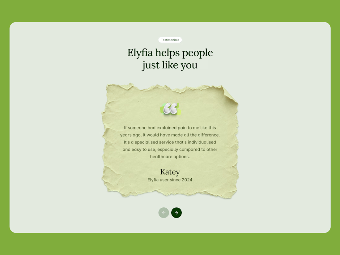
I like this section because it is minimal and clean.