The network for creativity
Join 1.25M professional creatives like you
Connect with clients, get discovered, and run your business 100% commission-free
Creatives on Contra have earned over $150M and we are just getting started
Back to feedPost

Damn, I probably should’ve submitted this product video as part of the Flora challenge too. I think it might’ve had a bit more impact.
Since I’d already made it anyway, here it is for those who enjoy this kind of thing! :)

A vision of 2100 where the future meets the past.
In an era of extreme technological evolution, humanity rediscovers the beauty of craftsmanship, natural...
The network for creativity
Join 1.25M professional creatives like you
Connect with clients, get discovered, and run your business 100% commission-free
Creatives on Contra have earned over $150M and we are just getting started
Challenges
View all


Related posts

What should a platform for tokenized private equity look like?
Probably not like another traditional bank.
For ICME, the client wanted a visual direction that felt modern, disruptive, and native to a new kind of financial market.
The challenge was finding the balance: make the experience bold enough to feel different, while keeping a complex product understandable and credible.
I developed a digital-brutalist direction with retrofuturist touches - oversized typography, hard contrast, pixel textures, raw layouts, blue gradients, and controlled motion.
I worked with Arash Attar and the ICME team across the landing page and parts of the wider product interface. This video focuses specifically on the landing-page experience.
The goal was to:
— Explain tokenized private-company equity more clearly
— Create a memorable visual identity for the product
— Speak to both investors and founders
— Make financial technology feel ambitious rather than conventional
Would this visual direction make you want to explore the product - or should financial platforms feel more restrained?


This is amazing, man.
Good job!

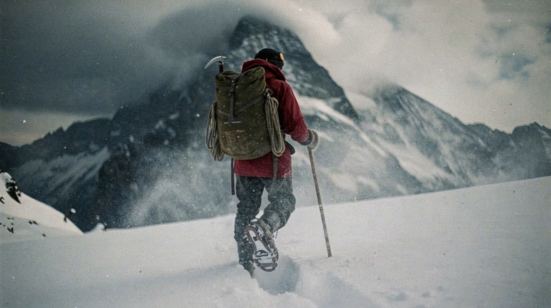
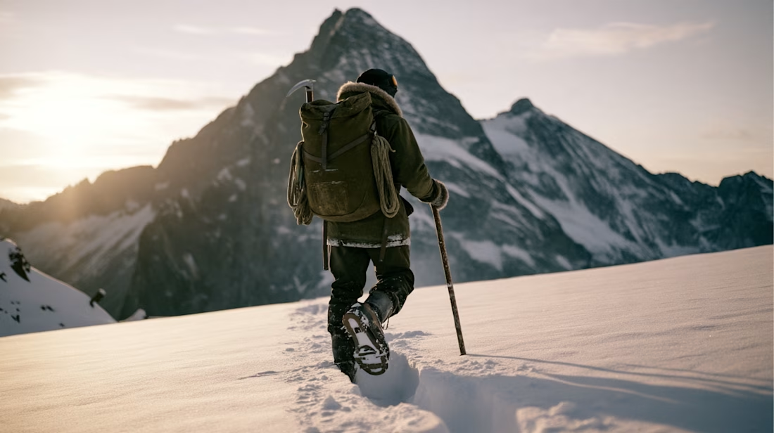
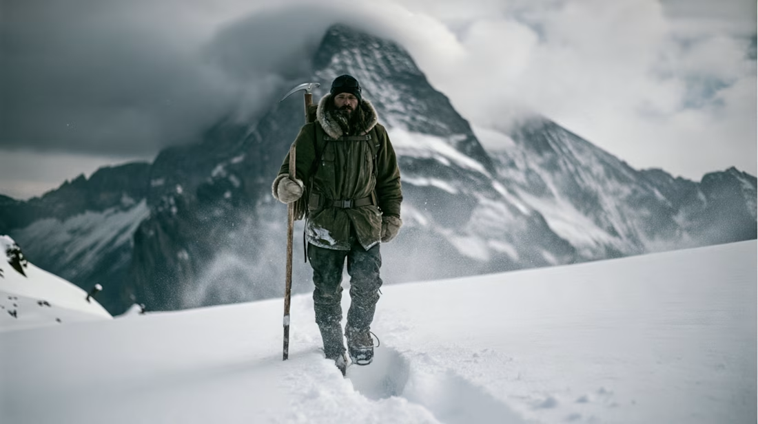
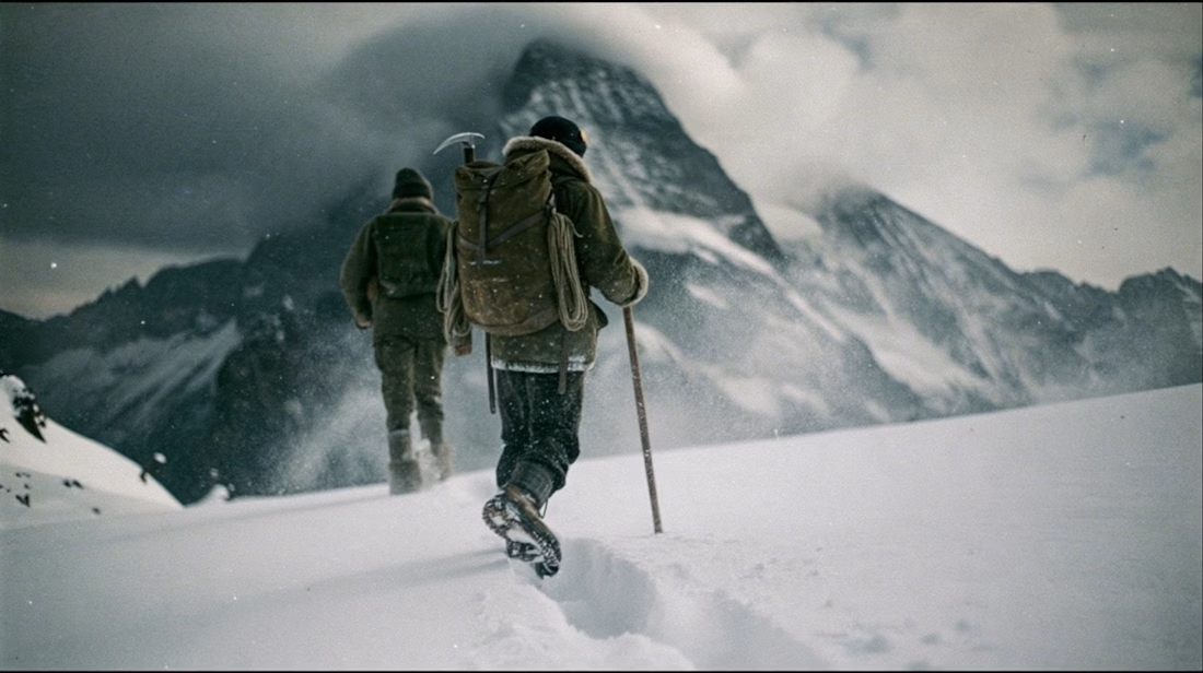
What happens when you take a hero frame from an AI-generated video and push it back into an image edit model?
This weekend I took a still from a recent Seedance 2.5 piece I made —depicting a solo mountaineer in a harsh alpine environment — and ran it through Midjourney's new v8.2 edit model to see how far I could iterate on a single frame without regenerating from scratch.
Tested wardrobe swaps, environment shifts, and style transfers.
Video walkthrough of the process coming in a separate post.


This looks cool

Today we want to share the results of the animation exploration for the Greeney website that I made yesterday.
Featuring smooth animations in each element to add to the beauty of a design.


Amazing!


