The network for creativity
Join 1.25M professional creatives like you
Connect with clients, get discovered, and run your business 100% commission-free
Creatives on Contra have earned over $150M and we are just getting started
Back to feedPost

Handmade Logos. Built From Scratch.
No templates. No shortcuts. No AI fills.
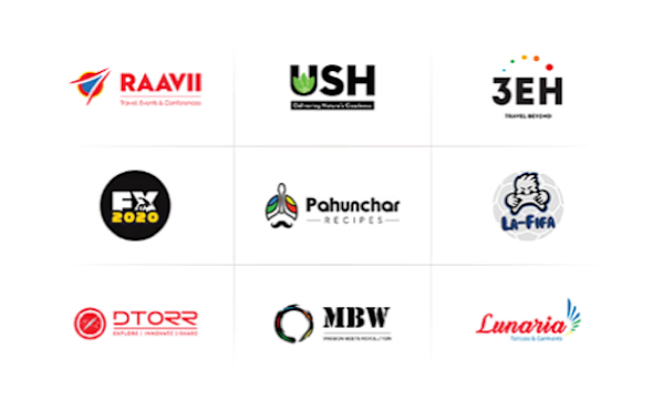
Nine logos across nine industries — travel, food, tech, consulting, gaming, trading, streetwear, fashion, and sustainable retail. Every mark hand-drawn, ink on paper, then refined into clean print-ready vectors.
A compass wordmark for travel. A stamp-style emblem for food. A circuit-sketch for tech. A copperplate crest for consulting. A pixel-art shield for gaming. A candlestick mark for trading. A brush-stroke lockup for streetwear. Calligraphy for fashion. A co-op stamp for sustainable retail.
Nine industries. Nine visual languages. One standard of craft.
Built for founders who want a logo that means something.

The network for creativity
Join 1.25M professional creatives like you
Connect with clients, get discovered, and run your business 100% commission-free
Creatives on Contra have earned over $150M and we are just getting started

Challenges
View all


Related posts


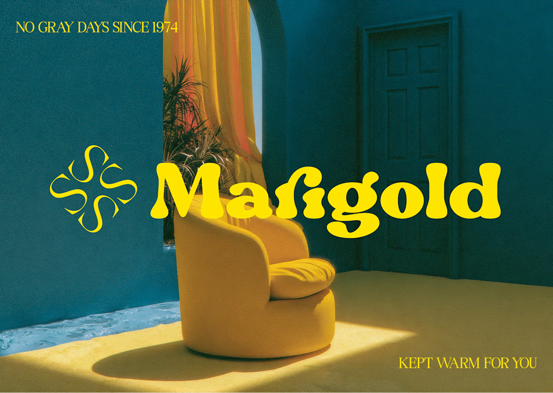
Marigold is a one day concept for envato's human by design challenge. i set the direction in real photography first then generated against that standard.

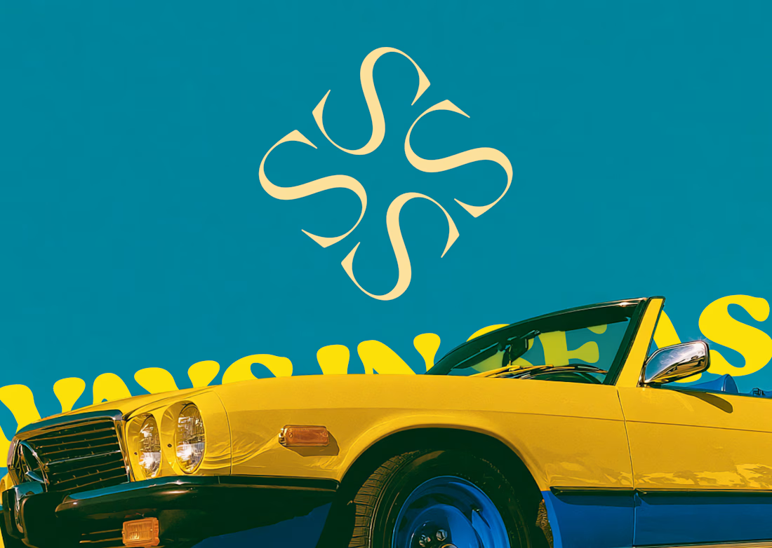
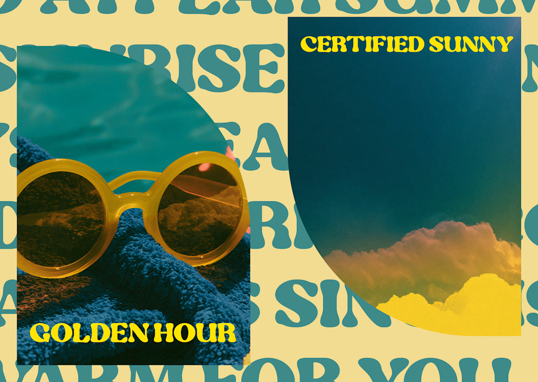

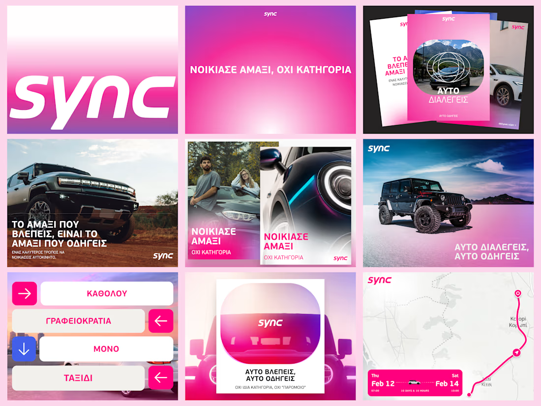
A few more pieces from my work on Sync’s identity.
The idea was to give this Greek car rental brand enough polish to sit next to the big names, with a personality of its own.
The pink was already there. I gave it more space and paired it with bold Greek typography and a frame inspired by a car’s side mirror.
Here’s a closer look at how it works across the layouts.

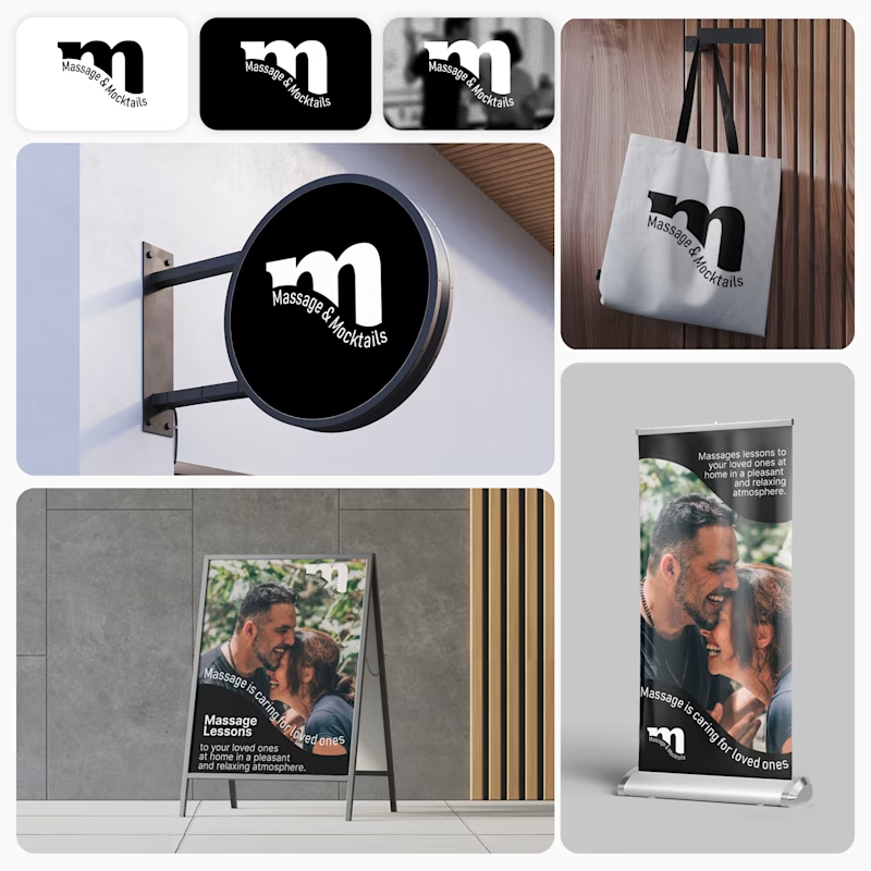
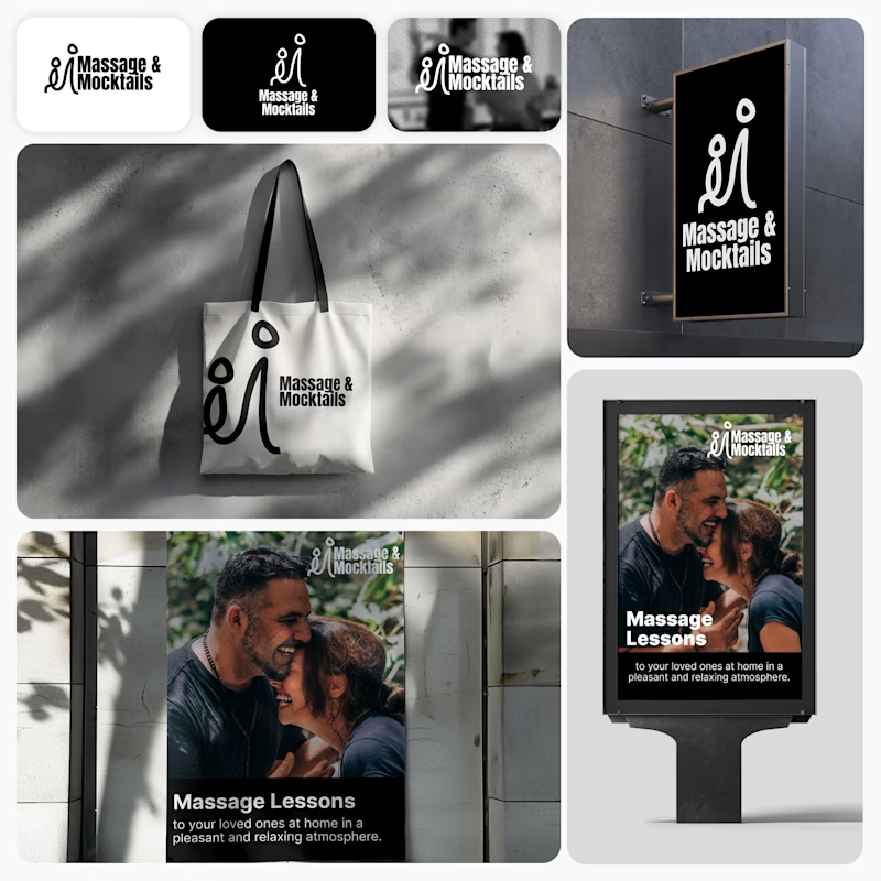
Client’s choice vs. Designer’s choice 👀
I’m currently working on a branding project for Massage & Mocktails — a concept built around couples learning massage together in a relaxed, social atmosphere.
These are two early, black & white directions from Stage 2 of my branding process, before moving into color, typography, and the full visual system.
The interesting part?
My client chose Concept 1. I chose Concept 2.
Now I’m curious what other creatives think.
Which direction would you choose — 1 or 2? And why?
Sometimes the most interesting part of branding is seeing how differently a client and a designer respond to the same brief.
21 voted
44%
27 voted
56%
48 votes
Closed

Concept 2 for me. That interlocking figure mark reads as two people meeting, which is the actual brief here, so it gives you more to build a system on. Concept 1 is the safer, more literal pick, which is usually why clients reach for it.