The network for creativity
Join 1.25M professional creatives like you
Connect with clients, get discovered, and run your business 100% commission-free
Creatives on Contra have earned over $150M and we are just getting started
Back to feedPost

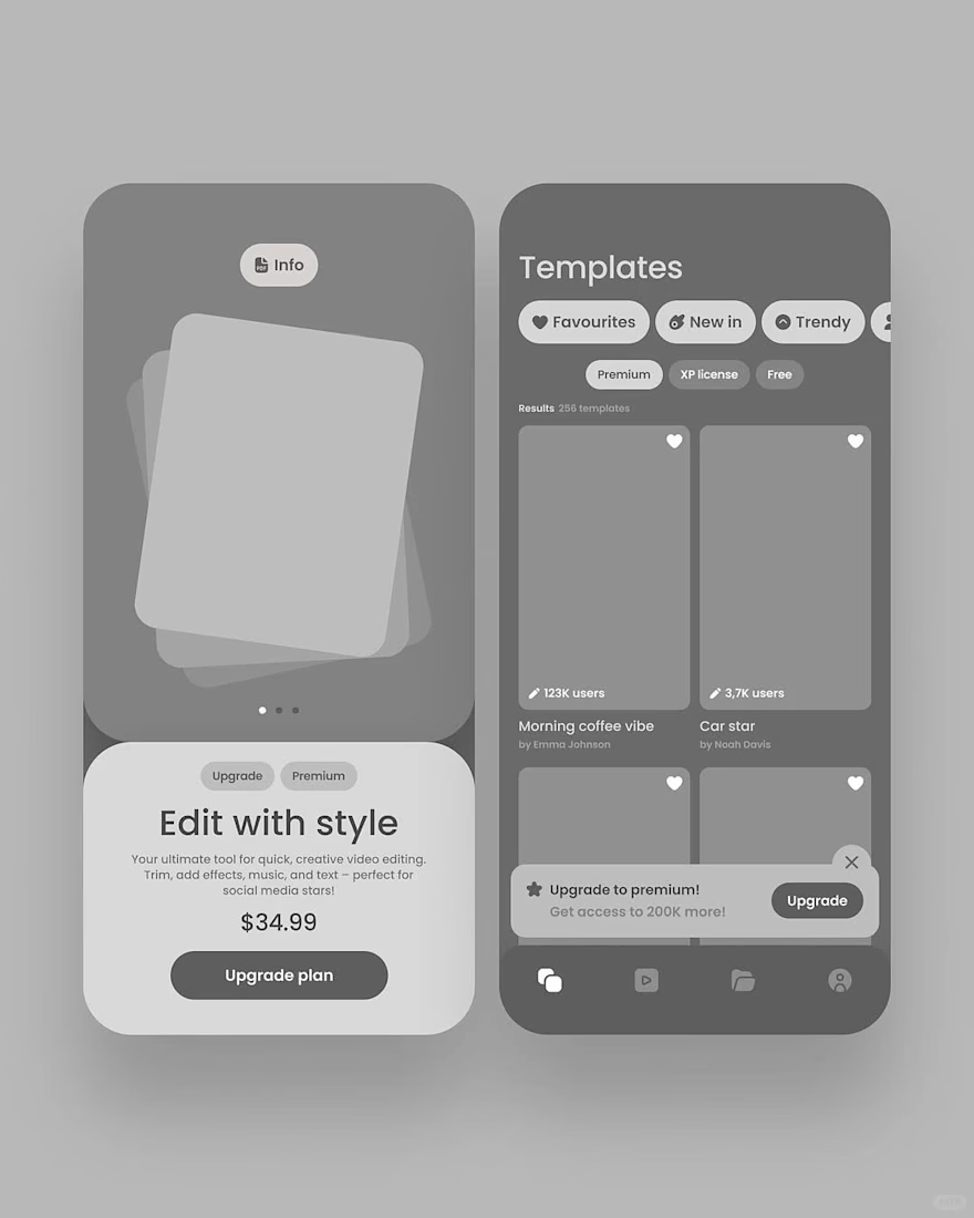
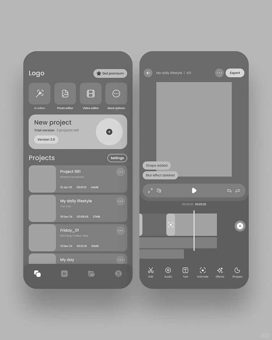
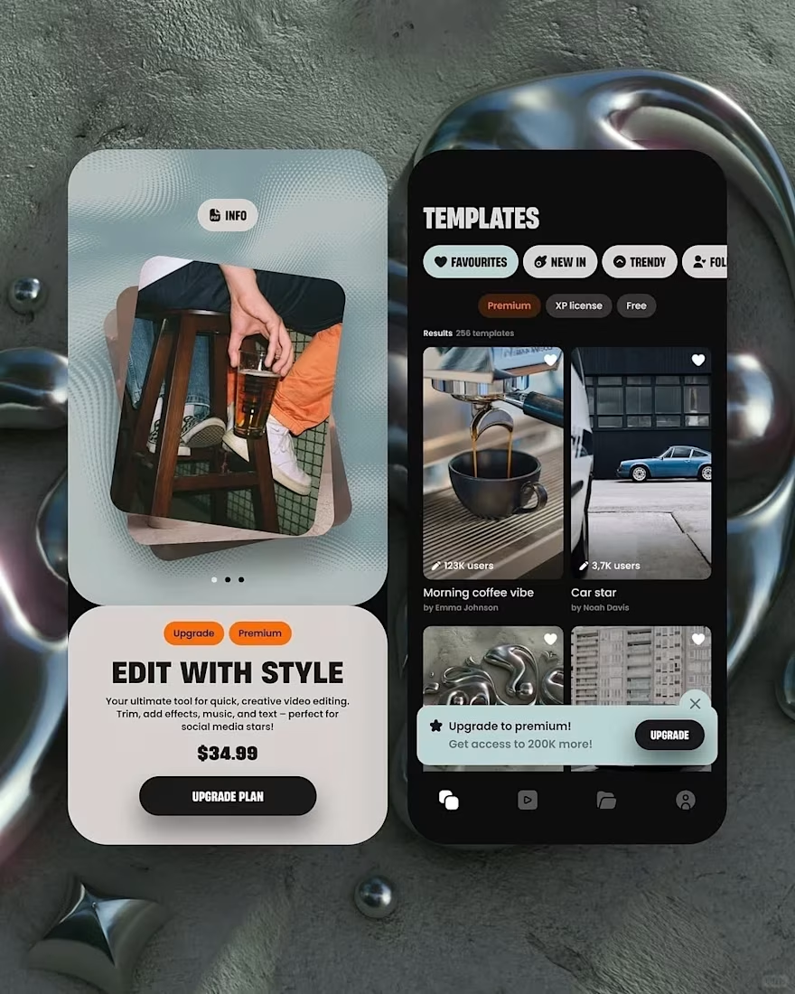
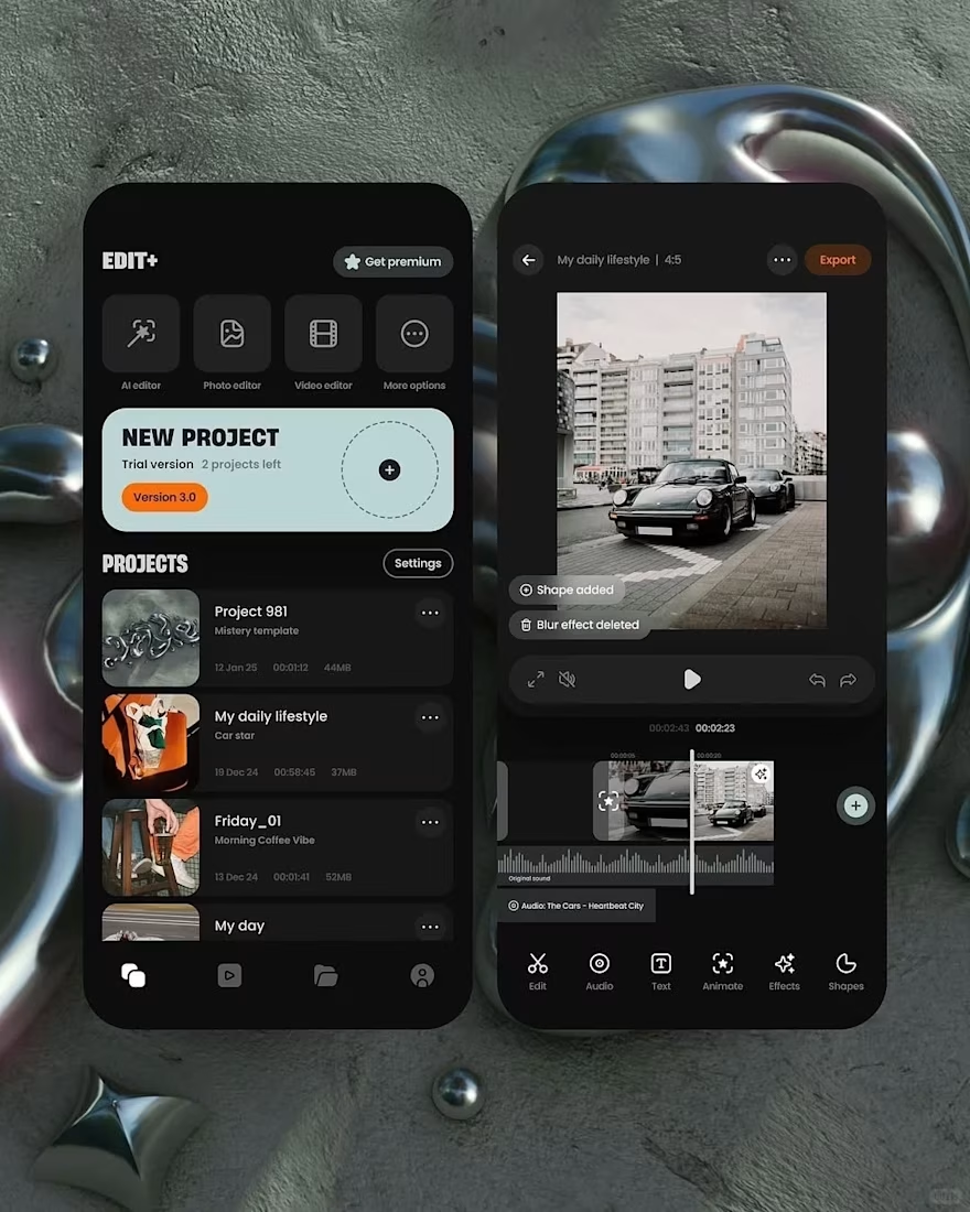
The jump from dull UX wireframe to polished UI happens through four key upgrades:
1️⃣ Structure stays, visuals evolve
UX defines layout and flow (where things go, how users navigate). This “skeleton” doesn’t change.
2️⃣ Color brings mood and hierarchy
UI replaces gray with a purposeful palette (e.g., dark background for media apps, accent colors for actions), instantly making it feel finished and professional.
3️⃣ Real content replaces placeholders
Blank boxes become photos, thumbnails, textures, and branded graphics—adding atmosphere and context.
4️⃣ Micro-details add desirability
Shadows, rounded corners, gradients, icons, and rich states (waveforms, highlights, hover/active cues) make elements tactile and inviting.


The network for creativity
Join 1.25M professional creatives like you
Connect with clients, get discovered, and run your business 100% commission-free
Creatives on Contra have earned over $150M and we are just getting started
Trending
retrofuturism
Share your favorite designs from the past exploring the distant future. Or your own take on the aesthetic 🚀
halftone
Dots. Texture. Grain. Let's see your designs using the halftone technique.

Midjourney
Creatives are showing off what they're making with Midjourney.
colorgrade
Video editors sound off: How do you enhance the mood of your video in color grading?
Related posts


The best outcome for me is when a project grows into a long-term product partnership.
We’ve been working with CleverShares for around six months now. The product keeps evolving, attracting investment, and opening up new opportunities and growth challenges for us to solve together.
For me, that’s one of the strongest signs of good work: not simply completing a design phase, but creating enough value that the client wants to keep building the product with you.
And we’re continuing 🚀
Want to grow your app’s revenue — or make the product stronger for your next investment round?
Book a strategy session with me:
https://calendly.com/asol_design/book-diagnostic-call-linkedin-clone




six months in and still growing, that's the goal


Some lovely thoughts to concept brand motion design for
phantom .Hope u like them!🧸