The network for creativity
Join 1.25M professional creatives like you
Connect with clients, get discovered, and run your business 100% commission-free
Creatives on Contra have earned over $150M and we are just getting started
Back to feedPost
Renesans is an early music ensemble founded in 1969, with decades of concerts, recordings, archive material and cultural heritage behind it.
For this project, the main challenge was not just to design a website, but to create a clear digital home for decades of music, performances and archive material.
The goal was to organize the ensemble’s history, concerts, discography, media, gallery and contact information into a bilingual, responsive experience that feels elegant, structured and easy to explore.
Visually, I wanted to keep a sense of heritage without making the website feel outdated. The design combines refined typography, archive-inspired details and a clean layout that supports readability and navigation.
The question I kept coming back to was:
When designing for a cultural project, how much should the visual style preserve the historical feeling, and how much should it move toward a cleaner modern presentation?
I tried to find the balance between both.
Would you go more classic or more modern for a project like this?


Beautiful work. I really like the balance between preserving the ensemble's heritage and creating a clean, modern user experience. The structure feels intuitive, and the bilingual approach makes the archive much more accessible. Great project! 👏

Može ovako, kratko i profesionalno:
Thank you so much, Milos. I really appreciate your thoughtful comment. Preserving the heritage while making the experience clear and accessible was one of the main goals of the project, so it means a lot to hear that it came across. 🙏
The network for creativity
Join 1.25M professional creatives like you
Connect with clients, get discovered, and run your business 100% commission-free
Creatives on Contra have earned over $150M and we are just getting started











Related posts

Pulse Athletics... Branding & App design✨
Check it out
#app #sport #productdesign #uiuxdesign #uidesigner #uxdesigner #pulse #branding #brandidentity #brandstrategy #brandguidelines #logo #homepage


That's really stunning app design🔥🔥🔥
Great job Ziva🎉🎉🎉

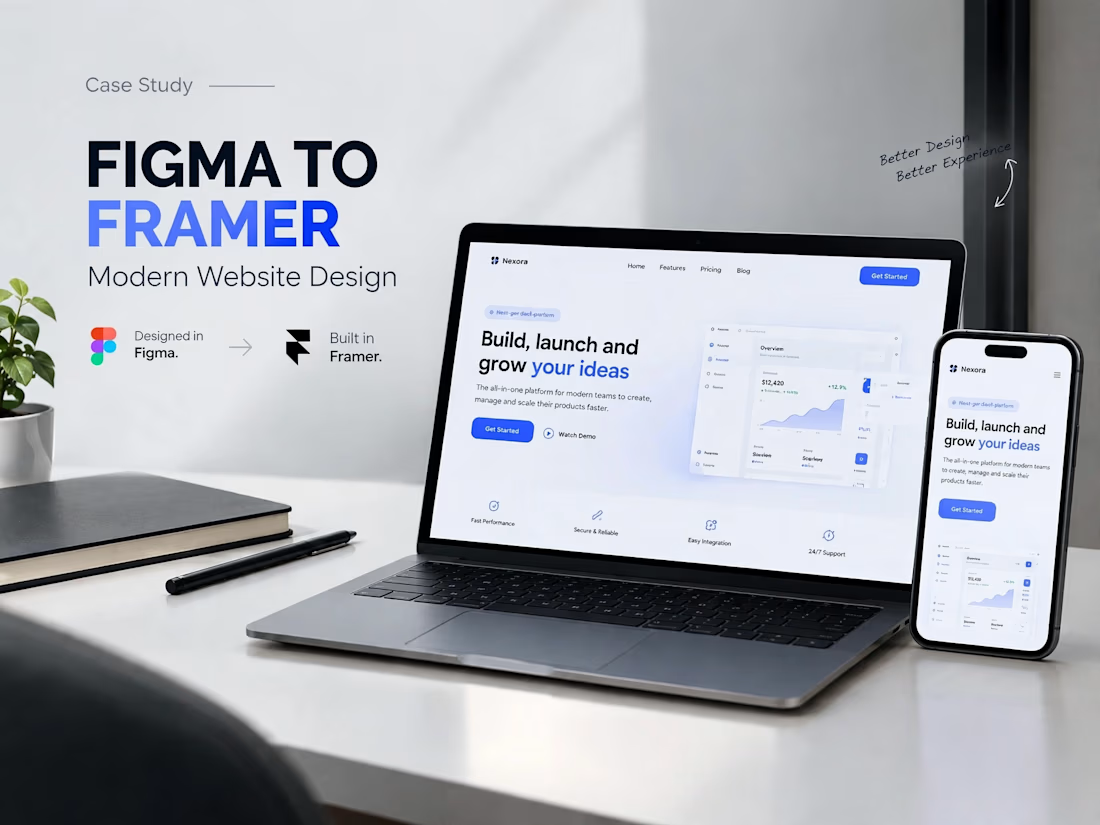
A modern SaaS website concept designed in Figma, featuring clean layouts, intuitive navigation, consistent visuals, and a user-friendly experience across different screen sizes.


Today I’m sharing something a bit different from packaging. This is the brand identity I designed for ALVA Industries, a Norwegian company developing electric motor technology.
I wanted it to feel modern and clear, but not too cold or impersonal. It’s a technical field, of course, but I think there’s still room for some character.
What do you think?
Incredible branding kit 🔥🔥🔥🔥
Great job Roberto❤️❤️