The network for creativity
Join 1.25M professional creatives like you
Connect with clients, get discovered, and run your business 100% commission-free
Creatives on Contra have earned over $150M and we are just getting started
Back to feedPost
While many competitors lean into nightlife, energy, and bold metallic aesthetics, I started with a different mood: the candid photos people take when they're genuinely having a good time with friends. The blurry snapshots from beach days, pub nights, and spontaneous plans that feel imperfect, relaxed, and authentic.
That idea became the foundation for the visual direction.
I used ingredient photography treated with a lino-print effect to give each flavour its own texture and character while creating a distinctive visual system across the range.
Clean, contemporary typography balances the expressive imagery, while a vibrant green accent helps the bottles stand out on shelf and reinforces the brand's fresh, easygoing personality.
The result is a simple, modern packaging system designed for laid-back moments shared with friends.


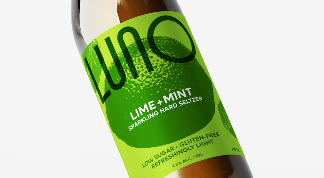

Starting from candid snapshots instead of the category's metallic nightlife look is a smart way to stand apart on shelf. The lino-print ingredient treatment keeps each flavour readable without falling into glossy fruit photography. Have you tested how the flavour cue holds up as...

The goal was for the ingredient and the green accent to stand out and for the people to pick the bottle on the shelf or on the thumbnail. If this is what you think then it is working out!! 🙌
The network for creativity
Join 1.25M professional creatives like you
Connect with clients, get discovered, and run your business 100% commission-free
Creatives on Contra have earned over $150M and we are just getting started



Related posts



Great branding kit Alex 🎉🎉

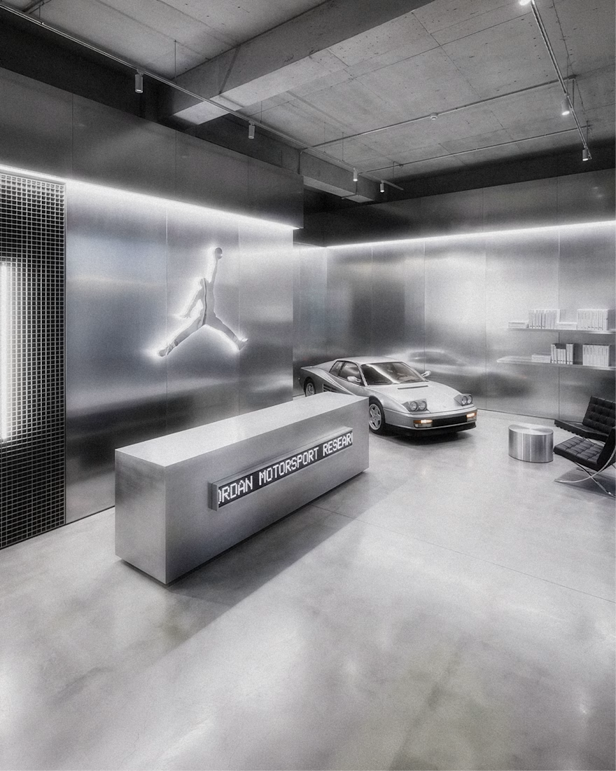
Jordan Racing concept.
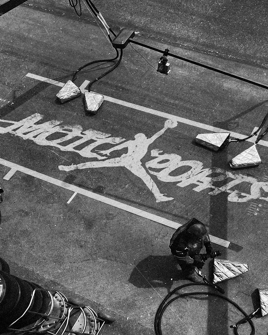
What if Jordan Brand launched its own racing team? We imagined the full launch, from the Speed Demon campaign and posters to a telemetry inspired website, racing streetwear and a flagship research facility. Basketball heritage meets Formula 1 speed.
Designed by Studio /03
Concept project, not affiliated with Nike or Jordan Brand.
Art Direction, Brand Identity, Campaign Design, Web Design, Poster Design, Apparel Graphics, Motorsport, Concept

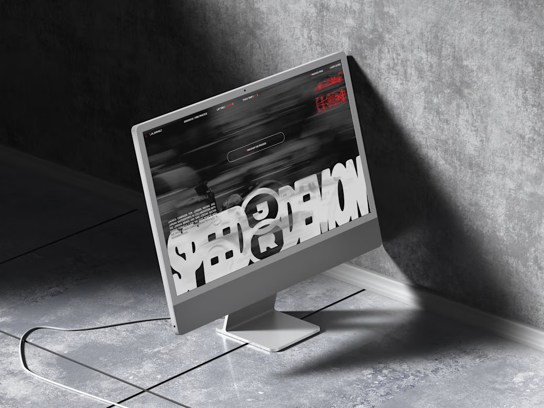
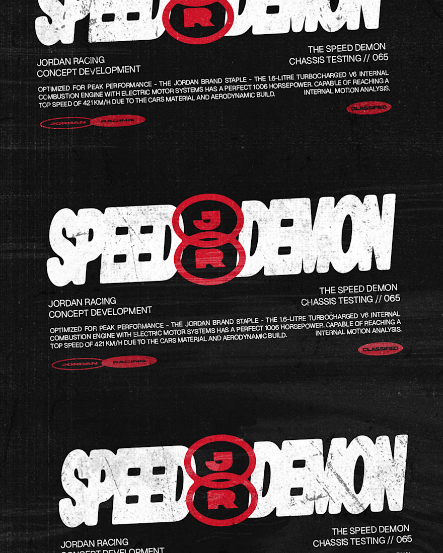

The grayscale with that one red accent keeps the whole system tight. Telemetry style site is a smart touch.


A logo reveal created in Blender, where simple geometric shapes come together to form the Geisleris Studio identity.


Nice