The network for creativity
Join 1.25M professional creatives like you
Connect with clients, get discovered, and run your business 100% commission-free
Creatives on Contra have earned over $150M and we are just getting started
Back to feedPost

🚀 Excited to submit my entry for the #MeliusChallenge on Contra!
For this build, I focused on creating a clean, modern, and visually engaging experience that blends strong design, usability, and creativity.
My approach centered on:
✨ Clean UI & Modern Layout
✨ Smooth User Experience
✨ Strong Visual Hierarchy
✨ Conversion Focused Design
✨ Attention to Detail
Designed to be simple, impactful, and memorable.
Feedback and connections are always welcome!
#MeliusChallenge #Contra #WebDesign #UIDesign #UIUX #Creative #Freelancer

The network for creativity
Join 1.25M professional creatives like you
Connect with clients, get discovered, and run your business 100% commission-free
Creatives on Contra have earned over $150M and we are just getting started





Related posts

Should I go for left or right? Focusing on updating and finishing up my portfolio... and then I came across this crossroads. Another alternative is to make them switchable themes through a toggle, but I still need to decide which should be the default.

27 voted
75%
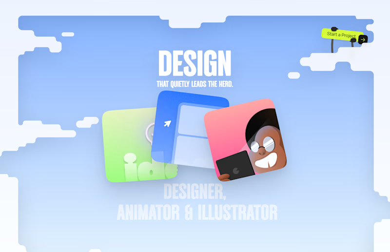
9 voted
25%
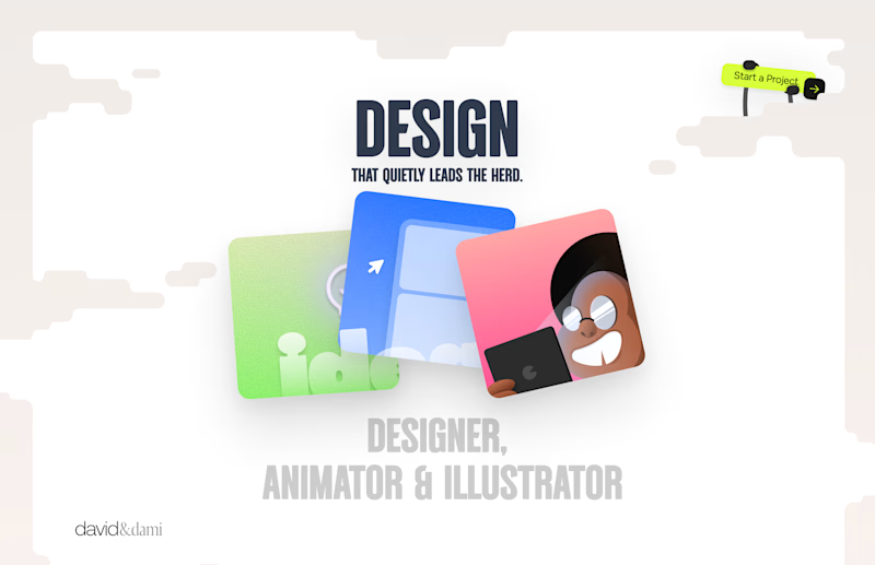
36 votes
Closed

Left is better because the text is readable, the overall blue background is not flashing to the eyes as compared to the right one.
For the top right button " Start a project ", you can add some animation so that it stands out and encourage users to click on it.

Wellness shouldn’t feel like another task on your to do list.
Elixra turns breathing, sleep, and mindful routines into an immersive digital experience through cinematic visuals, soft interactions, and rewarding micro moments.
What if wellness felt like this?


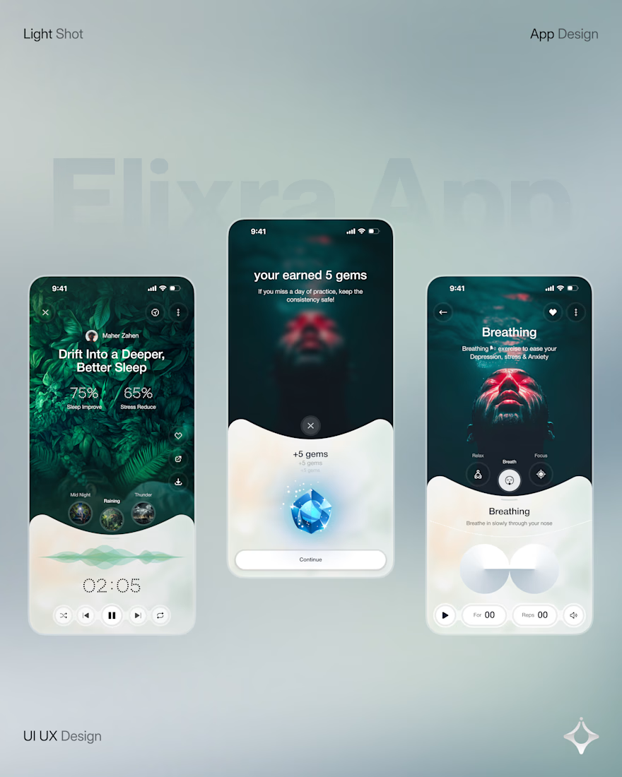
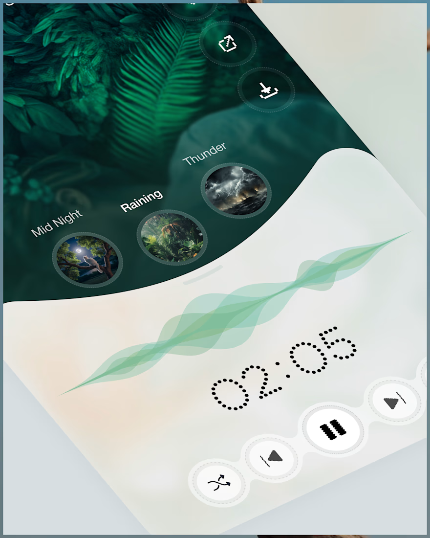
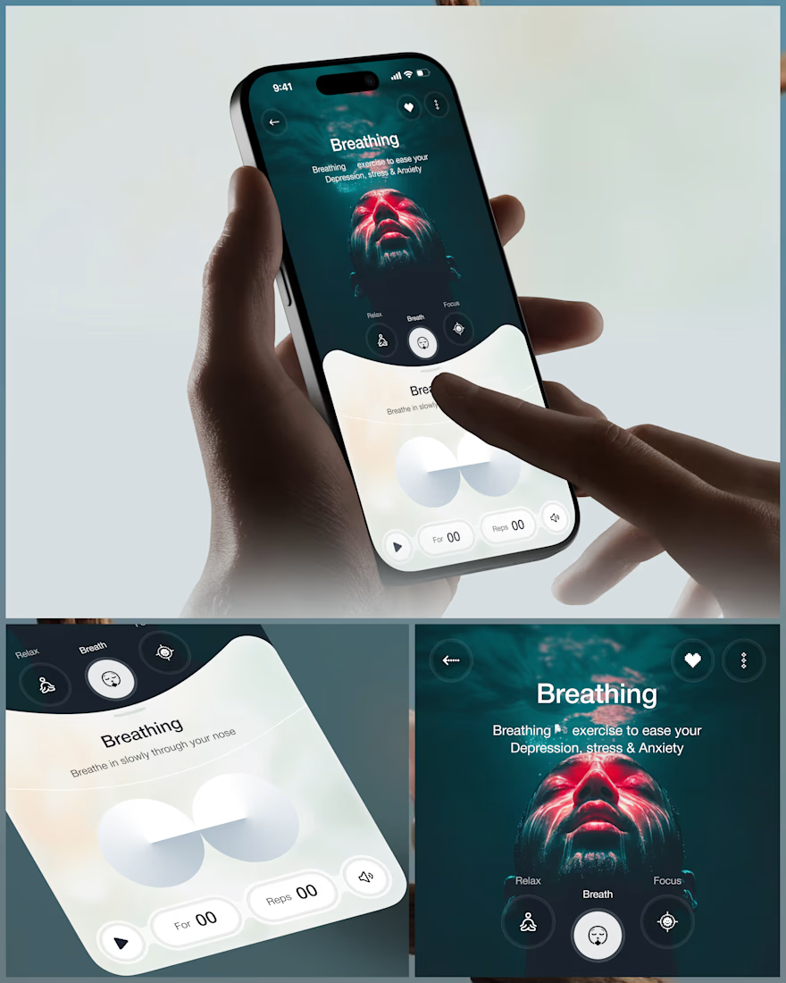
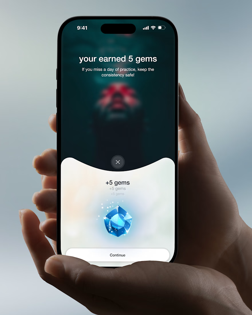

Love the soft interactions and micro moments idea. The cinematic approach makes wellness feel calm, not clinical.

i'm happy to share it that; The Contra Curation team featured me (my Invideo Submission) on the Contra new homepage.
if you would want to know why i was featured, check out the quoted post below 👇
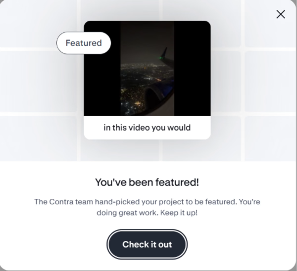

in this video you would see that, i created a video effect i call "Staggered Splice" using the Invideo AI editing agent (Agent Two).
a horizontal and vertical...