The network for creativity
Join 1.25M professional creatives like you
Connect with clients, get discovered, and run your business 100% commission-free
Creatives on Contra have earned over $150M and we are just getting started
Back to feedPost

Smart Fumigation
Project Overview
Developed a professional website for Smart Fumigation, a pest control company serving Karachi.
My Contribution
Website design and development
Clear presentation of pest control services
Responsive design and user-friendly navigation
SEO and digital marketing support
Project Goal
Build customer trust, make pest control services easy to explore, and support the company’s online visibility and lead-generation efforts.
Search Engine OptimizationSocial Media MarketingWordPress DevelopmentGoogle AnalyticsRank MathWordPress



The network for creativity
Join 1.25M professional creatives like you
Connect with clients, get discovered, and run your business 100% commission-free
Creatives on Contra have earned over $150M and we are just getting started











Related posts

Designing a fragrance website with 2 sections that feels as premium as the product.
Built a fragrance experience where the product takes center stage.
I wanted the website to feel as refined as the fragrances themselves minimal layout, strong typography, immersive product visuals, and subtle interactions that make exploring each scent feel premium.
The goal wasn’t to fill the page with elements, but to give every product enough space to create its own presence.
Built with Next.js, with a focus on responsive design, smooth interactions, and a polished browsing experience.


The product imagery is doing most of the work here. Did you use art-directed mobile crops, or keep one image with a different object position? That can preserve label detail without loading the full desktop asset.

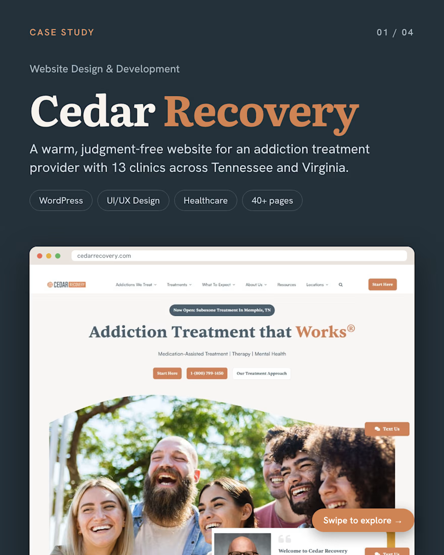
Most people looking for addiction treatment are scared, ashamed or in crisis.
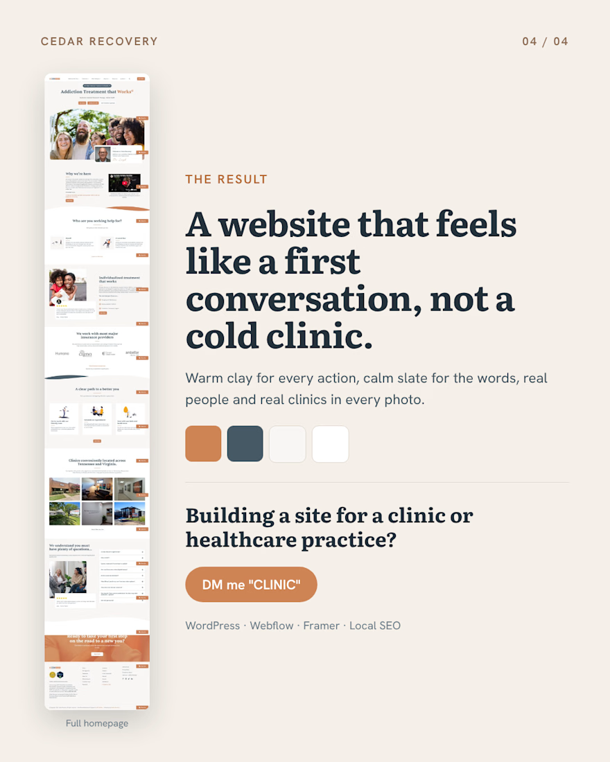
For Cedar Recovery, an addiction treatment provider with 13 clinics across Tennessee and Virginia, we designed and developed a custom WordPress website with one goal: make the first step feel safe.
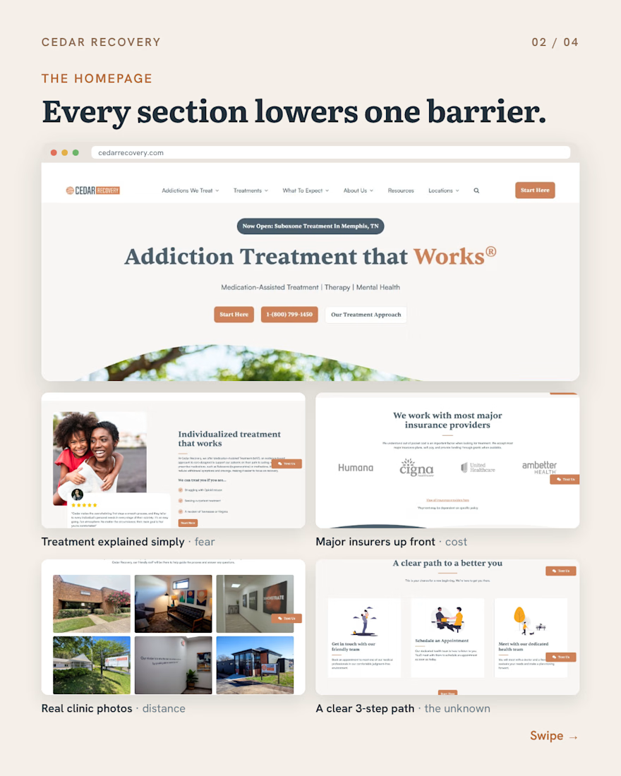
Each section removes one barrier:
→ Fear: treatment in plain words, real patient stories
→ Cost: insurers and payment options up front
→ Distance: real clinic photos and a page for every location
→ The unknown: a clear 3-step path to the first appointment
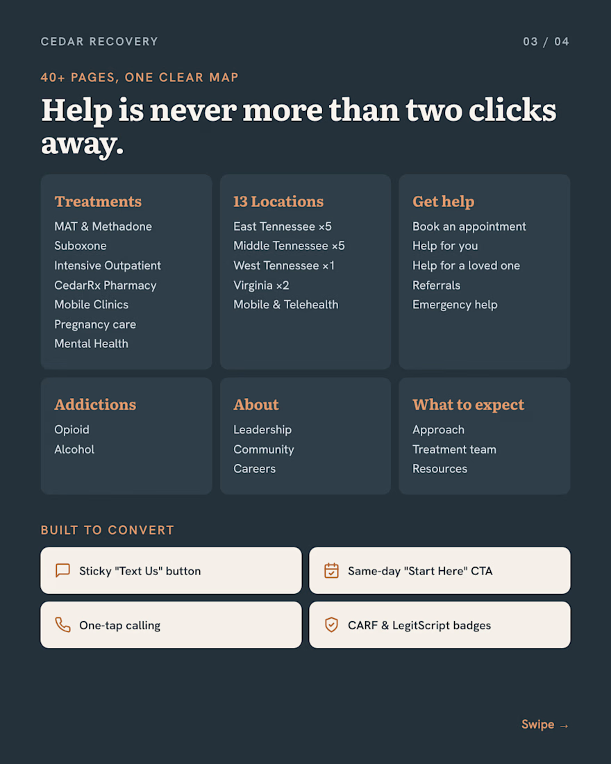
What we did: UX strategy, UI design and a full WordPress build of 40+ pages, with “Text Us” and “Start Here” on every screen so help is always one tap away.
🔗 See it live: https://www.cedarrecovery.com
Swipe to see it 👉

"make the first step feel safe" is a really thoughtful goal for a treatment site, and text us on every screen fits it. how did you end up working with cedar recovery, did they find you or did you reach out?


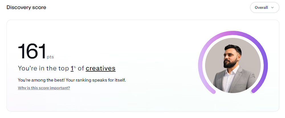
Made it to the top 1% on a random Monday. But to be fair, it took countless hardworking Mondays to get here. Forever grateful for the journey, the effort, and everything in between.
Next goal: Breaking past 175. 🚀


Congrats man