The network for creativity
Join 1.25M professional creatives like you
Connect with clients, get discovered, and run your business 100% commission-free
Creatives on Contra have earned over $150M and we are just getting started
Back to feedPost

Clinora — Rethinking the Healthcare Dashboard Experience
How can complex health information feel simpler, clearer, and more engaging?
Introducing Clinora, a healthcare dashboard UI concept focused on presenting health metrics through a clean, organized, and visually engaging interface.
Design highlights
• Health monitoring dashboard with organized metric cards
• Heart rate, blood pressure, and blood sugar indicators
• Prescription reminders and consultation scheduling
• 3D anatomical visuals to create a more engaging experience
• Soft blue tones, clear information hierarchy, and consistent UI component.
My goal with this concept was to explore how thoughtful UI/UX design can make health information easier to navigate while maintaining a modern, approachable visual language.
What would you improve first in this dashboard: information hierarchy, data visualization, or navigation?
#Ui design #Ux design #Healthcare design #Dashboard design #Product design #Figma


This is amazing

Looks clean!
The network for creativity
Join 1.25M professional creatives like you
Connect with clients, get discovered, and run your business 100% commission-free
Creatives on Contra have earned over $150M and we are just getting started
Related posts

I saw the Base44 challenge and thought: what if I built an actual app?
I've built plenty of websites, and my workflow there is pretty well established. But building an app entirely on my own, as a designer? I've never done anything even close to that. So naturally, I wanted to try.
And I already had an idea I'd been putting off for a while.
About a year and a half ago, I became a mom, and one of the things that drove me absolutely crazy was introducing solids. The information was scattered across dozens of sources, recommendations were confusing, and I ended up putting together my own plan piece by piece. And then trying to keep all of it in my head. Not exactly what you need when you're already sleep-deprived.
That's where the idea for Tastimi, a gentle guide to your baby's first foods, came from.
So I got to work. Designed the screens, created the logo, thought through the user flows, and got a little carried away, as usual.
Then I looked at the calendar and realized that even with AI assistants and all their superpowers, building an entire native app in a few days was a bit too ambitious.
Well, what do we do when there's not enough time?
🚀 MVP, of course.
I already had the designs, so I decided to turn them into an interactive website using Base44. Something that could introduce the product, give parents actual value, and help me test the idea before investing months into development.
So here's what I managed to build:
1. Design: Custom branding, illustrations, real app screens, and a fully responsive, mobile-first website. Everything is based on my original app designs.
2. Automatic language detection: The website opens in English or French depending on the visitor's browser settings, with a manual language switch.
3. Interactive quiz: Parents select their baby's age and get a personalized starting-solids plan with food suggestions, practical tips, and things to avoid. The recommendations are curated, not AI-generated. I love AI, but I'd rather not let it improvise when it comes to feeding babies.
4. Waitlist and lead capture: Since the app isn't available yet, visitors can leave their email instead of clicking a download button that leads nowhere. The idea is to start building an audience before the actual launch.
5. Behind the scenes: I've also been working on the signup flow and automation logic, including personalized follow-ups and collecting insights about potential users. Some parts are still a work in progress, but the foundation is there.
I did hit a few limitations with my current Base44 plan, so there's still some setup to finish. But given the deadline, I decided to focus on getting the MVP live and leave the polishing for later.
The business logic is pretty simple: instead of spending months building an app based entirely on my assumptions, I can start validating demand now. Parents get something useful through the quiz, and I get a chance to understand what to build first.
Is it the native app I originally wanted to submit? No. Is everything finished? Also no. But it's a working MVP, and honestly, I'm pretty happy with how much I managed to get done.
So here I am, jumping into the Base44 challenge literally in its last hours. Better late than never, I guess 😅
Here's Tastimi: https://tastimi.base44.app
Would love to hear what you think!
#Base44 #ProductDesign #BuildInPublic #MVP #NoCode


Unbelievable 😍

Section, a matcha shop that runs itself
The problem A lot of matcha brands skip the story. You buy a tin and never learn where the leaf grew, how it was shaded or how it was ground. And the instructions come as a little booklet in the box that ends up in a drawer by the second bowl.
The idea Tell the story on the website, and move the instructions there too. Section is a concept matcha brand: the site follows one leaf from the field to your bowl, then sells one box with the matcha and the five tools a barista uses. There's no booklet in the box. The guide lives on the site: every part lettered A to F, four drinks, each step read aloud, and pages that turn by themselves while your hands are busy. Live: pure-section-space.base44.app
Automation depth Behind the counter, the shop runs itself:
Saves time: an order lands on the packing board the moment it's placed, with where it ships. Nobody copies orders out of an inbox.
Improves operations: stock counts itself. Every order takes its items off the shelf (a box takes one of each part). At 3 left the shop says "Only 3 left" and I get an email. At zero, the item sells out on its own.
Increases leads: a sold-out item offers "Tell me when it's in". That's a list of people who want to buy. When I type a new count, each of them gets one email.
Enhances the customer experience: the buyer gets an email at every step: got it, packed, on its way. The last one links to the guide, so the steps arrive before the box does.
The packing board is mine, behind a sign-in, and addresses are kept where only I can read them.
** It all runs on Base44: its database, Google sign-in, one backend function for the emails, and its hosting. **
Design quality
One idea runs through the whole brand: everything is drawn in one black line, and the only colour is the matcha's green.
The first screen is a small matcha bar. Scroll, and it opens into its own drawing.
The phone layouts are designed, not shrunk. The box, its price and its key stay at the foot of the first screen, and the guide's Back and Next stay under your thumb.
How I built it I tried style directions in Figma, built the site and automation in Base44, and I published from there. The video shows both sides: buying the box, and running the shop.
Real-world use Section is a concept, and no payment is taken. Everything else is built to run as a real shop: real orders, real emails, a locked staff board and private addresses. Add a payment provider, and a matcha brand could start selling with it.

Ohhhhh this is very nice

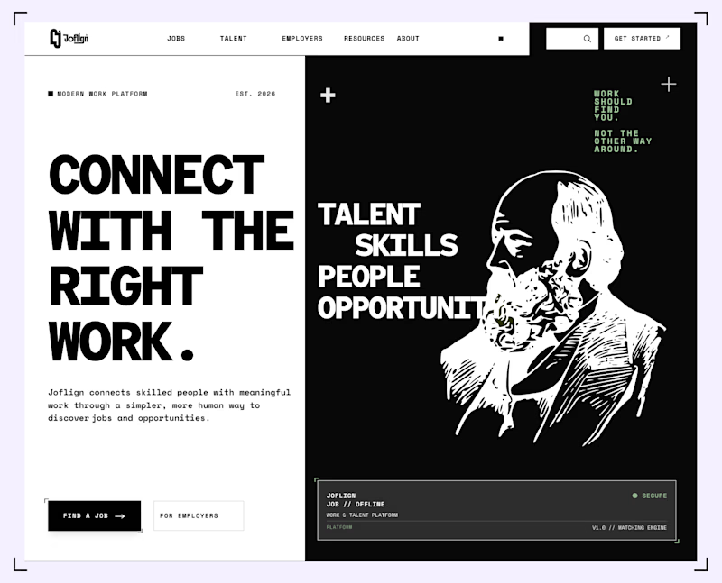
Which hero background works better?
9 voted
75%
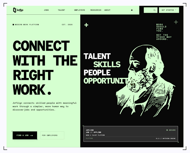
3 voted
25%
12 votes
Closed

I lean light green because it carries through both the copy panel and the illustration, making the two halves feel connected. I’d keep “Find a job” clearly stronger than “For employers” if jobseekers are the main audience. That hierarchy matters more than the background preference alone.