The network for creativity
Join 1.25M professional creatives like you
Connect with clients, get discovered, and run your business 100% commission-free
Creatives on Contra have earned over $150M and we are just getting started
Back to feedPost
Taste Test

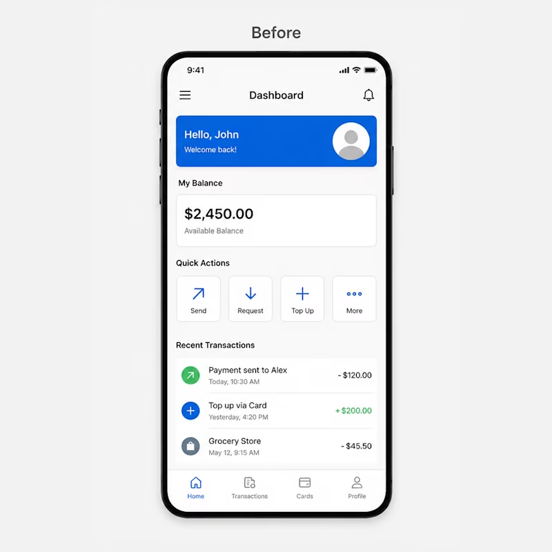
Before vs After 👀
Small UI changes can completely transform the user experience.
Which dashboard design feels more modern and premium to you?
A — Clean & Minimal
B — Modern & Visual
Drop your vote below 👇

13 votes
Ends in 1d

B is better
🔥


The network for creativity
Join 1.25M professional creatives like you
Connect with clients, get discovered, and run your business 100% commission-free
Creatives on Contra have earned over $150M and we are just getting started
Related posts


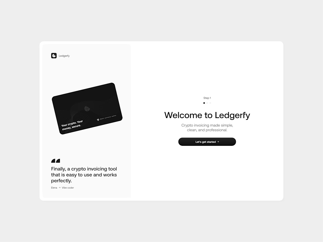

Yes, they're good job bro

More than a year old but still nice imo! The redesign for Chore's website

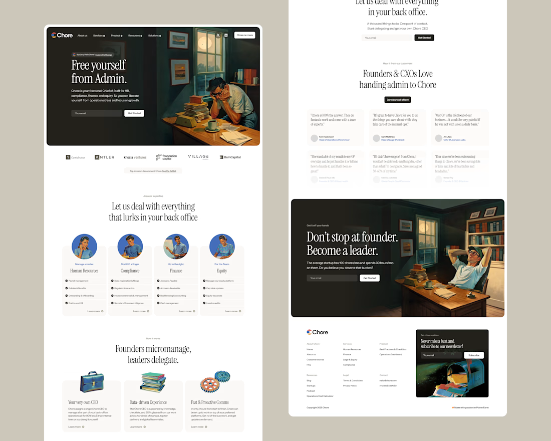

Love this!

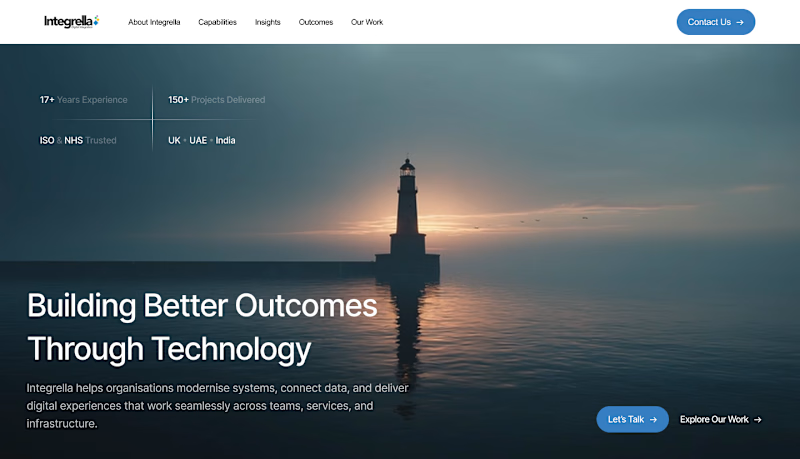
2 hero design directions for the client to explore. Each pushes a completely different visual energy and brand perception. Curious to see which direction resonates more with you.
2 voted
15%

11 voted
85%
13 votes
Closed








Trending

Claude
Claude has entered the design space. How are you using Claude Design?

Contra University
Learn from expert creatives how to earn more using next-gen AI tools.
creativeaiflow
Creative AI workflows are evolving. What tools do you use, and what are their strengths and weaknesses?
portfolioreview
The best portfolios tell a story, not just show a grid. Share yours for feedback.
freelancerlife
Freelancer life is wins, pivots, and everything in between. What’s yours right now?