The network for creativity
Join 1.25M professional creatives like you
Connect with clients, get discovered, and run your business 100% commission-free
Creatives on Contra have earned over $150M and we are just getting started
Back to feedPost
The Synq logo is built around a distinctive geometric “S” symbol, created through clean, precise forms that reflect connection, movement, and technology. The structured geometry gives the mark a modern and intelligent character, while its simplicity keeps it highly recognizable and versatile across digital platforms.
The Synq brand identity is designed to communicate innovation, connectivity, and forward-thinking technology. A minimal visual language, refined typography, and a focused color system create a clean and contemporary presence suitable for a modern tech company. The geometric “S” acts as the core visual element, providing a consistent foundation across digital products, social media, presentations, and other brand touchpoints.


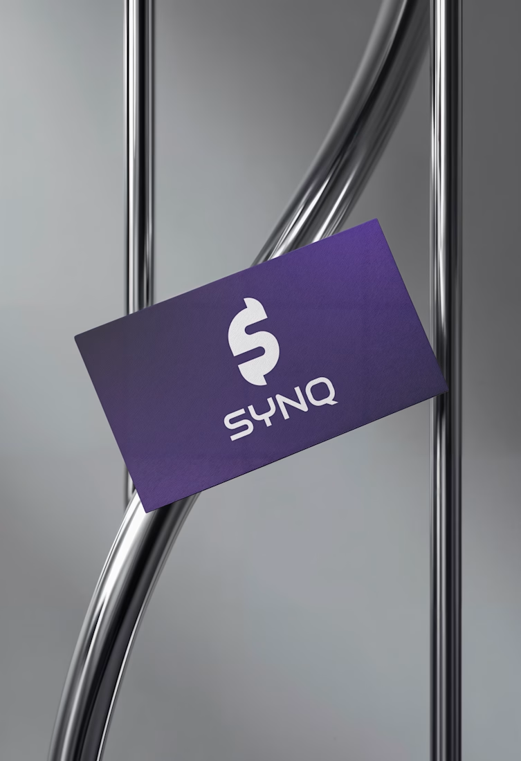

Clean geometry and the purple gradient on the card hold together well. One risk worth testing: the S with a vertical bar through it can read as a dollar sign at small sizes, which sends a very different signal than connection. Try it at favicon size before it ships.


Nice thoughts, Aditya! However, at smaller sizes, the logo will be used below the circle. I’ve already tested it across the complete brand guidelines, and the client is happy with the result.

Nice Concept Umer
Thanks a lot . I appreciate the feedback!

Using a geometric S for a brand named Synq risks immediate visual confusion with existing tech giants. The distinctiveness of the mark will likely depend on how clearly the typography and color system separate it from those familiar shapes.
Thanks for sharing your thoughts. I understand your point about visual similarity. The goal was to create a clean, geometric mark for Synq, while keeping the overall identity distinctive through its typography and color system. I appreciate the feedback!
The network for creativity
Join 1.25M professional creatives like you
Connect with clients, get discovered, and run your business 100% commission-free
Creatives on Contra have earned over $150M and we are just getting started





Related posts

Brand identity work for WesoftAI



Take a vampire, a grim reaper and a bat for a midnight ride through a haunted town. Hold to boost over broken track, brake before the big hills, and grab candy to refill your boost. Push your luck too far and your passengers end up splattered across the screen.


Cute!!

Solene: skincare e commerce website, built in Framer
Skincare shopping should feel as good as the routine itself. For Solene, I designed and built a full online store with a soft, warm identity: a bold maroon and pink palette, big expressive type and real-skin photography.
What's inside:
A hero that sets the brand tone straight away
A Bestsellers section for quick browsing
Category pages for Cleanse, Hydrate and Protect
A shop page with price slider, filters, sorting and hover image previews
An Our Story page with brand values
A clean, confident footer
Need a website for your beauty or lifestyle brand? Let's talk.

The hover image previews on the shop page caught my eye - they let shoppers sense texture instantly without an extra click.