The network for creativity
Join 1.25M professional creatives like you
Connect with clients, get discovered, and run your business 100% commission-free
Creatives on Contra have earned over $150M and we are just getting started
Back to feedPost

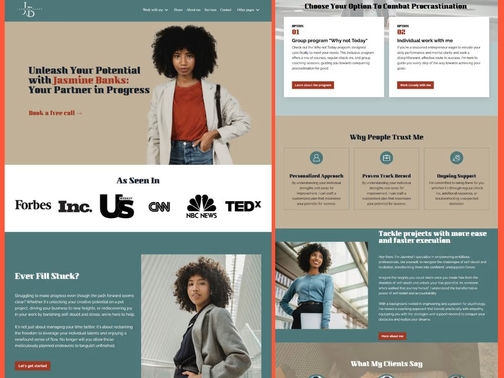
Jasmine Banks: Your Partner in Progress" is a luxury, premium-tier landing page engineered for a high-performance leadership coach specializing in anti-procrastination and career execution. The core challenge of this project was to merge an elegant, minimalist aesthetic with an authoritative corporate layout that commands high-ticket coaching fees.
The design utilizes a sophisticated, earth-toned color palette featuring muted sage greens, warm taupes, and terracotta accents paired with clean editorial typography to build immediate trust and resonate with ambitious professionals and executives.
Key Design & Features
High-Authority Hero Section: Features a compelling, bold headline ("Unleash Your Potential with Jasmine Banks") set against a clean, minimalist backdrop that gives the coach's professional imagery maximum breathing room.
Instant-Trust Media Banner:
Strategically places an "As Seen In" social proof row directly below the fold, featuring high-profile network logos (Forbes, Inc., CNN, NBC, TEDx) to eliminate client skepticism immediately.
Empathy-Driven Problem Section:
A dedicated "Ever Feel Stuck?" block that utilizes high-contrast text on a soothing sage background to directly address target audience pain points and spark emotional alignment.
Binary Option Funnel Architecture:
A clean, grid-based program selector ("Choose Your Option To Combat Procrastination") that separates offerings into two clear paths Group Programs vs. Individual Work streamlining the decision-making process for the user.
Value Proposition Matrix:
A three-column "Why People Trust Me" feature grid highlighting key performance pillars (Personalized Approach, Proven Track Record, and Ongoing Support) using crisp, minimalist iconography.


The network for creativity
Join 1.25M professional creatives like you
Connect with clients, get discovered, and run your business 100% commission-free
Creatives on Contra have earned over $150M and we are just getting started







Related posts

Contact page done with claude from my phone
What a time to be a designer


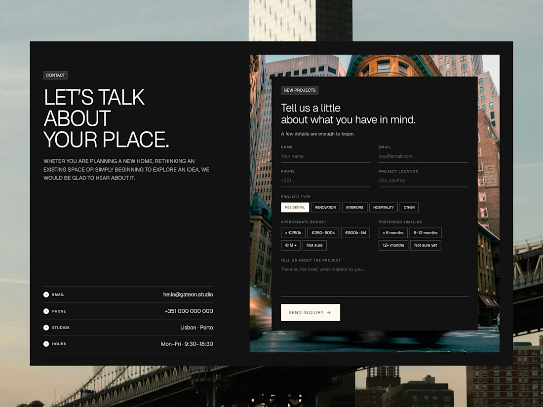

That is amazing and the contact page design looks great.

Hey Contra community! 👋🏻
I'm Poncho, the person behind Kajabi Ninja. I help course creators and online expert businesses with Kajabi websites, funnels, migrations, and all the technical stuff in between.
Been freelancing since 2014, but still fairly new around here. Looking forward to connecting with other independent creatives and specialists! 🤝


Would love to connect and hear more about what you do! What do you specialize in with Kajabi?

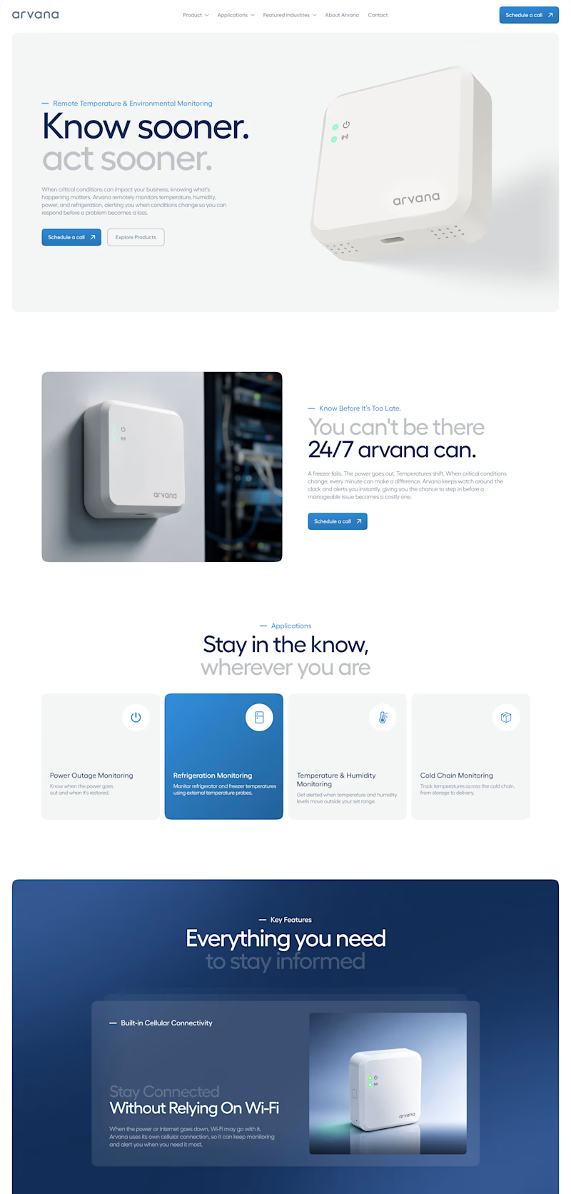
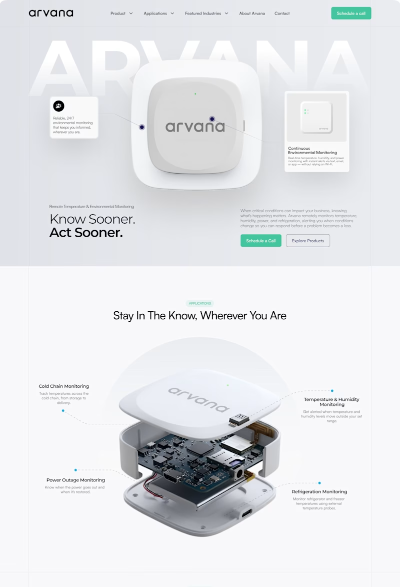
✨ Two website concepts. One brand. Which Arvana design stands out?
I explored two creative directions for Arvana, balancing clean aesthetics with product-focused storytelling and a modern tech feel. 🌐💡
🔵 Option 1: Clean & Corporate 🟢 Option 2: Bold & Interactive
Which direction would you choose? 👀
Cast your vote! 🗳️👇
1 voted
4%
25 voted
96%
26 votes
Closed

I love this design