The network for creativity
Join 1.25M professional creatives like you
Connect with clients, get discovered, and run your business 100% commission-free
Creatives on Contra have earned over $150M and we are just getting started
Back to feedPost
Taste Test

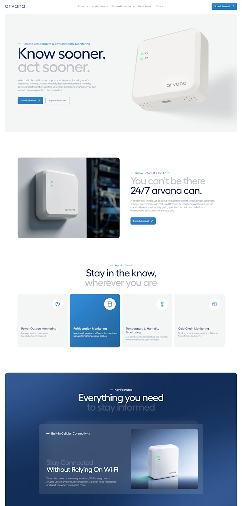
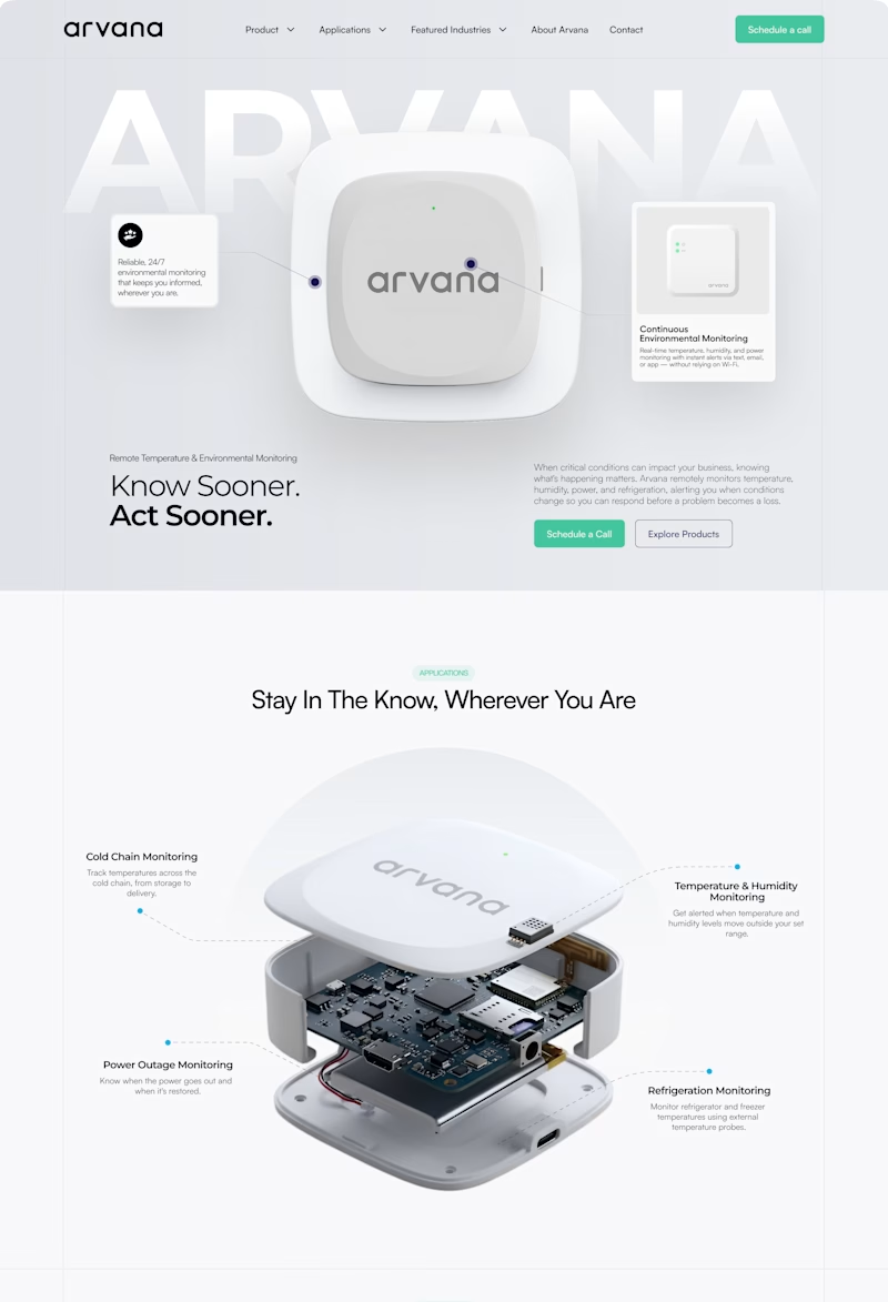
✨ Two website concepts. One brand. Which Arvana design stands out?
I explored two creative directions for Arvana, balancing clean aesthetics with product-focused storytelling and a modern tech feel. 🌐💡
🔵 Option 1: Clean & Corporate 🟢 Option 2: Bold & Interactive
Which direction would you choose? 👀
Cast your vote! 🗳️👇
14 votes
Ends in 1d

Option 2 is great specially how it shows the product nice job Maham🎉🎉🔥🔥

Top-notch design.

I’d go with Option 1 🔵. The clear sections, strong blue accents, and structured layout make the product easier to understand while giving it a polished, modern tech feel. 👌

very clean and balanced

The network for creativity
Join 1.25M professional creatives like you
Connect with clients, get discovered, and run your business 100% commission-free
Creatives on Contra have earned over $150M and we are just getting started

Challenges
View all


Related posts

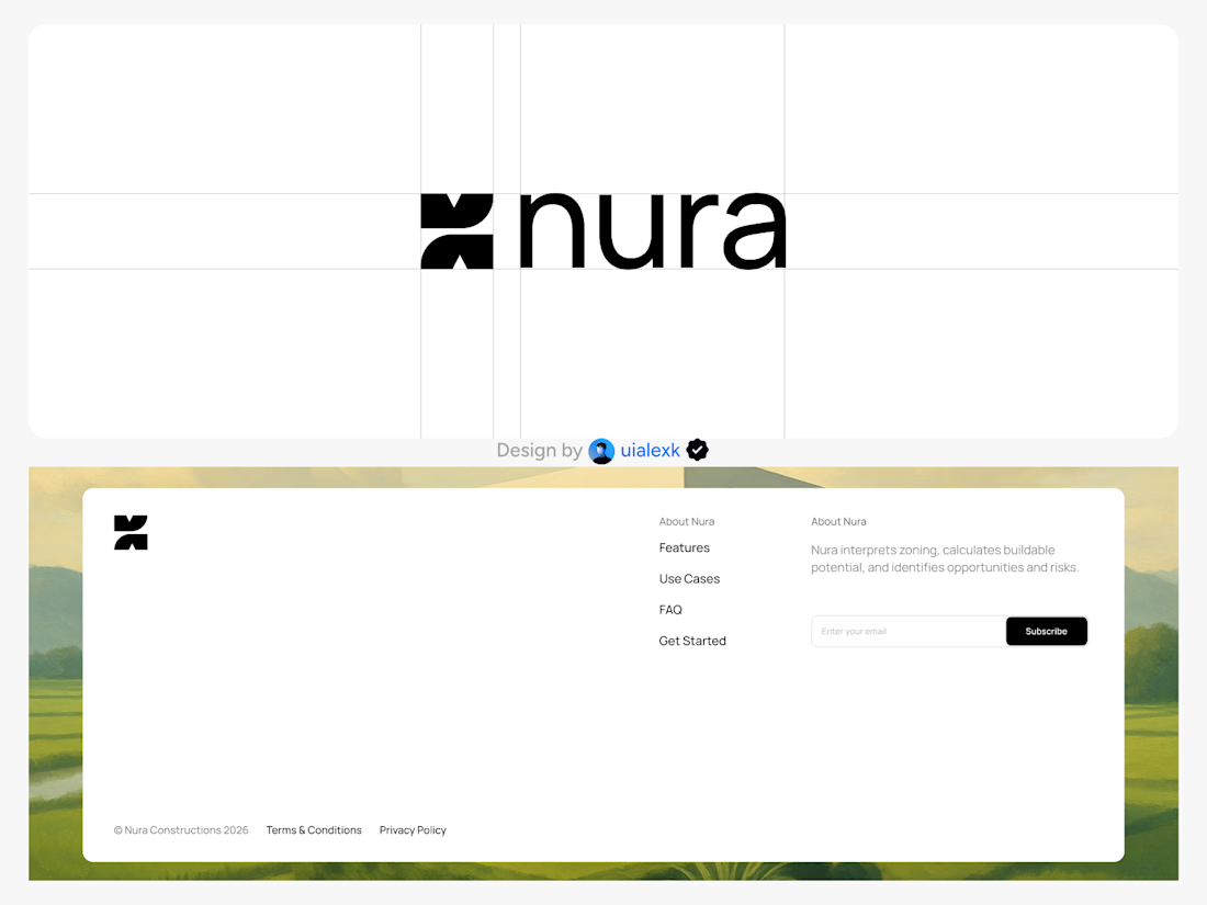
Branding design and Framer Development for an AI real estate tool
See full Case study


amazing work!🚀

i create a 3D cube component for a Framer website to add creativity. which one is better dark or light? Check the live preview here
22 voted
51%
21 voted
49%
43 votes
Closed

Snap to the position in the last will feel more real

Two color directions for an AI governance explainer. A draft AI use policy becoming the questions nobody can answer yet.
20 voted
77%
6 voted
23%
26 votes
Closed

blue for sure 💯