The network for creativity
Join 1.25M professional creatives like you
Connect with clients, get discovered, and run your business 100% commission-free
Creatives on Contra have earned over $150M and we are just getting started
Back to feedPost

I designed this dental clinic landing page with a focus on creating a clean, welcoming, and easy-to-navigate healthcare experience.
My goal was to guide users naturally through the website, build trust through clean visuals, and make booking appointments feel quick and seamless.
I also paid attention to spacing, visual hierarchy, and smooth section flow to make the experience feel more natural and easy to follow.
The network for creativity
Join 1.25M professional creatives like you
Connect with clients, get discovered, and run your business 100% commission-free
Creatives on Contra have earned over $150M and we are just getting started











Related posts

A landing page should continue the conversation started by the ad.
For Corpus, a Pilates and physiotherapy studio, I designed campaign-specific entry points. Pilates, physiotherapy and RPG each needed a relevant starting point, while sharing one visual system.
The page keeps the brand’s warm, editorial character through typography, photography and movement. Clear service information and WhatsApp calls to action give that visual experience a practical next step.
My role covered art direction, responsive web design, interaction and AI-assisted front-end development.
This clip shows the general version. The responsive layouts follow the same visual language across desktop and mobile.
When designing campaign landing pages, do you start with one master page or with the individual ad journeys?

Separate entry points per campaign under one visual system is exactly the right instinct. The warm editorial character comes through even in the clip. I tend to start with the individual ad journeys, then build the system around what they have in common. Did the WhatsApp CTA drive noticeably more bookings than a standard form?

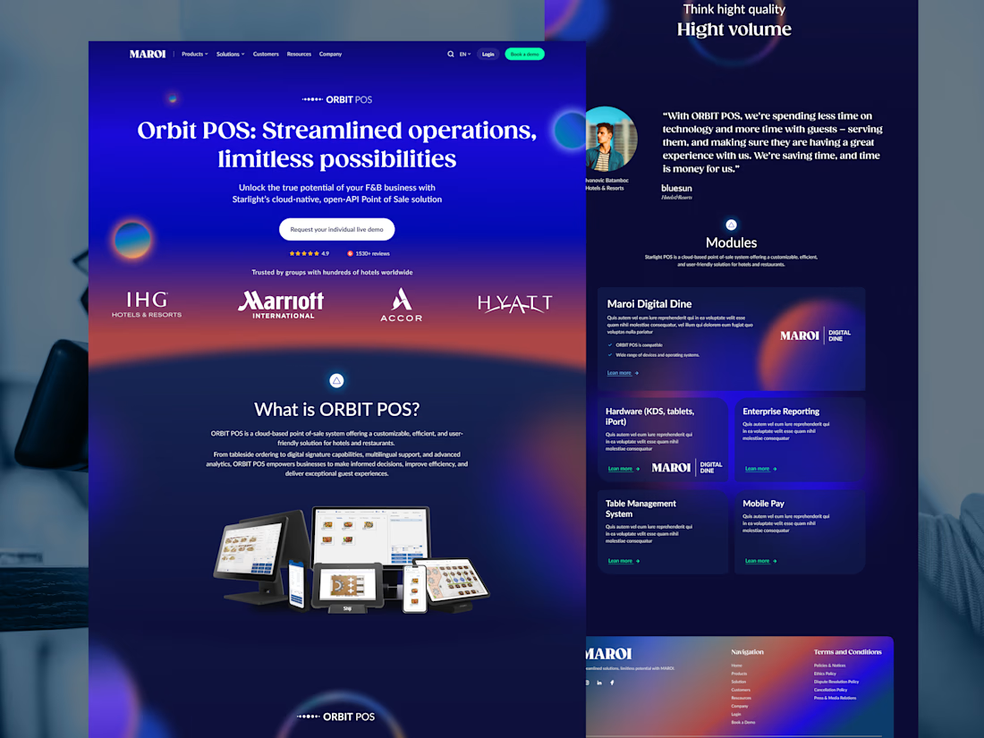
Who said hospitality SaaS websites have to look boring? 👀
Meet MAROI Orbit POS. Bold gradients, glowing visuals, and a fresh take on how hospitality tech should look.
Here's the design breakdown. 🧵
#WebDesign #UIUX #SaaSDesign #LandingPage
(1/5)
Less clutter, more impact. ✨
We combined expressive typography, vibrant gradients, and structured layouts to make complex hospitality solutions easier to explore.
(2/5)

A modern website concept for a skin clinic ..
I built this website with a focus on clean design, easy navigation, and making it simple for patients to explore treatments and book appointments.
The goal was to create a professional online presence for clinics that want to make a strong first impression and give patients a smoother experience.
🔹 Clean, modern UI 🔹 Treatment and service sections 🔹 Appointment booking integration 🔹 Responsive design for mobile and desktop
I enjoy building websites that combine thoughtful design with practical functionality, especially for healthcare businesses.


Ye le Jani Rithik wali post ke liye copy-ready:
Really clean concept Rithik! Love how you focused on clean design and easy navigation — making it simple for patients to explore treatments and book appointments is exactly what a skin clinic needs. Looks very professional and user-friendly!