The network for creativity
Join 1.25M professional creatives like you
Connect with clients, get discovered, and run your business 100% commission-free
Creatives on Contra have earned over $150M and we are just getting started
Back to feedPost
A modern website concept for a skin clinic ..
I built this website with a focus on clean design, easy navigation, and making it simple for patients to explore treatments and book appointments.
The goal was to create a professional online presence for clinics that want to make a strong first impression and give patients a smoother experience.
🔹 Clean, modern UI 🔹 Treatment and service sections 🔹 Appointment booking integration 🔹 Responsive design for mobile and desktop
I enjoy building websites that combine thoughtful design with practical functionality, especially for healthcare businesses.


Ye le Jani Rithik wali post ke liye copy-ready:
Really clean concept Rithik! Love how you focused on clean design and easy navigation — making it simple for patients to explore treatments and book appointments is exactly what a skin clinic needs. Looks very professional and user-friendly!

Thanks a lot!!
Most welcom🔥♥️

How does the booking step work when two patients pick the same slot at once? Is the slot held as soon as someone starts the form, or only when they submit?
Currently, the slot isn’t held just because someone starts filling out the form. The booking is processed when they submit it. To prevent double bookings, the system needs to validate slot availability at that point and handle simultaneous requests accordingly.

Modern care that feels human is a good headline.
The network for creativity
Join 1.25M professional creatives like you
Connect with clients, get discovered, and run your business 100% commission-free
Creatives on Contra have earned over $150M and we are just getting started











Related posts

AI can build the UI in minutes.
Bringing it up to a good standard, still needs a designer. Agree or disagree?

I see some of your work and honestly your work is really premium 🎉🎉
Great job Alex🎉🎉🔥🔥


Gorgeous 😍


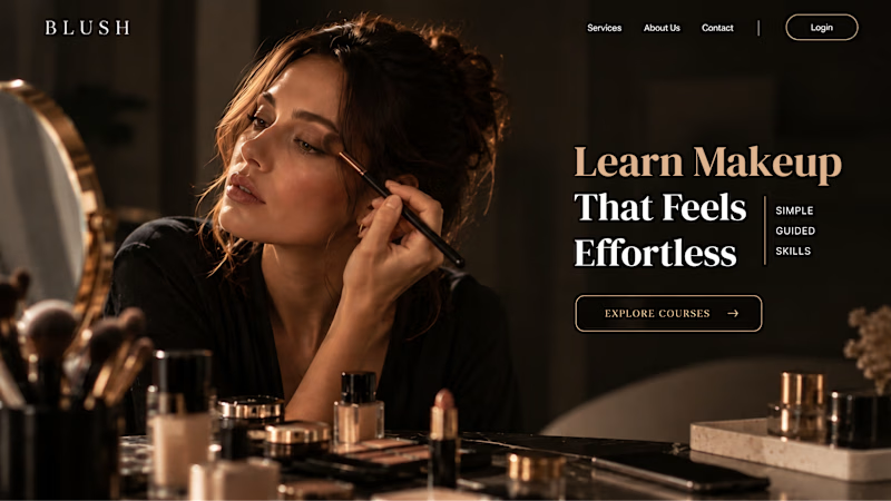
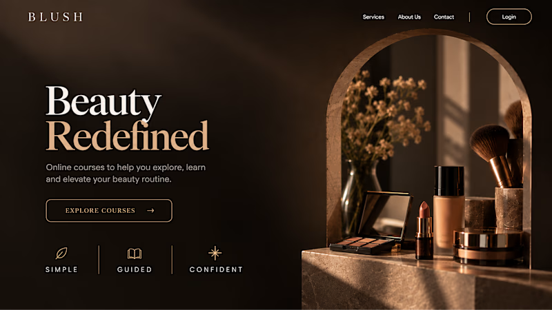
Your Hero Section Has One Job: Be Clear.
You don’t need huge headlines or long explanations. You need the right image + short headline + clear offer.
For the first version, we worked on the branding, the image and the copy together, so at first glance it’s clear: this is a makeup course, and here’s what you’ll get.
The second version is still beautiful and still feels like beauty. But what are you actually getting? A makeup course? Products? A store? That’s the problem with a Hero that looks good but isn’t thought through.
Your first screen doesn’t need to say everything. It just needs to say the right thing.

22 voted
61%
14 voted
39%
36 votes
Closed
