The network for creativity
Join 1.25M professional creatives like you
Connect with clients, get discovered, and run your business 100% commission-free
Creatives on Contra have earned over $150M and we are just getting started
Back to feedPost

This is a holistic skin care and wellness brand that has a large presence online (instagram) and in the ecommerce space and their goal now is to grow their presence on youtube with lifestyle vlogs, cooking, and other wellness practices. My goal is to help them craft stories that align with their values and most importantly what their brand represents.
Starting with a ‘cooking at home’ series and later leaning more into holistic health practices, getting both husband and wife involved in a youtube series has helped to better round out the brand’s image.
Attached is a short bit from their new youtube series


The network for creativity
Join 1.25M professional creatives like you
Connect with clients, get discovered, and run your business 100% commission-free
Creatives on Contra have earned over $150M and we are just getting started

Challenges
View all


Related posts

Experiments in AI on a red background
Character card from my photos
Text prompt
Revitalizing Seedance 2.5

Cinematic

I'm not a professional video editor & this is my first time trying video generation and editing like this.
But I tried my best to make it good.
Spent 7 hours on it, and this is the result. 😍
What do you think? Would love your feedback!
#VideoGeneration #VideoEditing #AIVideo #BeginnerJourney #LearningInPublic #FirstAttempt #CreativeProcess #UIUXDesigner #AIProductBuilder #NoCodeTools #FigmaDesign #ContraFreelancer #WorkInProgress #DesignCommunity #OpenToFeedback


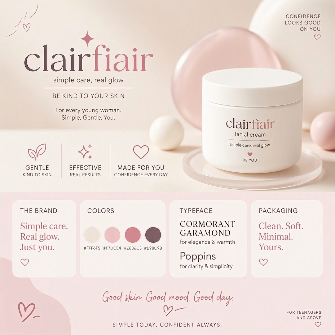
What does “simple skincare” look like as a brand?
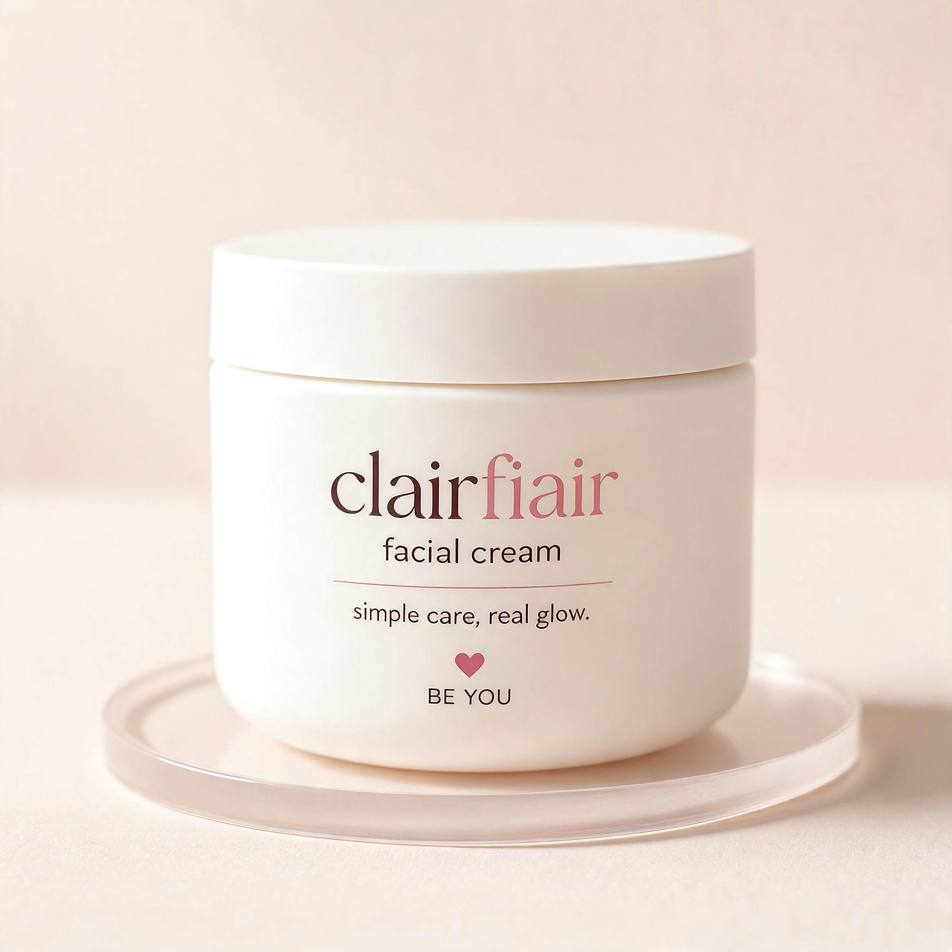
For Clairfair, I explored a soft, youthful visual identity built around a simple idea: care should feel gentle, approachable, and personal.
I developed the direction across the logo, typography, color palette, messaging, and facial-cream packaging keeping the system clean and minimal while adding subtle playful details through the soft pink palette, hearts, and expressive typography.
The goal wasn't to make skincare feel clinical or overly luxurious. It was to create something that feels friendly, confident, gentle, and easy to connect with.
I also explored how the identity could translate into a broader brand system rather than stopping at the logo.
Does this feel more like a skincare brand for teens, young adults, or both?


Teen-leaning to me, and the hearts are what tip it — they're the one element an older buyer would read as aimed at someone younger. The script wordmark and that muted rose palette on their own would sit fine in early-twenties territory. If you want it to stretch to both, the...