The network for creativity
Join 1.25M professional creatives like you
Connect with clients, get discovered, and run your business 100% commission-free
Creatives on Contra have earned over $150M and we are just getting started
Back to feedPost

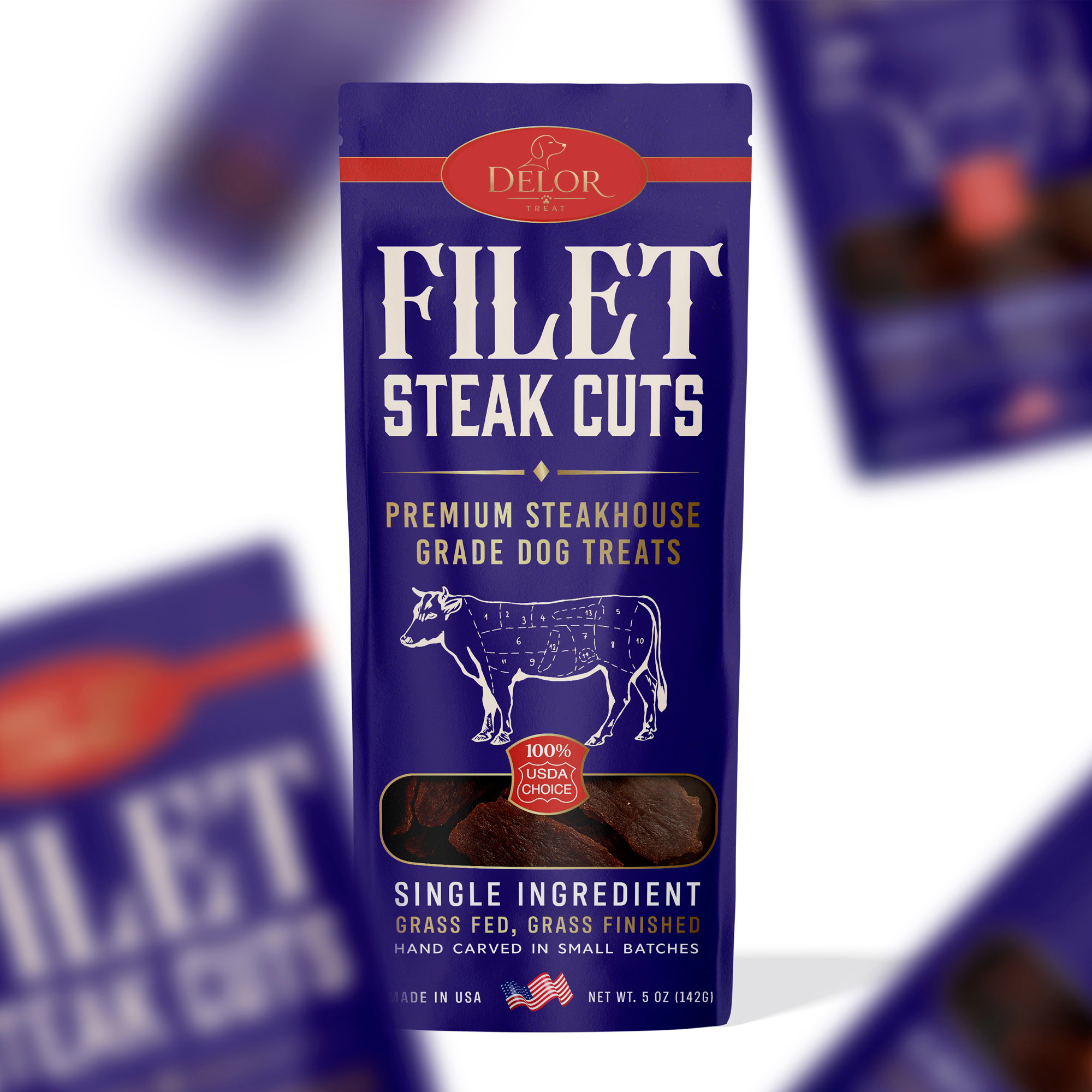
A packaging concept that reinterprets classic steakhouse branding for a contemporary dog treats line. Strong typography, vintage-inspired graphics, and a focused color palette define a visual identity that feels both familiar and distinctive.


The network for creativity
Join 1.25M professional creatives like you
Connect with clients, get discovered, and run your business 100% commission-free
Creatives on Contra have earned over $150M and we are just getting started





Related posts

Brand identity work for WesoftAI



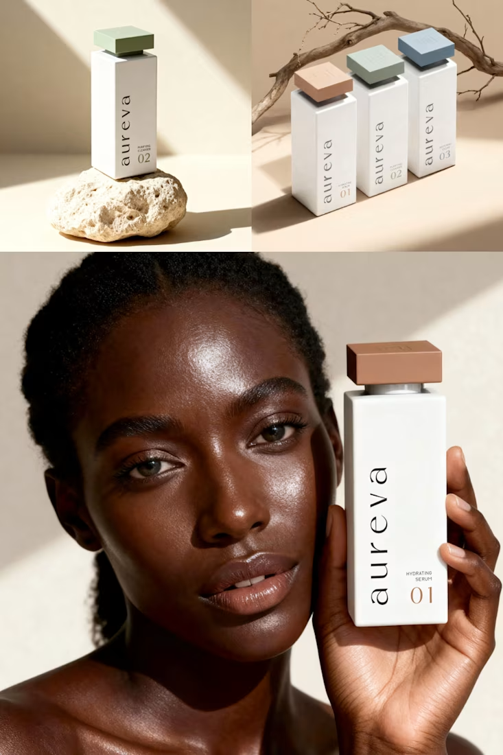
A closer look at Aureva, a Paris-based skincare brand I worked on.
The brief was to create a brand identity and packaging that felt premium yet approachable. I paired distinctive typography with soft earth tones, using color to give each product its own place within the range.
The full case study is now on my profile.

Premium branding

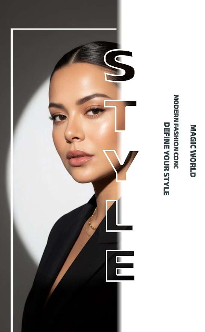
✨ Modern Fashion Poster Design - STYLE ✨
Designed a clean, high-fashion poster concept focusing on bold typography and minimalist aesthetics.
Concept: Modern Fashion | Define Your Style
Tool: Canva / Photoshop
Style: Luxury, Minimal, Editorial
Open to feedback and freelance work!
#GraphicDesign #PosterDesign #FashionDesign #Canva #ContraCommunity

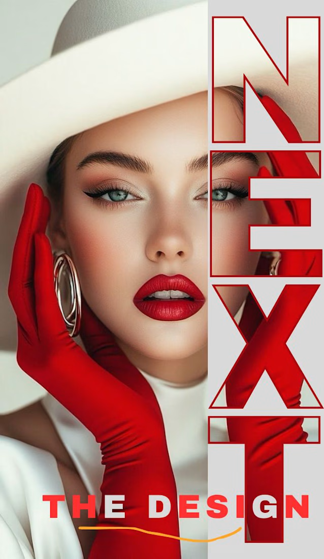
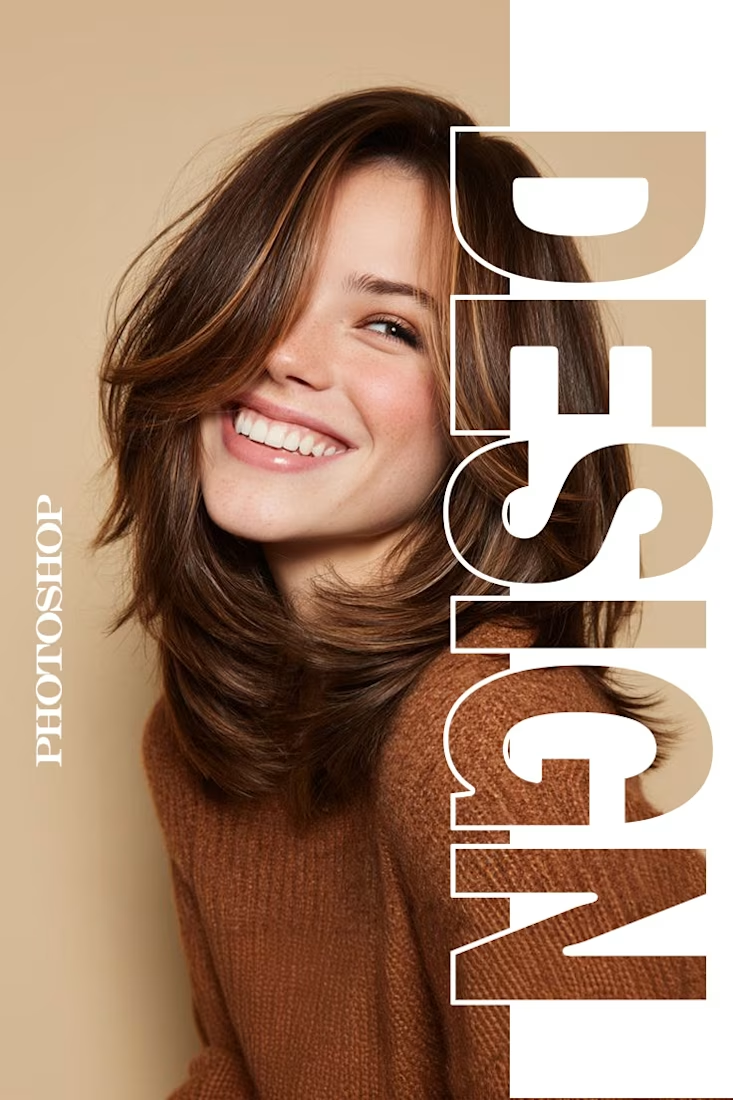
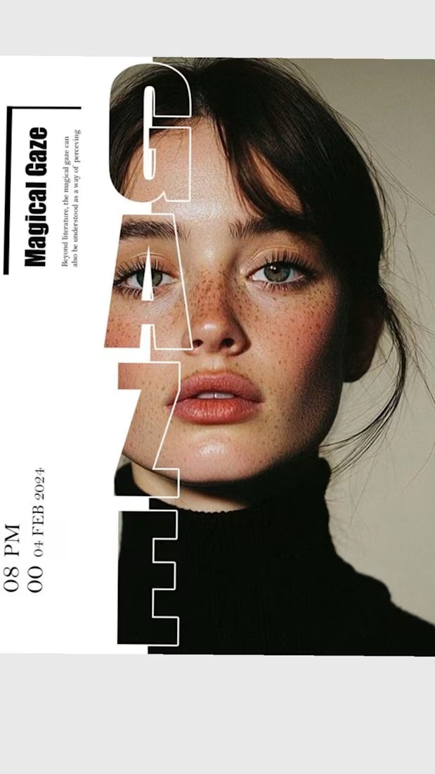

The way you let the bold type dominate the empty space really drives the luxury feel.