The network for creativity
Join 1.25M professional creatives like you
Connect with clients, get discovered, and run your business 100% commission-free
Creatives on Contra have earned over $150M and we are just getting started
Back to feedPost

Nobody reads testimonials (they scan).
Unless the design makes them stop.
Doesn't have to be boring. Doesn't have to go overboard.
One of the challenges for this design was that you don't have all the client's photos, but have their testimonials, and you need to blend them together to fit the layout.
This design provides the solution.
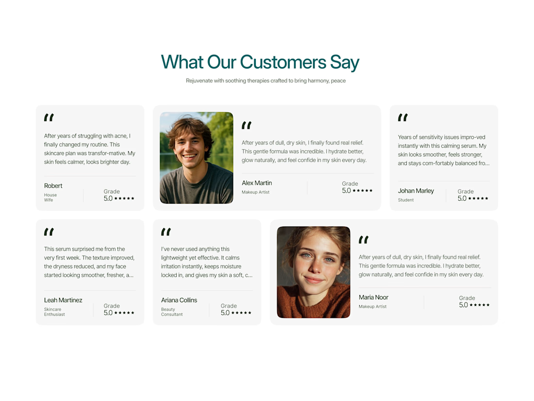

Great design, different from the usual testimonial layout but still clean and scannable enough to understand the content
Appreciate the feedback, David!

looks stunning👌
The network for creativity
Join 1.25M professional creatives like you
Connect with clients, get discovered, and run your business 100% commission-free
Creatives on Contra have earned over $150M and we are just getting started





Related posts

AI didn't take my job. It became my business partner.
Every designer I know is asking the same question right now: what's left for us when AI can make something pretty in 10 seconds?
Here's my honest answer, from branding and from product.
The way I work has completely changed. Moodboards, variations, mockups, even clickable prototypes: what used to take days now takes hours.
But here's what nobody says out loud: people are making a lot of pretty things. And pretty doesn't build a brand.
Pretty doesn't tell a stranger why they should trust you.
Pretty doesn't make your offer clear in 5 seconds.
Pretty doesn't fix the screen where users give up.
That part is still on me. It's actually most of my job now.
So I stopped seeing AI as a competitor. It does the drafts, I do the thinking, and my clients get both, faster.
Designers, how has AI changed the way you work this year?
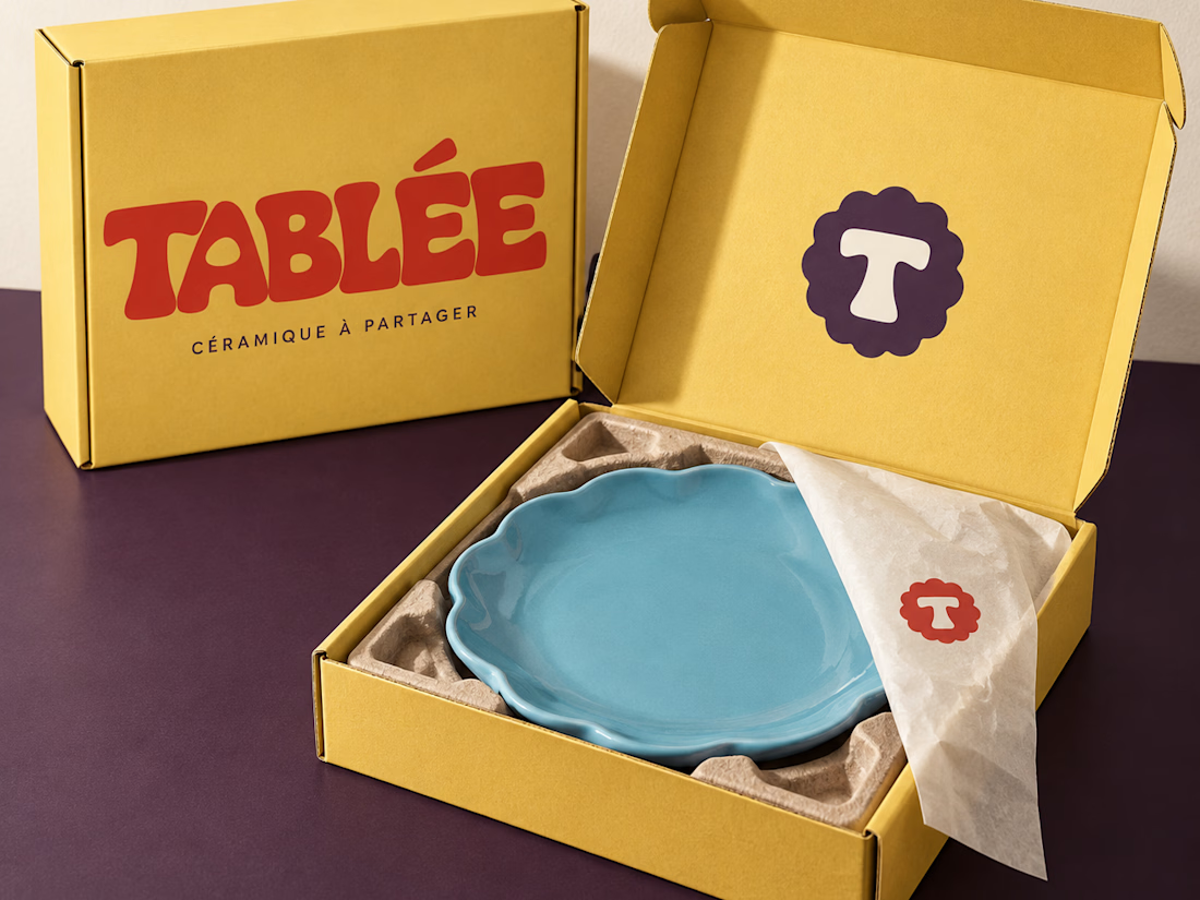

Wonderful presentation and I like your thought you shared

Designed a modern Healthcare Landing Page.
A calm teal and soft blue interface with elegant serif typography for a warm and trusted first impression.
A quick doctor search, friendly doctor profiles, hand-drawn medical illustrations, and patient reviews make finding care feel simple and human. Clean cards, generous spacing, and a smooth mobile booking section keep the whole page clear and easy to explore.
healthcarewebsitedesignmedicallandingpageProduct DesignUI DesignWeb DesignAdobe After EffectsFigmaJitter


I love this very much

A good landing page shouldn’t make you work to understand it.
Been working on a new project where the goal was simple:
Make a complex product feel simple, clear, and easy to explore.
Less explaining. Less clutter. More visual hierarchy. A clearer path to the next step.
Still working through the details, but this one is coming together nicely.
Full case study soon.
This pairs well with the Hire Hangar screenshot because the design itself demonstrates the point—you don't need to reveal the whole project yet.


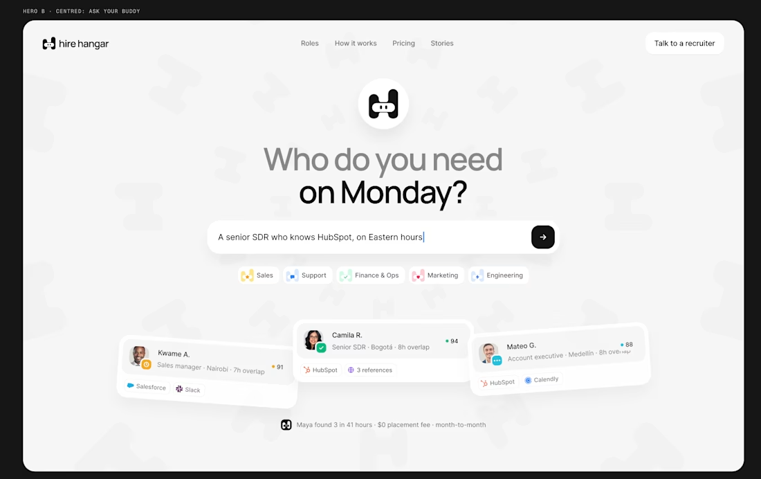
This is nice 👌