The network for creativity
Join 1.25M professional creatives like you
Connect with clients, get discovered, and run your business 100% commission-free
Creatives on Contra have earned over $150M and we are just getting started
Back to feedPost
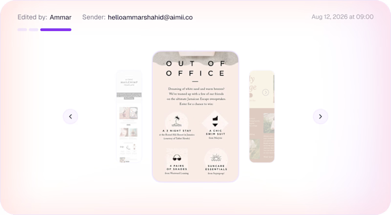
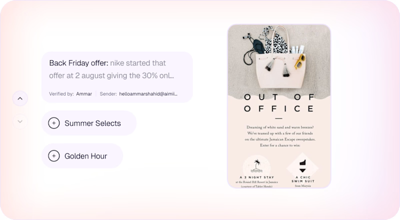
Taste Test

Just a heads up, left one is already rejected by the stakeholder, just because they didn't want a category for newsletters in the database.
I won't say which one is right, because there is going on under the table, just exploring the new ideas
0 voted
1%
0 voted
1%
0 votes
Closed
The network for creativity
Join 1.25M professional creatives like you
Connect with clients, get discovered, and run your business 100% commission-free
Creatives on Contra have earned over $150M and we are just getting started



Related posts

Working on a Contra project - which one is your go to?
90 voted
52%
82 voted
48%
172 votes
Closed

I will go for A - Spiral

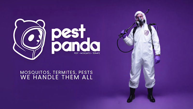
Which logo + Wordmark looks more organic/reliable/premium and why?
5 voted
71%

2 voted
29%
7 votes
Closed

Option 2 for me: the rounded lowercase wordmark and the panda in a hazmat hood feel friendlier and more premium, while the heavy caps next to the gas-mask photo in option 1 read a bit aggressive for a home service. I'd only give the tagline in option 2 more weight, at that size it gets lost on the purple.

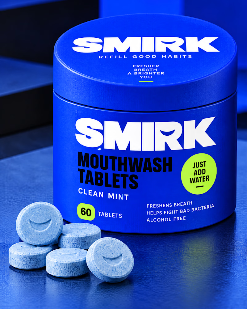
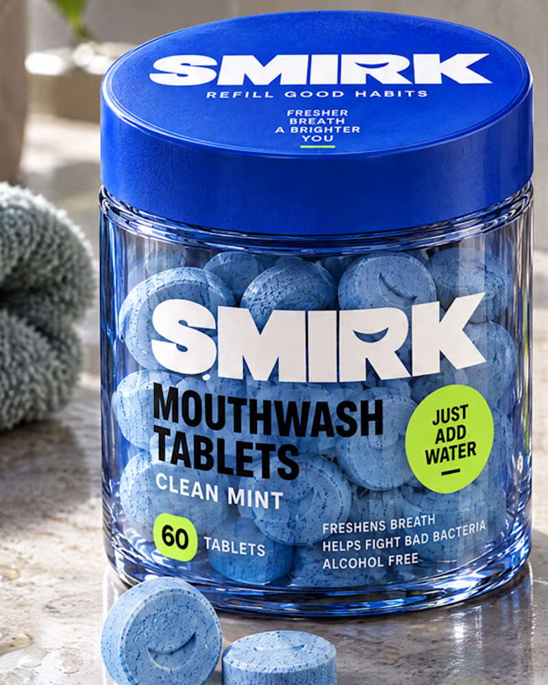
A visual transformation that turns everyday dental care into a fresh, modern brand experience. From the initial concept to the refined final look, every detail reflects simplicity, clarity, and confidence.
2 voted
20%
8 voted
80%
10 votes
Closed

I like the presentation, but I prefer it when the product is visible.