The network for creativity
Join 1.25M professional creatives like you
Connect with clients, get discovered, and run your business 100% commission-free
Creatives on Contra have earned over $150M and we are just getting started
Back to feedPost
Taste Test

Wich tshirt design look more premium and fit street wear brand? The name pacwrld was originated from some legends in music Tupac and juicewrld.
1 voted
50%
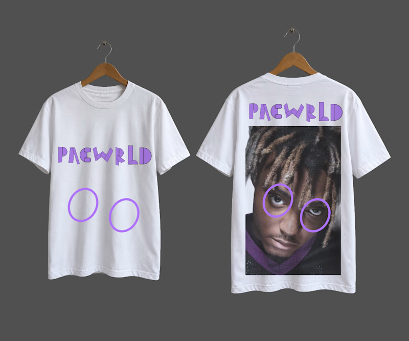
1 voted
50%
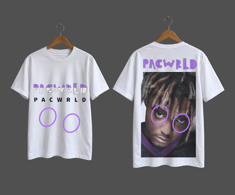
2 votes
Closed
The network for creativity
Join 1.25M professional creatives like you
Connect with clients, get discovered, and run your business 100% commission-free
Creatives on Contra have earned over $150M and we are just getting started






Related posts

hey there 👋 I'm working on an AI startup that matches you with people who dress like you.
I made two intros for the site and honestly, I'm not sure which one to use. I have a slight favourite, but I want to see what everyone thinks first.
which one would you keep?
7 voted
44%
9 voted
56%
16 votes
Closed

For a 'people who dress like you' product I'd lean fast cuts, quick outfit flashes sell the matching idea before anyone reads a word. The grid could make a great second section once people want to browse. What's your slight favourite?

Aurel Studio · Luxury Business Card Concept
I have explored two print finishes for the same monogram. Black & Gold pairs champagne foil with gilded edges, while Ivory & Oxblood uses a raised monogram and deep red edges to highlight the paper’s texture.
Which finish would you choose for your brand?
0 voted
1%
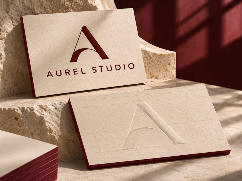
0 voted
1%
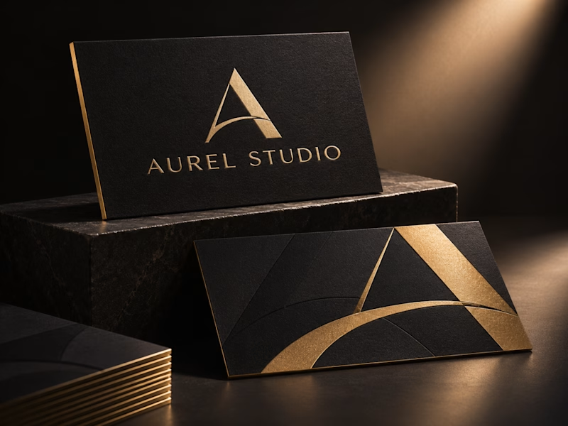
0 votes
Closed

I'd go Ivory & Oxblood. Black & Gold reads as luxury at first glance, but it's the category default, while the raised monogram with those red edges feels more ownable and rewards being held in the hand.

Same 18 seconds, two middles. One pulls you through a tunnel of banners, one lays them out. 1 or 2.
23 voted
55%
19 voted
45%
42 votes
Closed

2 — the laid-out banners read clearer.