The network for creativity
Join 1.25M professional creatives like you
Connect with clients, get discovered, and run your business 100% commission-free
Creatives on Contra have earned over $150M and we are just getting started
Back to feedPost

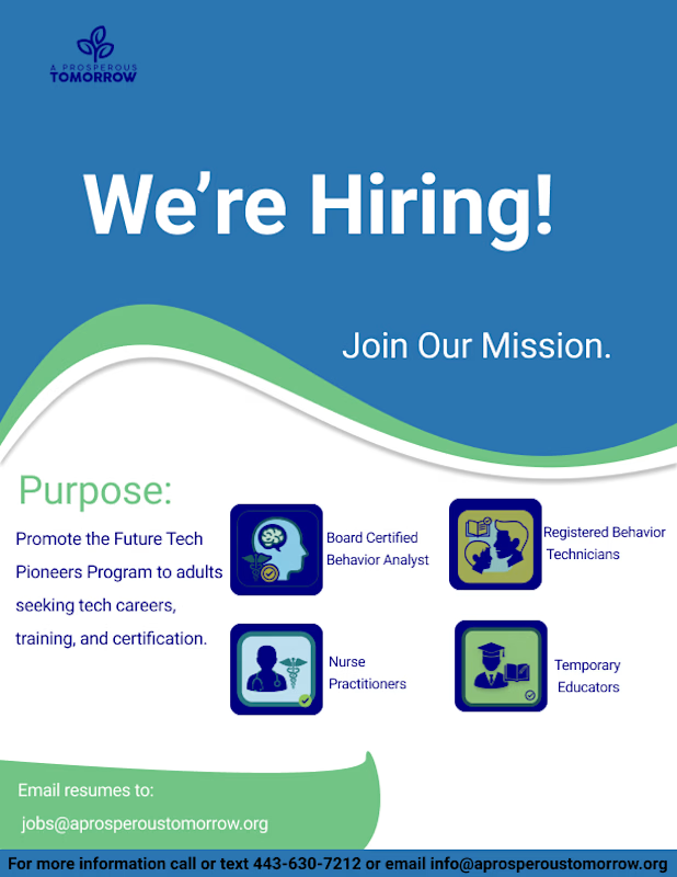
Designed a bold recruitment flyer built to attract qualified professionals and communicate opportunity with clarity.
This project focused on strong visual hierarchy, confident typography, and structured layout to ensure the message is instantly clear: We’re Hiring. The wave elements add movement and approachability, while the icon system keeps roles organized and easy to scan.
Every design decision supports credibility, trust, and action — from headline impact to the clear resume submission call-to-action.
This piece demonstrates my ability to create clean, purpose-driven marketing assets that align brand identity with recruitment goals.
Skills: Layout design, typography, brand consistency, CTA placement, visual communication, marketing design.

The network for creativity
Join 1.25M professional creatives like you
Connect with clients, get discovered, and run your business 100% commission-free
Creatives on Contra have earned over $150M and we are just getting started







Related posts


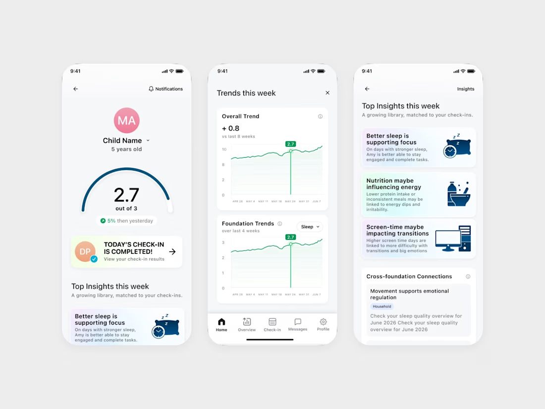
We designed an ADHD app that keeps the word ADHD off its daily screens.
It's Coastal Neuro Group's parent app. The everyday screens use words like attention, focus and regulation, and the ADHD framing stays in onboarding.
Ami Hansji, the founder, then used the same rule for the patient headers in the practitioner portal.

love this framing rule. keeping adhd in onboarding only makes it feel less clinical day to day. smart

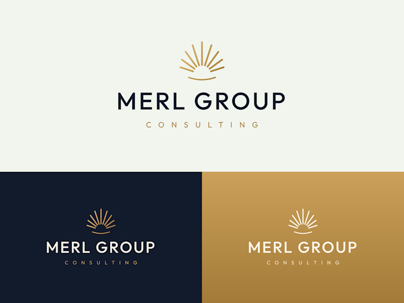
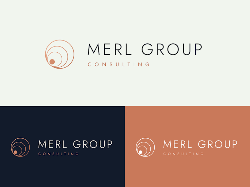
Two logo directions for Merl Group Consulting. Which one would you trust with your business? 👇
22 voted
69%
10 voted
31%
32 votes
Closed

I would go with Rising Sun Mark!

A Friday pick from the archives. I made this for Whale a few months ago, and it’s still close to my heart.
The task was to explain a product with several features without making viewers work to understand it.
I kept the structure simple: the problem, the main solution, then the extras.
First, scattered company knowledge and the same questions being asked repeatedly. Then, how Whale puts answers inside the tools teams already use. Recording processes and training quizzes come later, once the main value is clear.
That order matters. Viewers should understand why they need the product before learning everything it can do.
I took the same approach with the animation: calm transitions, focused UI, and time to follow each action.
Still proud of this one. Not because I squeezed everything in, but because I gave the important parts enough room.

