The network for creativity
Join 1.25M professional creatives like you
Connect with clients, get discovered, and run your business 100% commission-free
Creatives on Contra have earned over $150M and we are just getting started
Back to feedPost

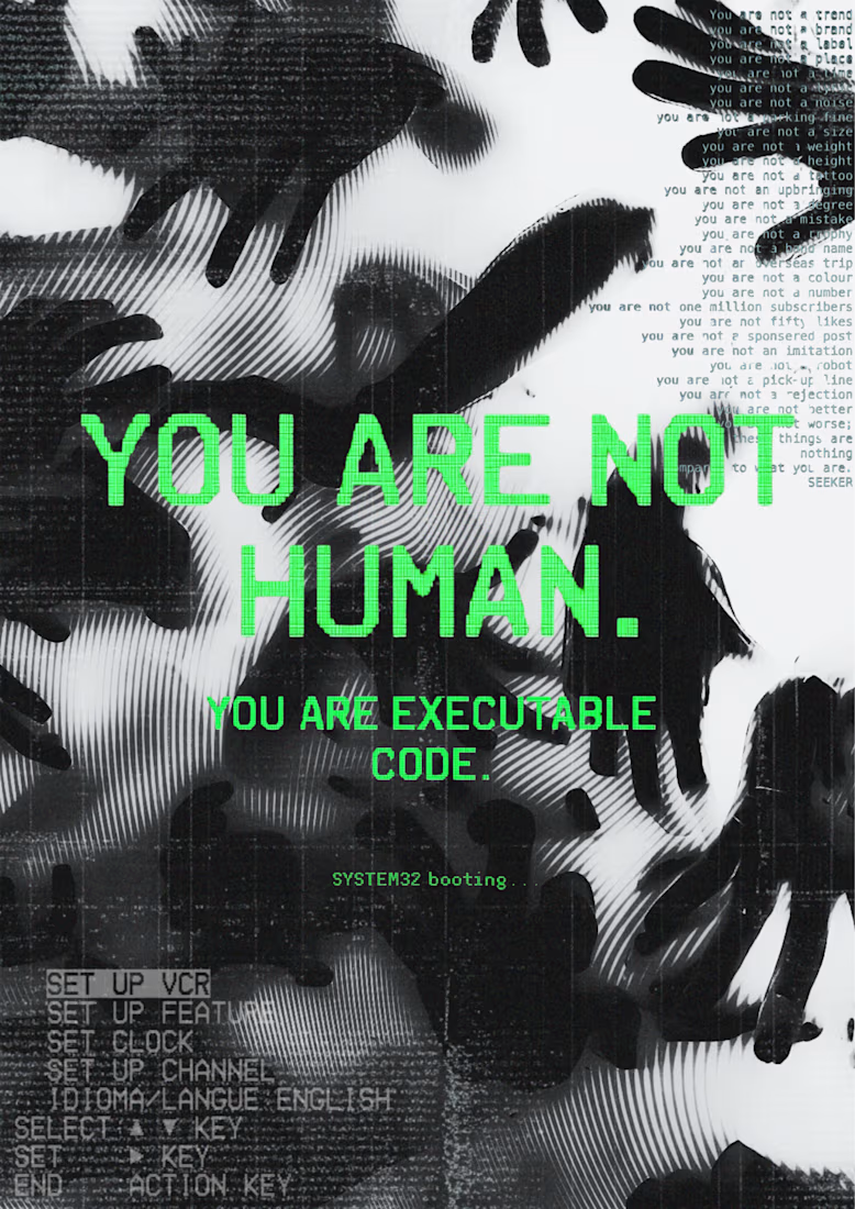
Glitch art poster exploring identity and technology. Made in Canva using texture overlays and typography.

The network for creativity
Join 1.25M professional creatives like you
Connect with clients, get discovered, and run your business 100% commission-free
Creatives on Contra have earned over $150M and we are just getting started





Related posts

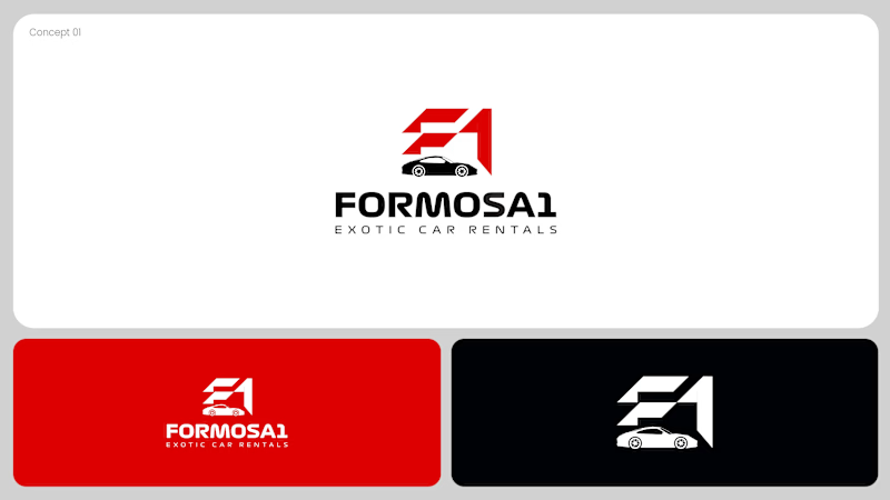
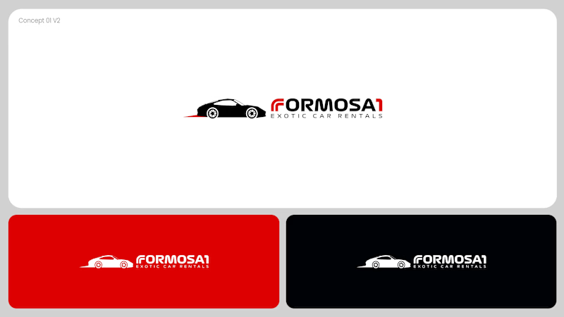
Two logo concepts for Formosa1 Exotic Car Rentals. Which one wins?
A: bold geometric F1 monogram, car tucked inside the mark. Strong and iconic.
B: car silhouette leads, red wordmark with a speed streak. Fast and clean.
Drop your vote 👇
17 voted
53%
15 voted
47%
32 votes
Closed

Both are great but I feel that was something special in the bottom one that's why I choose it❤️❤️

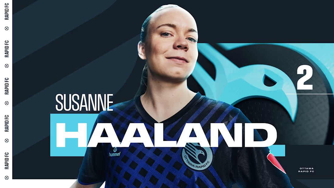
Sharing a project I'm really proud of: the 2025 broadcast design for the Northern Super League, Canada's new professional women's soccer league.
What made this one special is that the league had no visual history on TV. Every graphic viewers saw in that first season had to be created from zero, for a league that was introducing itself to the country.
The goal was a broadcast identity that feels as ambitious as the league itself: bold enough to stand out on screen, clear enough to follow at a glance, and flexible enough to carry six different clubs inside one consistent system.
The biggest lesson for me: when you design for a league that's just being born, you're not only packaging matches. You're helping define how people will remember its first season.
I'd love to hear from anyone working in sports or broadcast design: how do you approach building a visual system for a league that's launching from scratch?



Great Work demands great efforts

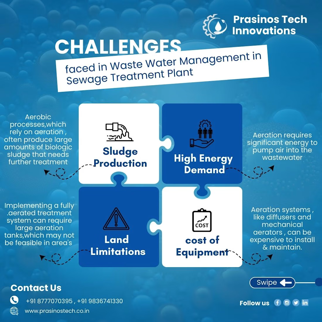
One of the more challenging creatives I worked on for Prasinos Tech Innovations — an innovation-focused company working in wastewater management.
The challenge was turning a content-heavy topic into a graphic that was easy to understand, visually engaging, and still professional. There wasn't much visual inspiration available online for this specific topic, so I had to build the visual direction from the content itself.
I explored ways to represent each challenge through puzzle-style layouts, icons, typography, visual hierarchy, and supporting illustrations, while keeping the overall design aligned with the brand.
The project pushed me to think beyond simply “making it look good” and focus on how design can make technical information easier to understand.