The network for creativity
Join 1.25M professional creatives like you
Connect with clients, get discovered, and run your business 100% commission-free
Creatives on Contra have earned over $150M and we are just getting started
Back to feedPost
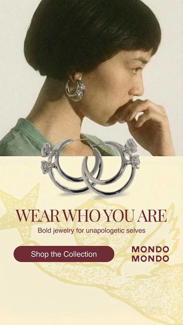
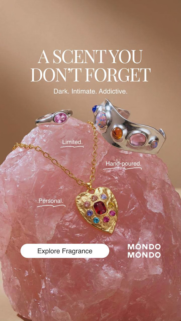
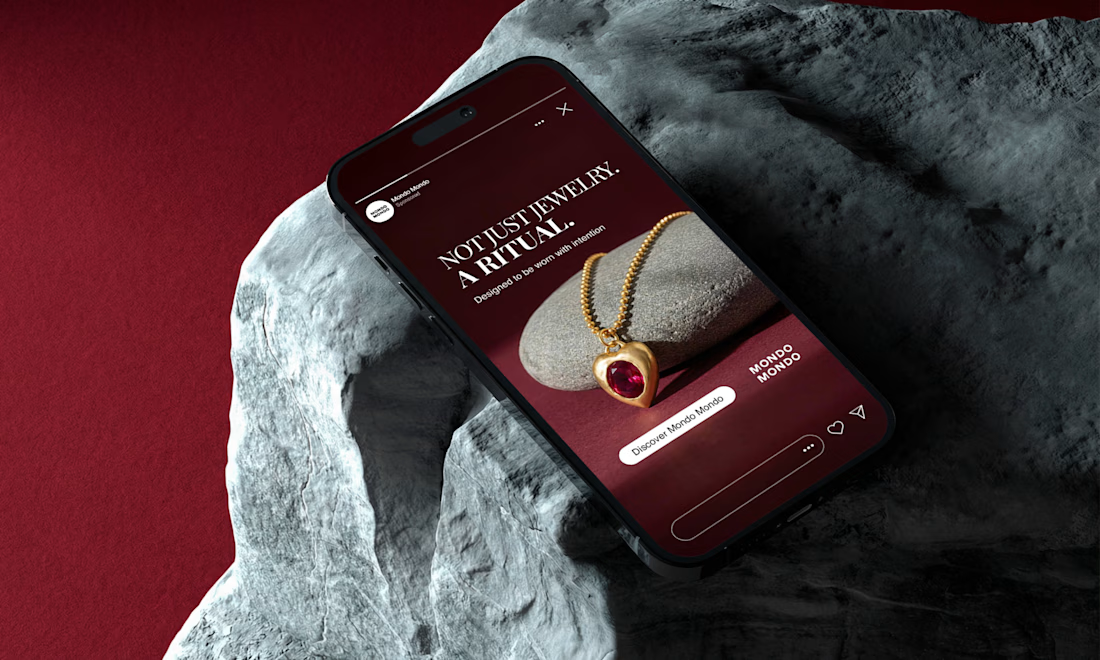
Why I ditched clean layouts for Mondo Mondo 💎
I wanted to break away from the usual bright, clean e-commerce templates and build something with a real dark luxury weight.
To do that, I focused entirely on directional lighting in Photoshop to catch the gold grain against the rough stone texture, keeping the rest of the canvas in deep shadow. For the typography, I chose a high-contrast serif and gave it wide tracking.
Mondo Mondo has this raw, distinct identity, so the copy needed room to breathe to actually feel like a ritual, not just a product description.
How do you feel about this direction for Mondo Mondo, or would you take the brand somewhere else entirely?
The network for creativity
Join 1.25M professional creatives like you
Connect with clients, get discovered, and run your business 100% commission-free
Creatives on Contra have earned over $150M and we are just getting started
Trending

Claude
Claude has entered the design space. How are you using it?

Contra University
Learn from expert creatives how to earn more using next-gen AI tools.
Brand Design
The best brand designers are on Contra. Scroll to see what's trending in brand design. What are you building?
creativeaiflow
Creative AI workflows are evolving. What tools do you use, and what are their strengths and weaknesses?
freelancerlife
Freelancer life is wins, pivots, and everything in between. What’s yours right now?



Related posts

A closer look at the identity we designed for the Rylo rebrand.
I teamed up with @hunterthompson to shape the logo, typography, icon system, colour palette, and full visual identity.
Rylo came to us with a strong foundation, but the existing identity felt a little to clinical and lacked the personality to match the product.
So we rebuilt the logo and icon system around Rylo's core purpose: a letterform, an audio waveform, and two opposing shapes representing communication, all in one simple, distinctive mark.
That mark became the engine of the system, driving the wave patterns, graphic language, motion, and supporting assets into one cohesive identity.
One of those projects where a single idea grows into an entire visual language. Loved every minute.
Huge congrats to Rylo on raising $100M and making communication more accessible for those who need it most


Very cool and playful brand design, I love it!

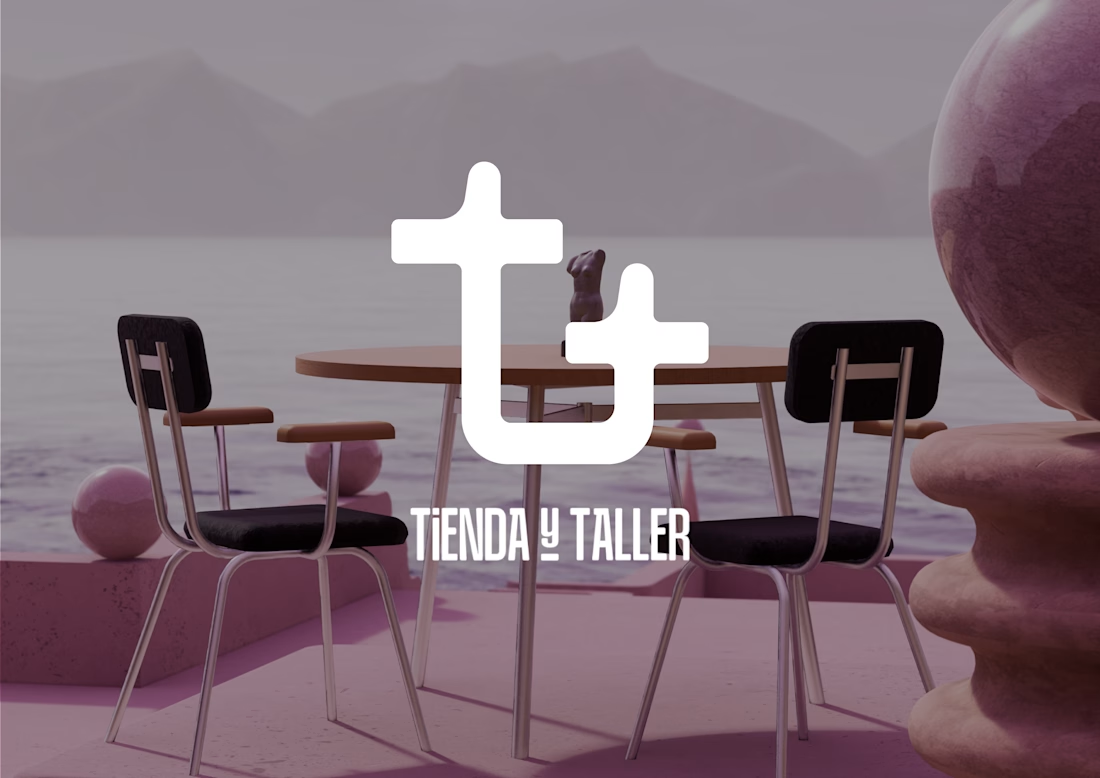
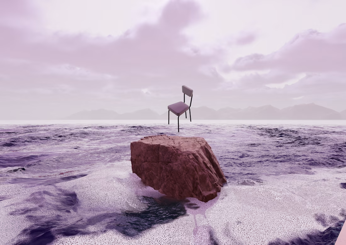
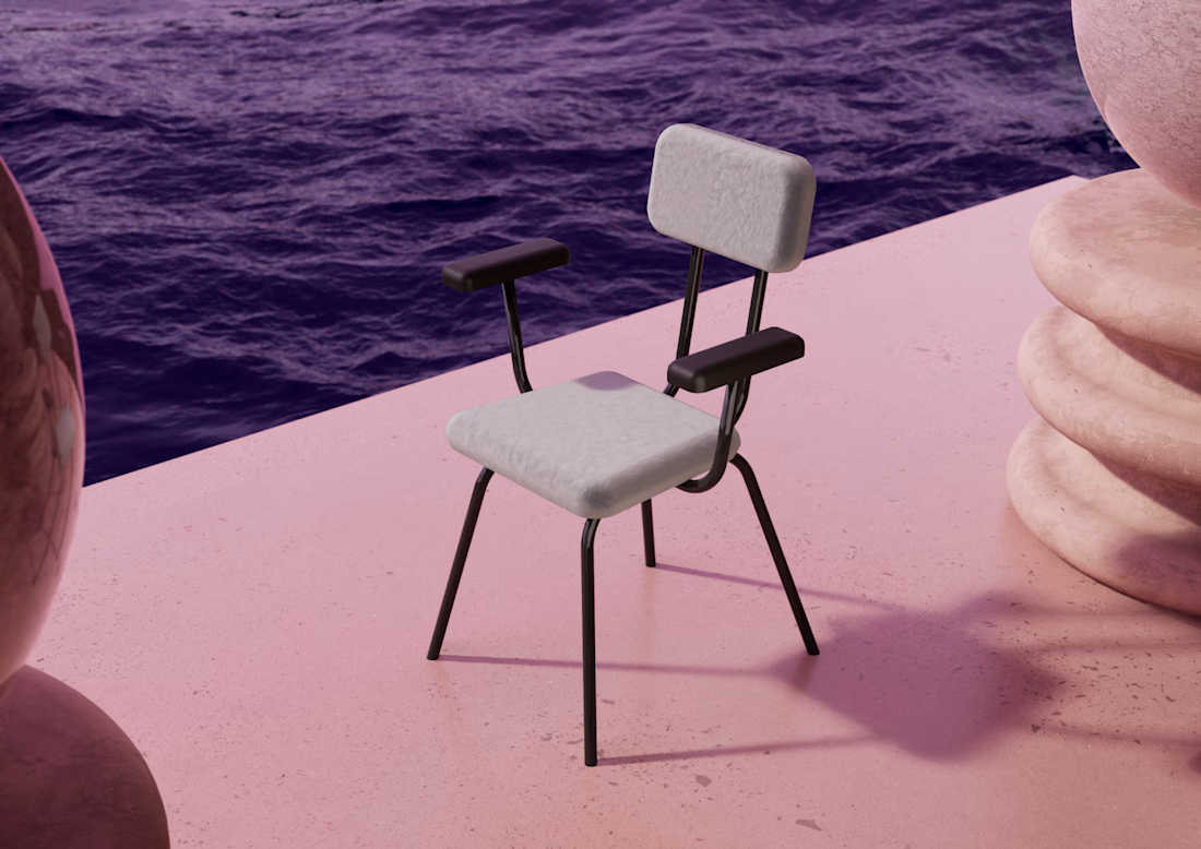
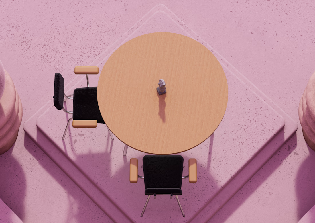
The client needed a way to present and sell the first furniture collection of her brand without producing physical pieces in advance, since all items are made to order.
The goal was to create a striking visual system that would highlight the design of each product, attract attention, and communicate the brand’s identity through an unconventional presentation.
Together with a collaborator, we proposed building a surreal digital environment where the furniture could be showcased in a distinctive and memorable way, standing out clearly from its surroundings.
Everything was modeled in Blender, Plasticity and lastly rendered in Unreal Engine. 🙌




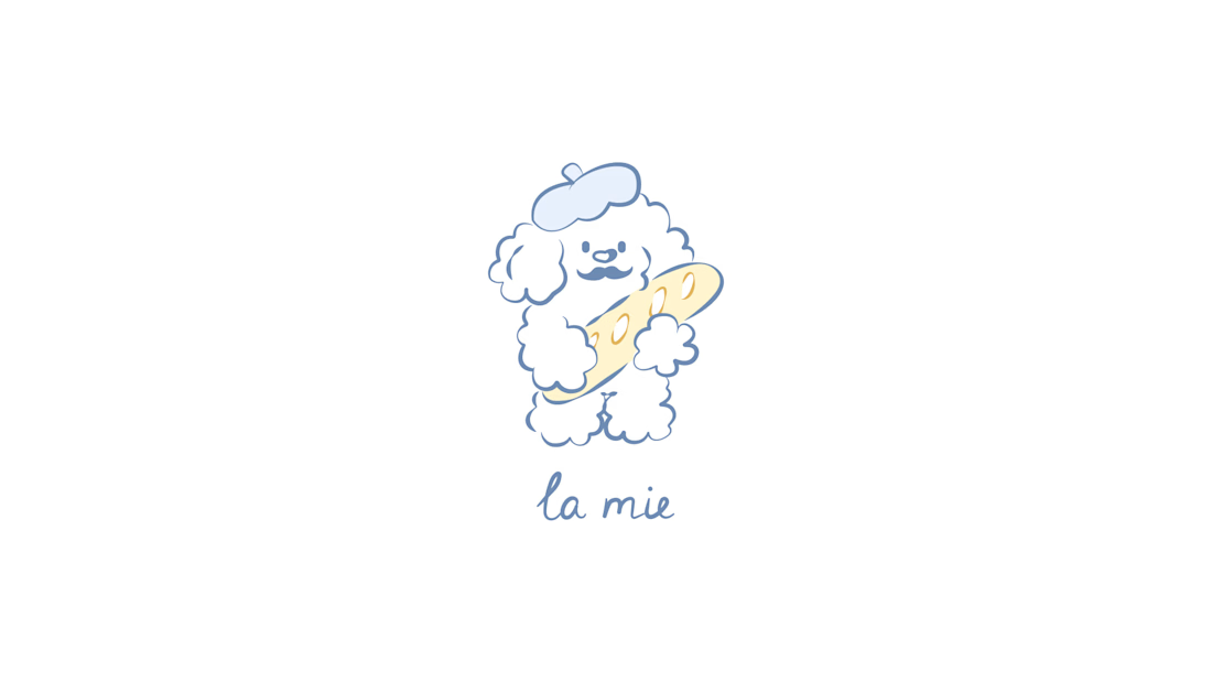
Human by Design: La Mie Bakery Identity
Although we missed the official Contra x @envato challenge deadline, the workflow behind this project is worth sharing.
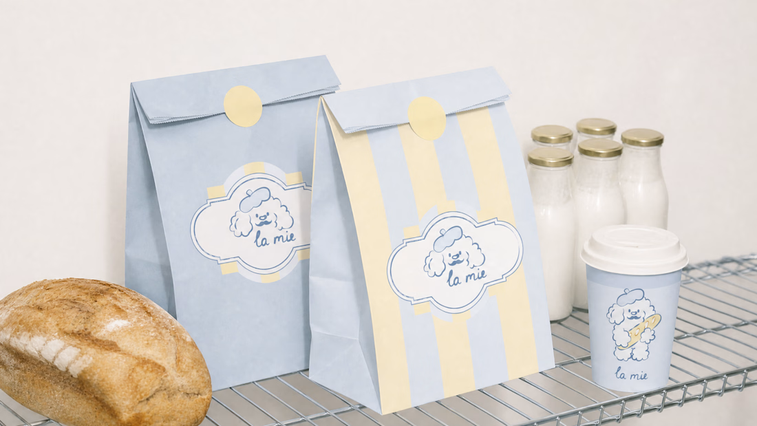
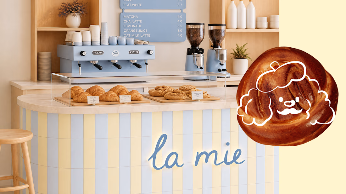
It's a complete brand identity and packaging system for La Mie, an artisan bakery.
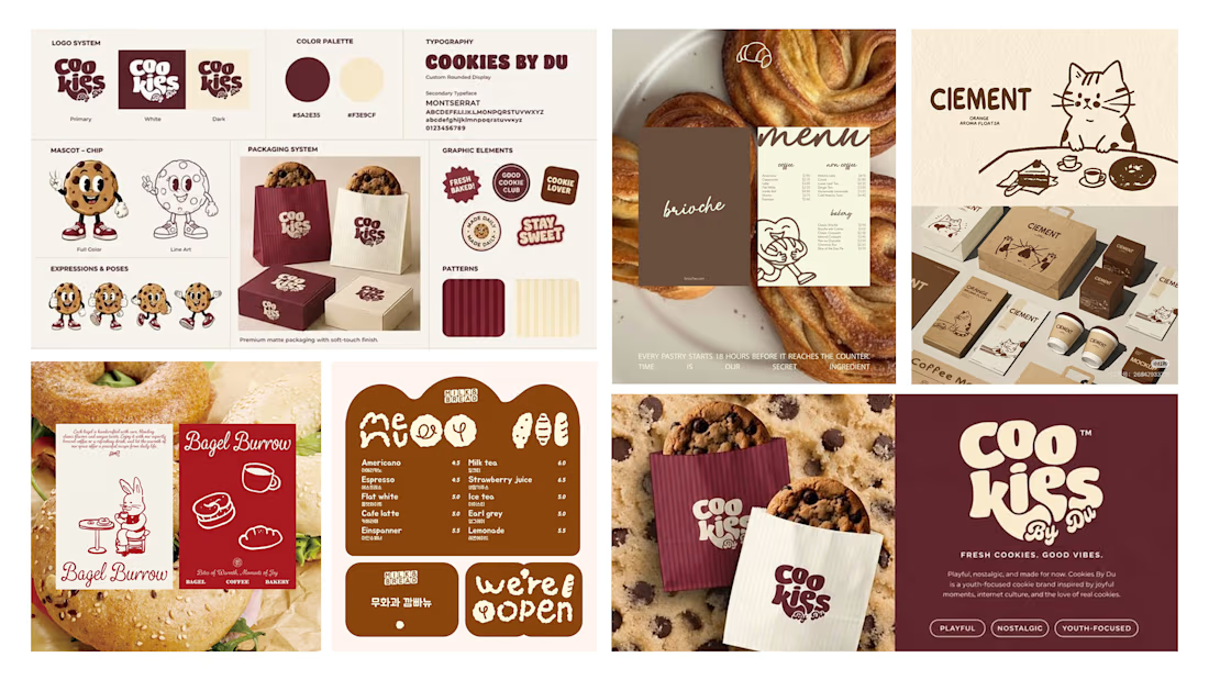
While exploring the Envato library for inspiration, we noticed how generic concepts easily fall into template traps. Anyone can pull assets or generate a quick layout, but a distinct human perspective is required to create a cohesive, soulful brand ecosystem.
The workflow:
- custom character design: we moved away from sterile AI concepts and sketched a bespoke French poodle mascot from scratch.
- bespoke typography: we hand-lettered the primary logo text to establish an authentic, homey brand voice.
- production & curation: developed the packaging system in Figma using curated Envato mockups and design assets to enhance the final presentation.
While AI is an efficient tool for rapid brainstorming, true storytelling and emotional connection still require a designer’s touch.