The network for creativity
Join 1.25M professional creatives like you
Connect with clients, get discovered, and run your business 100% commission-free
Creatives on Contra have earned over $150M and we are just getting started
Back to feedPost

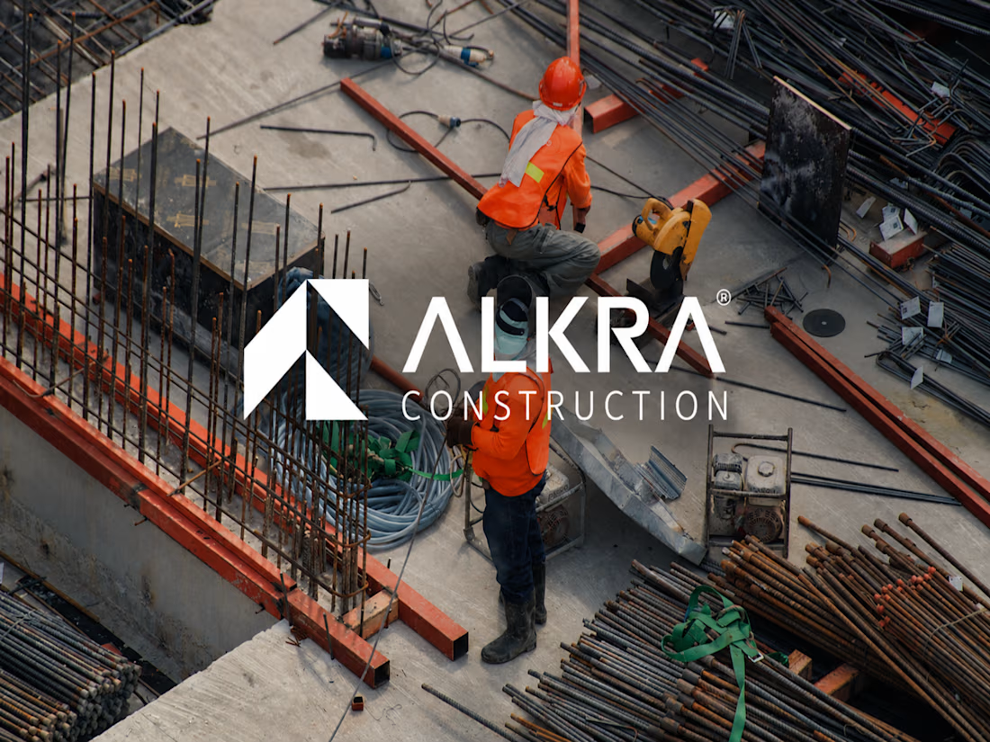
A construction brand shouldn’t just look strong. It should feel engineered.
That was the thinking behind ALKRA Construction.
The goal wasn’t to create another construction logo built around the usual buildings, cranes, or generic industrial visuals.
I wanted to create a visual identity that communicates strength, precision, progress, and long-term reliability while still feeling modern enough to stand confidently in front of investors, partners, and clients.
From the geometric ALKRA symbol and typography system to construction-site branding, vehicles, stationery, packaging, signage, and digital applications, every touchpoint was designed to work as part of one consistent system.
The result is a brand identity built to feel as solid as the structures ALKRA creates.
Built with precision. Designed for what’s next.
I’ve shared the full case study on my Contra profile.
#BrandIdentity #BrandDesign #LogoDesign #VisualIdentity #BrandStrategy #ConstructionBranding #ConstructionDesign #CorporateBranding #GraphicDesign #BrandDesigner #Contra #CreativeDesigner #VisualSystems


The angular A mark feels engineered like you wanted, no hard hats or cranes needed.
The network for creativity
Join 1.25M professional creatives like you
Connect with clients, get discovered, and run your business 100% commission-free
Creatives on Contra have earned over $150M and we are just getting started






Related posts

Winder is a bold brand identity built around a geometric W-inspired symbol, combining sharp angles and forward movement to represent progress, speed, and direction.
The identity uses a striking red and deep burgundy palette, supported by clean typography and a consistent visual system across brand guidelines, digital applications, and product mockups.
Progress in Motion.



Great logo it feels it really has an identity 🎉🎉

Somehow, every time autumn in Berlin rolls around, I'm astonished - the colours seem like they couldn't get any brighter.
I live between the city and a wonderful forest called Wuhlheide, where I often walk during long lunch breaks to get away from the screen.
The forest is a place where I can process my thoughts, generate creative ideas and submerge myself in the changing seasons.
Since that magical first autumn in Berlin, this underrated season has earned a special place in my heart.
What's your favourite season and how do you feed your creativity?
(This is an animation I made for fun, drawn in Photoshop and animated in After Effects).

That's great motion graphics congrats it's funny 🎉🎉🔥🔥


Rejected logo concepts 2026 - Which one did you like the most?
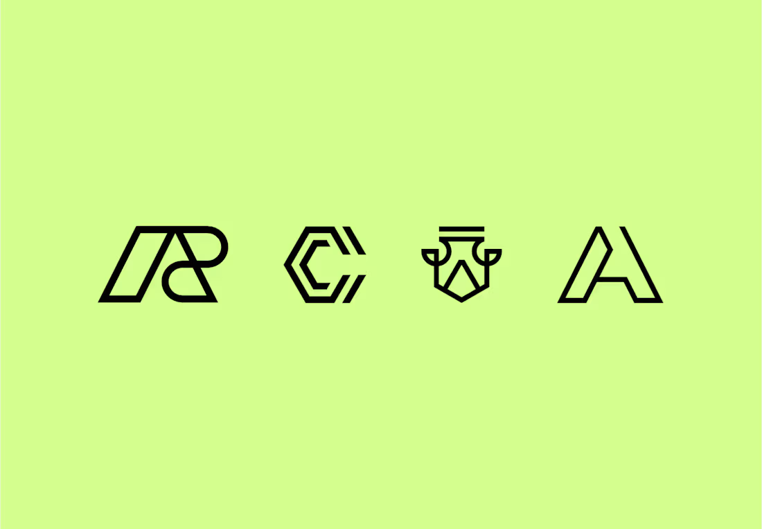

The C-shaped mark is my pick. The notched outline stays readable even when it gets small. Did the rejections come down to concept, or to how they held up at tiny sizes?