The network for creativity
Join 1.25M professional creatives like you
Connect with clients, get discovered, and run your business 100% commission-free
Creatives on Contra have earned over $150M and we are just getting started
Back to feedPost
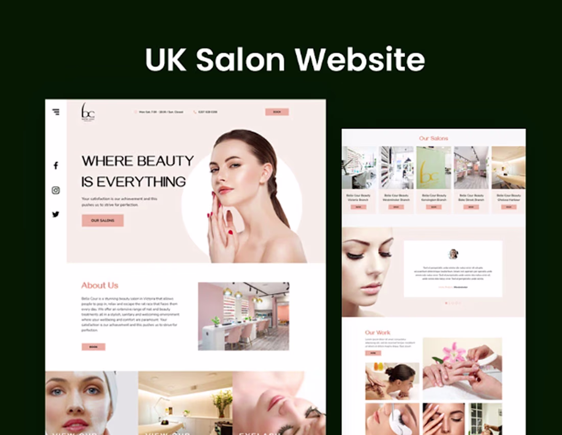
Belle Cour Beauty — Website Redesign
A UX & Visual Design Overhaul for a London Beauty Salon Brand
Overview
CLIENT
Belle Cour Beauty — a boutique beauty salon group based in London, with a location in Victoria/Pimlico offering services including nail treatments, facials, eyelash extensions, eyebrow threading, waxing, massage, and laser hair removal.
MY ROLE
UX Designer & Visual Designer — responsible for audit, strategy, and full redesign of the website.
PLATFORM
Web (desktop & mobile responsive)
The Problem
Belle Cour Beauty's existing website struggled to reflect the premium, personalised experience the brand delivers in person. Despite offering a broad and well-curated menu of beauty services across a central London location, the digital presence fell short of converting visitors into bookings.
Key Issues Identified
Cluttered navigation with an overly deep menu hierarchy — services were buried under multiple dropdown levels, making it difficult for users to find what they were looking for quickly.
Weak visual hierarchy and an inconsistent aesthetic that did not communicate the brand's upscale positioning or build trust with first-time visitors.
The homepage lacked a clear value proposition. The tagline 'Your satisfaction is our achievement' offered little differentiation or emotional resonance.
Critical information — such as location, hours, and booking options — was scattered and not immediately visible, creating friction at the most important decision point.
The booking call-to-action was present but not prominent or well-integrated into the user journey.
The site did not effectively communicate the salon's credentials, team expertise, or the personalised nature of their service — key trust signals for a beauty brand.
Mobile experience was not optimised, despite the majority of local search traffic arriving via mobile devices.
The Solution
The redesign focused on three core pillars: clarity, trust, and conversion. Every decision was made to reduce friction, communicate brand quality, and guide users toward booking.
Navigation & Information Architecture
The deep, multi-level dropdown navigation was restructured into a flatter, more intuitive hierarchy. Services were reorganised into clearly labelled categories so users could reach any treatment page in two clicks or fewer. A persistent booking button was introduced in the navigation bar on all pages.
Visual Identity & Tone
The visual language was elevated to match the salon's in-person experience — a refined, editorial aesthetic using a calm neutral palette, clean typography, and intentional white space. Photography guidelines and image treatments were standardised to create consistency across service pages.
Homepage Redesign
The homepage was restructured around a clear narrative flow: hero section with a compelling headline and immediate booking CTA, followed by service highlights, a trust-building section featuring credentials and testimonials, and a location module with practical visit information. The hero copy was rewritten to lead with outcome and emotion rather than a generic statement.
Trust & Credibility
Dedicated sections were designed to surface the salon's expertise — therapist qualifications, years of experience, and customer reviews. This content previously existed but was not strategically placed or visually prioritised.
Booking Flow
The booking experience was streamlined. The CTA was made persistent and consistent throughout the site — in the header, within service pages, and at natural decision points — reducing the number of steps between interest and action.
Mobile Optimisation
The layout was rebuilt with a mobile-first approach, ensuring that key information (hours, location, booking) and primary CTAs were immediately accessible on small screens without scrolling.
Outcome
The redesigned website presents Belle Cour Beauty as a credible, premium salon brand that is easy to navigate and easy to book. The cleaner structure reduces cognitive load for first-time visitors, while the stronger visual identity builds confidence and encourages return visits.
Design Improvements
Navigation depth reduced from 4 levels to 2, improving discoverability of all service pages.
Booking CTA made persistent and visible across all pages and screen sizes.
Homepage restructured around a clear user journey from awareness to conversion.
Visual consistency established across service pages, improving brand cohesion.
Trust signals — reviews, qualifications, personalisation messaging — surfaced prominently.
Mobile layout redesigned for thumb-friendly navigation and instant access to key information.
The network for creativity
Join 1.25M professional creatives like you
Connect with clients, get discovered, and run your business 100% commission-free
Creatives on Contra have earned over $150M and we are just getting started
Related posts
It's been a while since I last posted a project on my portfolio and today I am happy to bring this one to you!
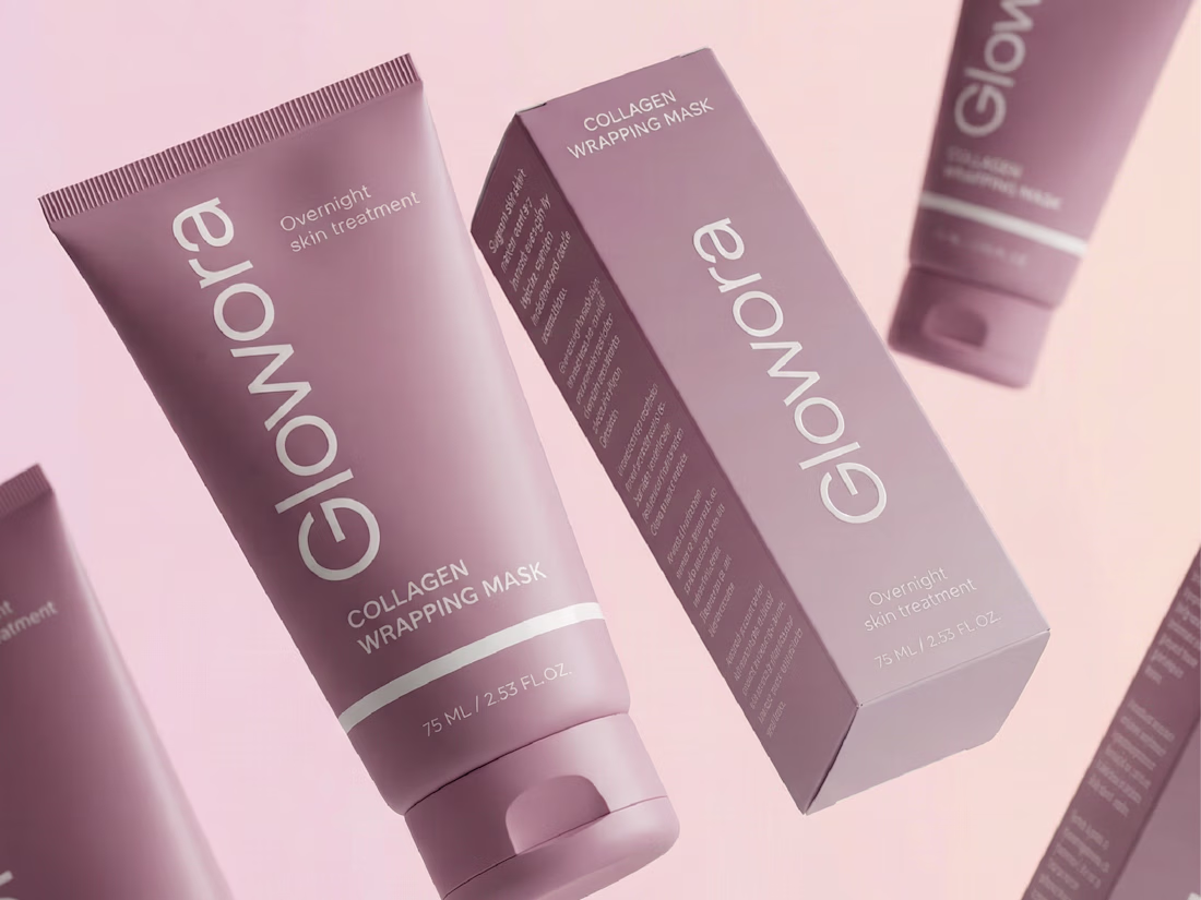
Glowora approached me with a clear foundation already in place: a defined logo and brand identity that was not being consistently applied across their existing products. The challenge was to translate that identity into packaging and label designs that truly reflected the brand’s premium positioning.
I love your use of color and composition here.
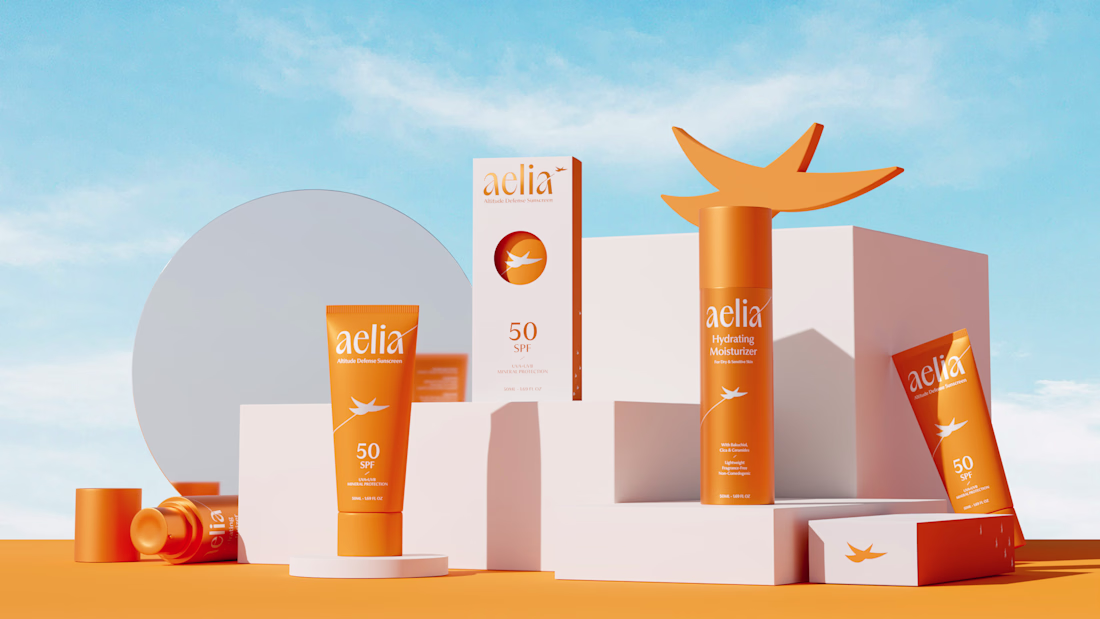
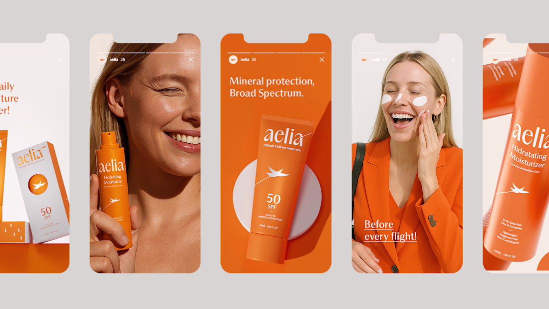
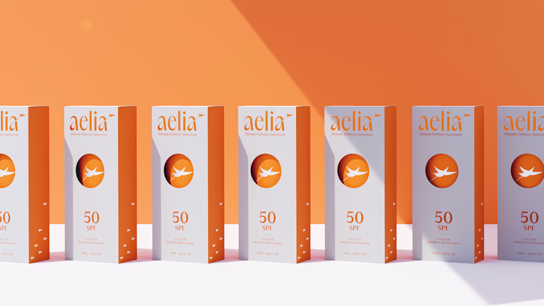
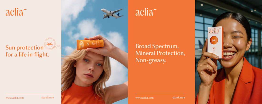
For Aelia, I was responsible for developing the brand strategy, visual identity, packaging design, and the overall creative direction of the project. My goal was to transform the founder’s unique perspective as a pilot into a distinctive brand experience, creating a clear connection between skincare, travel, and life at high altitudes.
The project began with defining the brand positioning and core narrative, which guided every design decision that followed. I created a visual identity inspired by freedom, protection, and elevation, expressed through a custom symbol, a carefully crafted color system, and a modern aesthetic designed to resonate with frequent travelers and modern explorers. The packaging was designed to reinforce this story, featuring a distinctive circular cut-out that references both the sun and an airplane window, creating a memorable and meaningful brand asset.
By aligning strategy, identity, and packaging under a single concept, I helped build a cohesive brand that feels premium, functional, and emotionally connected to its audience.
I love your use of color and composition here.
Still can't believe this is fully native.
With the Framer 3.0 update I rebuilt this viral landing page using Opus 4.8. The result is insane.
Edit every layer on the canvas or just ask Claude
Check it live https://lumio.framer.media/
How would you compare this to a website built using only claude code and pulling from something from say, the Figma MCP?
Trending
Claude
Claude has entered the design space. How are you using Claude Design?
Contra University
Learn from expert creatives how to earn more using next-gen AI tools.
MagicPath
The canvas is infinite, and exploration is becoming the workflow. How are you using MagicPath?
creativeaiflow
Creative AI workflows are evolving. What tools do you use, and what are their strengths and weaknesses?
freelancerlife
Freelancer life is wins, pivots, and everything in between. What’s yours right now?