The network for creativity
Join 1.25M professional creatives like you
Connect with clients, get discovered, and run your business 100% commission-free
Creatives on Contra have earned over $150M and we are just getting started
Back to feedPost

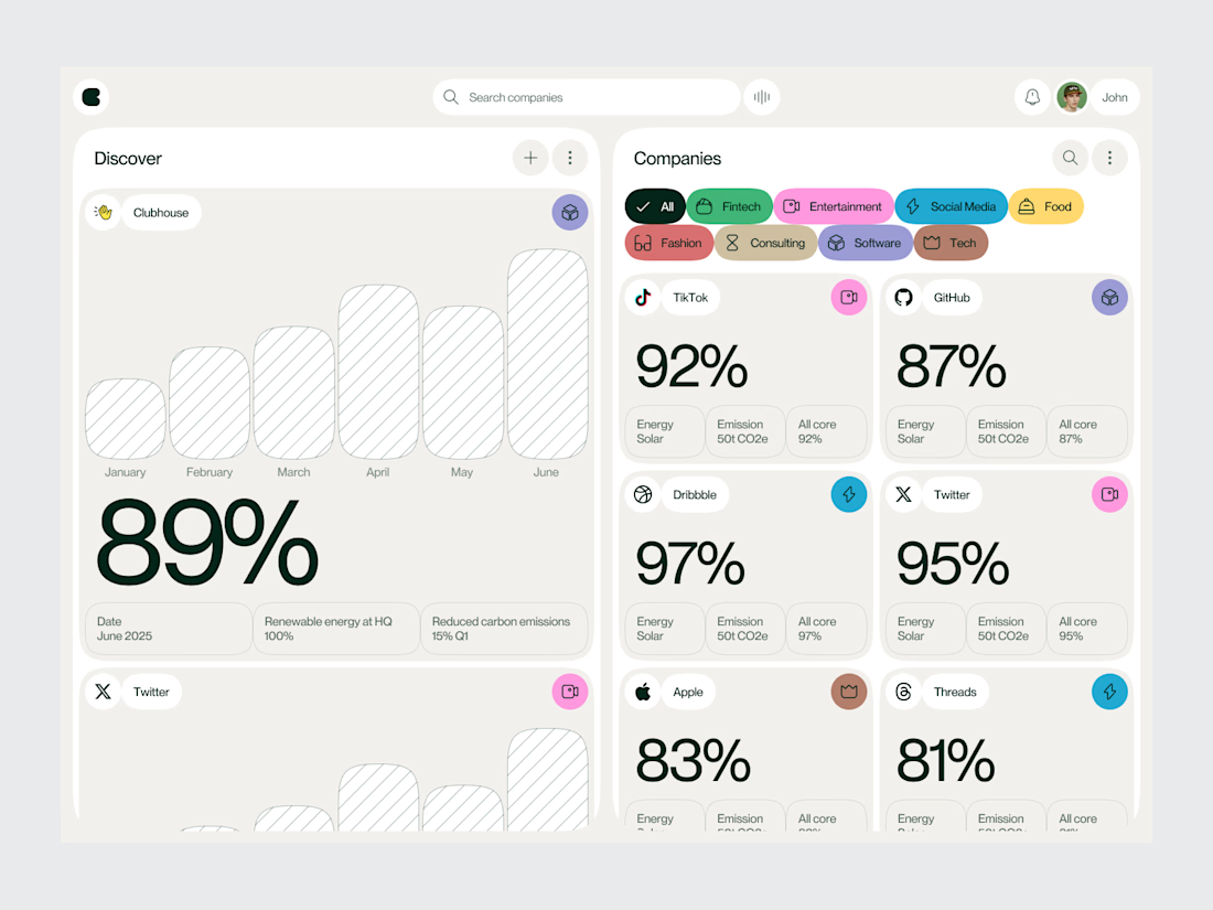
Energy platforms often deal with a lot of data.
The challenge is deciding what deserves attention first.
For this sustainable energy dashboard concept, we designed the interface around that question creating a structured experience for monitoring energy production, consumption, efficiency and sustainability performance.
The dashboard combines high-level metrics with data visualizations that help users identify changes and patterns without making the interface feel overwhelming.
The visual direction is clean and technical, but the UX remains approachable.
Services: Dashboard Design · UI/UX Design · Data Visualization · Product Design · Energy Tech UX
The goal was to turn complex energy information into a dashboard that feels clear, useful and easy to navigate.
Designed by WaxyWeb.

The network for creativity
Join 1.25M professional creatives like you
Connect with clients, get discovered, and run your business 100% commission-free
Creatives on Contra have earned over $150M and we are just getting started
Trending
retrofuturism
Share your favorite designs from the past exploring the distant future. Or your own take on the aesthetic 🚀
halftone
Dots. Texture. Grain. Let's see your designs using the halftone technique.

Midjourney
Creatives are showing off what they're making with Midjourney.
colorgrade
Video editors sound off: How do you enhance the mood of your video in color grading?





Related posts


Sunflower is built around the idea that every sober day grows your garden, and a relapse costs you something. We designed the field switch animation to make that psychological loop visible and felt, not just understood.
The movement had to feel natural and meaningful, soft timing, nothing gamified or cheap, because a recovery app that feels like a slot machine loses the user's trust immediately.
The goal is to make progress feel real enough that users think twice before breaking their streak.

Obsessed with the bee! 🐝 Such good design!


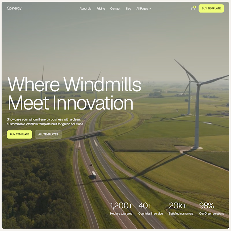
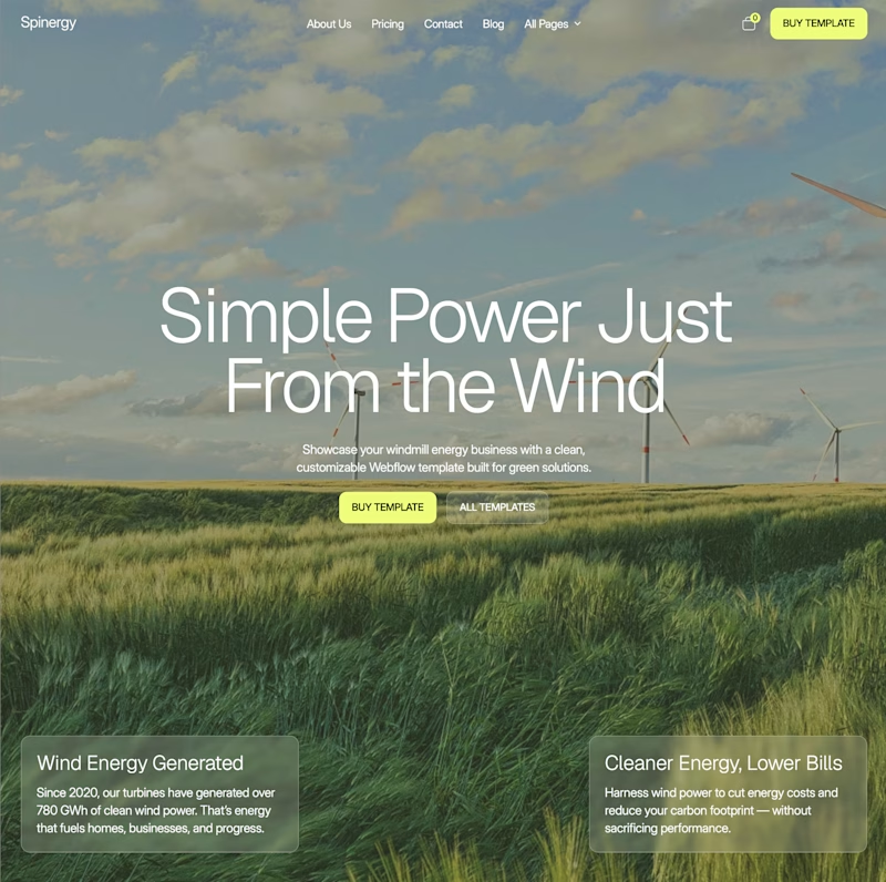
I’ve been staring at these two for too long, so I’ll let you decide.
Both are homepage directions for Spinergy, a Webflow template for wind energy companies.
Which one would you choose?

50 voted
68%
24 voted
32%
74 votes
Closed


A look at a Web3 gaming concept from our archives.
We explored a neon-driven visual direction for a fast-paced shooter, combining bold typography, anime-inspired visuals, and a dark green palette.
The goal was to create a style that feels energetic, playful, and instantly recognizable across the experience.
A concept built around gaming, Web3, and strong visual identity.


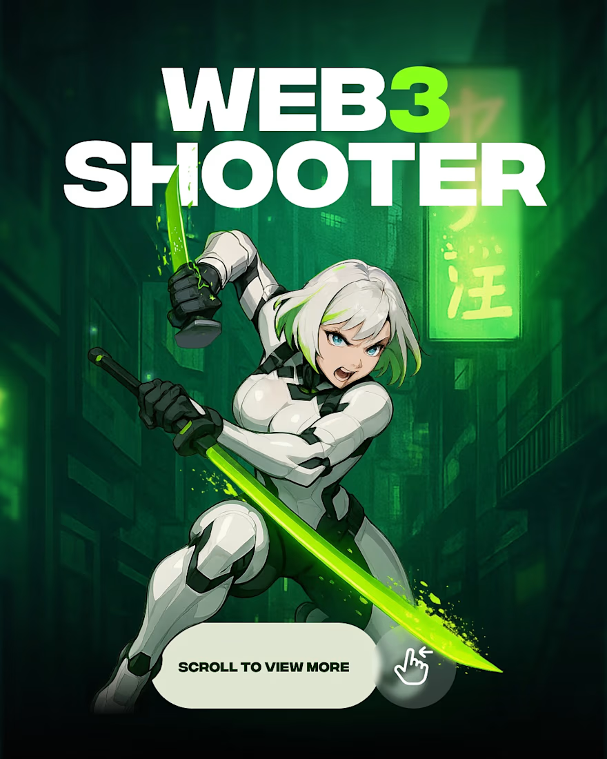
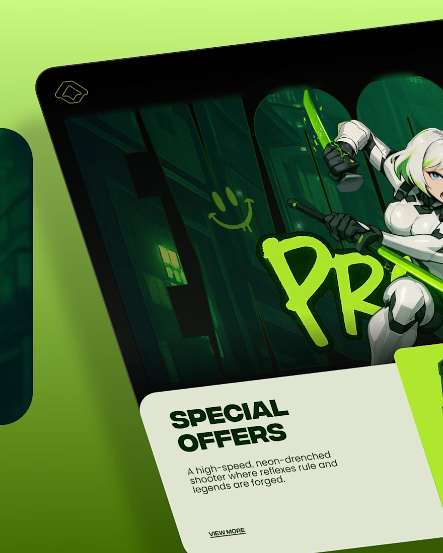
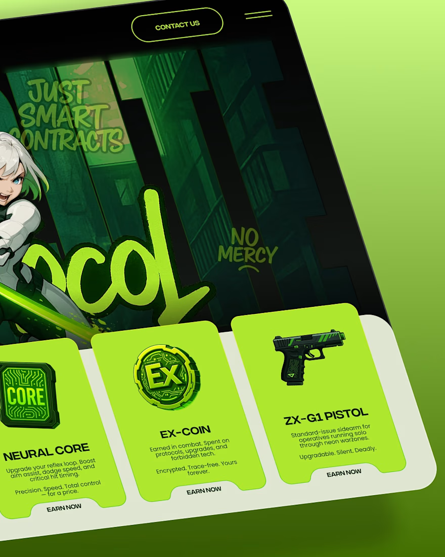
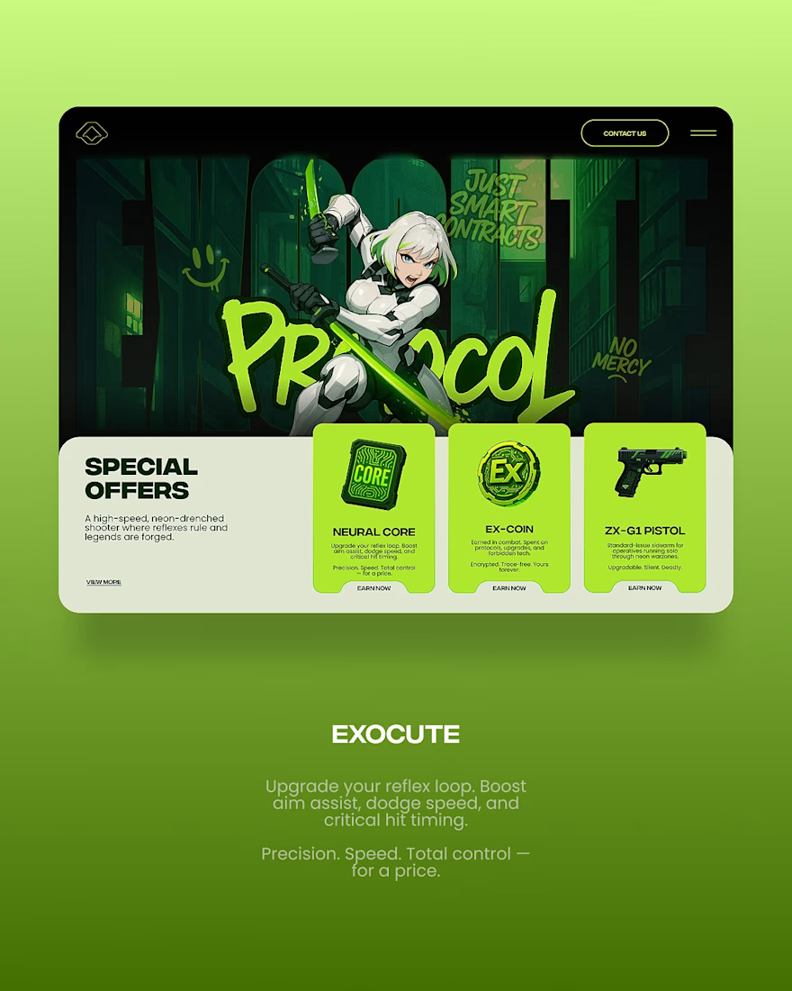

The neon-green graffiti type carrying through the item cards and the store screen is what sells it as one world, not just a splash art — that consistency is usually the first thing that gets cut when a game's marketing and in-app UI are designed separately.