The network for creativity
Join 1.25M professional creatives like you
Connect with clients, get discovered, and run your business 100% commission-free
Creatives on Contra have earned over $150M and we are just getting started
Back to feedPost

Testing Seedance 2.5 for Direct-Response UGC: A Cetaphil Skincare Case Study
I used Cetaphil's Daily Defence Facial Moisturiser SPF 30 as a test case to push Seedance 2.5 against my ecom creative workflow, from product shot to a full UGC-style ad with script and voiceover.
The goal was testing whether an AI-generated model could carry a direct-response arc, real problem, skeptical-to-convert turn, proof, soft CTA, the way a real UGC creator would, without looking scripted or "studio."
What went into it:AI-generated creator in an organic bedroom setting with handheld angles and natural lighting, a voiceover refined to sound genuinely spoken rather than read, a before/after beat,timed to the visuals, and my six-layer prompt formula to keep everything consistent.
Why it matters:Brands don't need more polished ads, they need content that doesn't look like one. This project shows AI-generated UGC can hit that bar at a fraction of the cost and turnaround of a traditional shoot.If you're a skincare or DTC brand looking to test UGC-style creative at scale, this is the kind of work I do. Let's talk.
seedancechallengeecommercevideoAI Video ProductionCreative StrategistVideo EditingCapCutChatGPTClaude


The network for creativity
Join 1.25M professional creatives like you
Connect with clients, get discovered, and run your business 100% commission-free
Creatives on Contra have earned over $150M and we are just getting started










Related posts

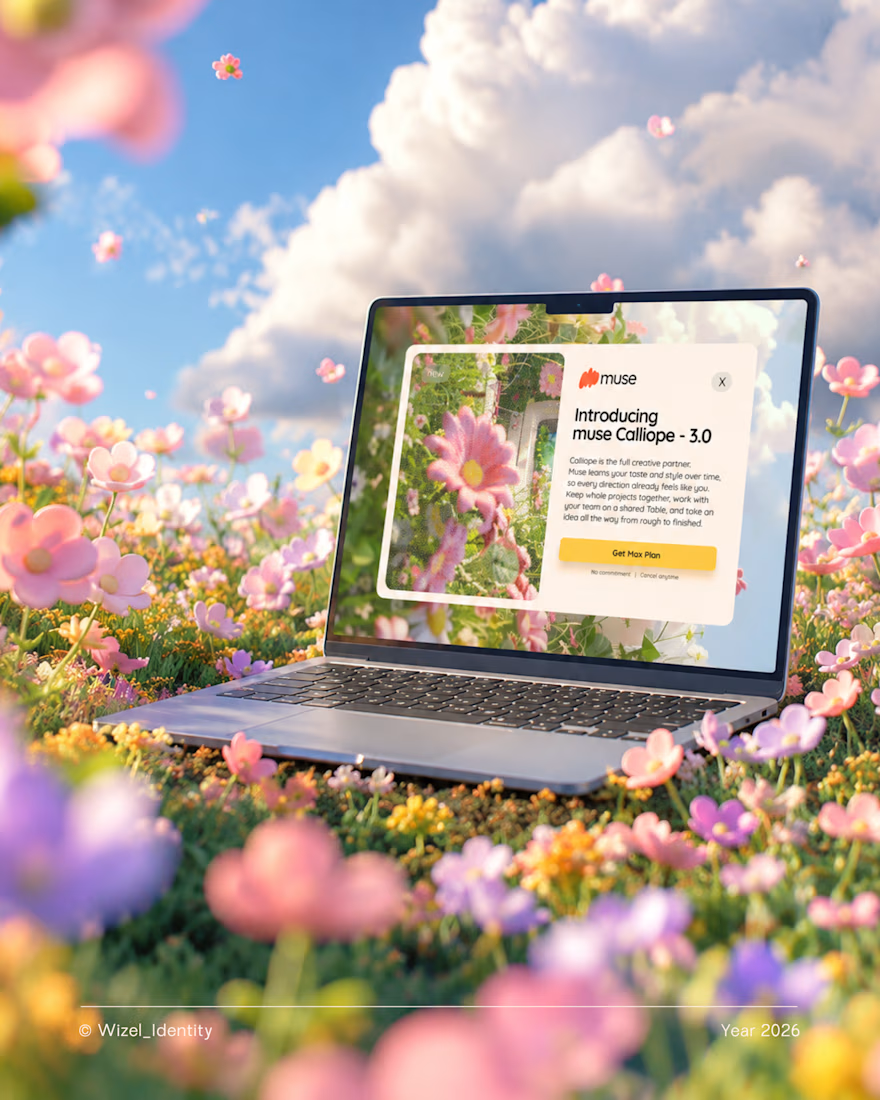
What if creating felt more natural? 🌼
Meet Muse, an AI creative companion that helps turn rough ideas into clear concepts.
The thought you can't quite explain. The idea that's still taking shape. The concept you're trying to bring to life.
Muse meets you right there.
For this identity, I explored a visual direction that feels playful, expressive, and full of possibility, a reflection of what creativity can feel like when you have room to explore.
Brand identity design for Muse.
Designed by Wizel_Identity. © 2026
#BrandIdentity #VisualIdentity #BrandDesign #CreativeTechnology #AI



T O P!

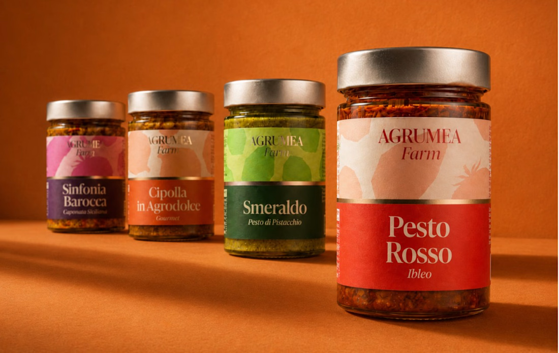
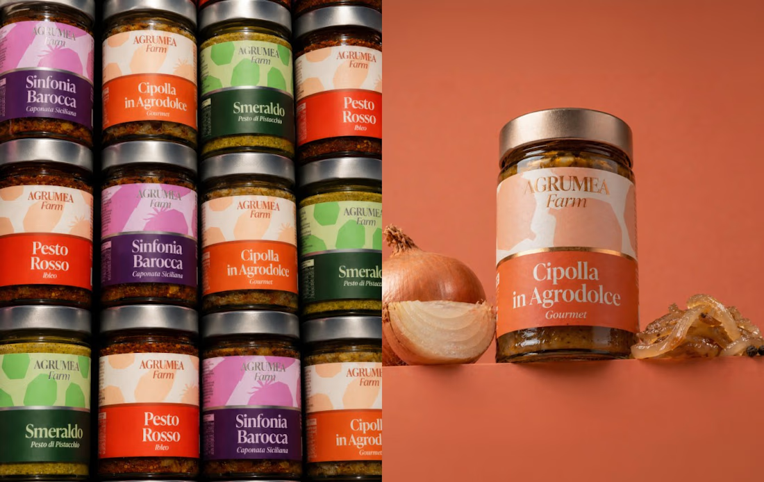
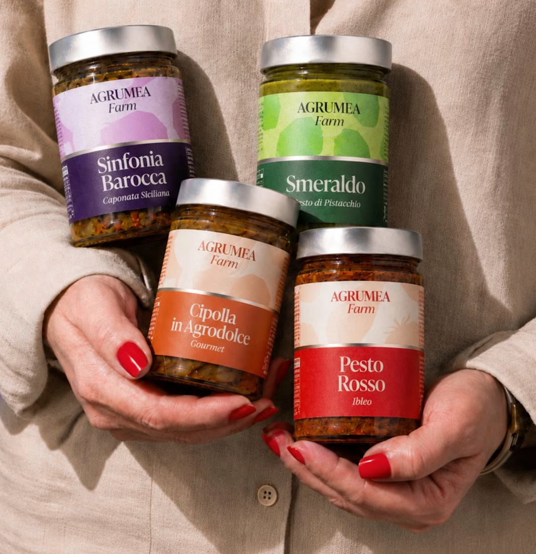
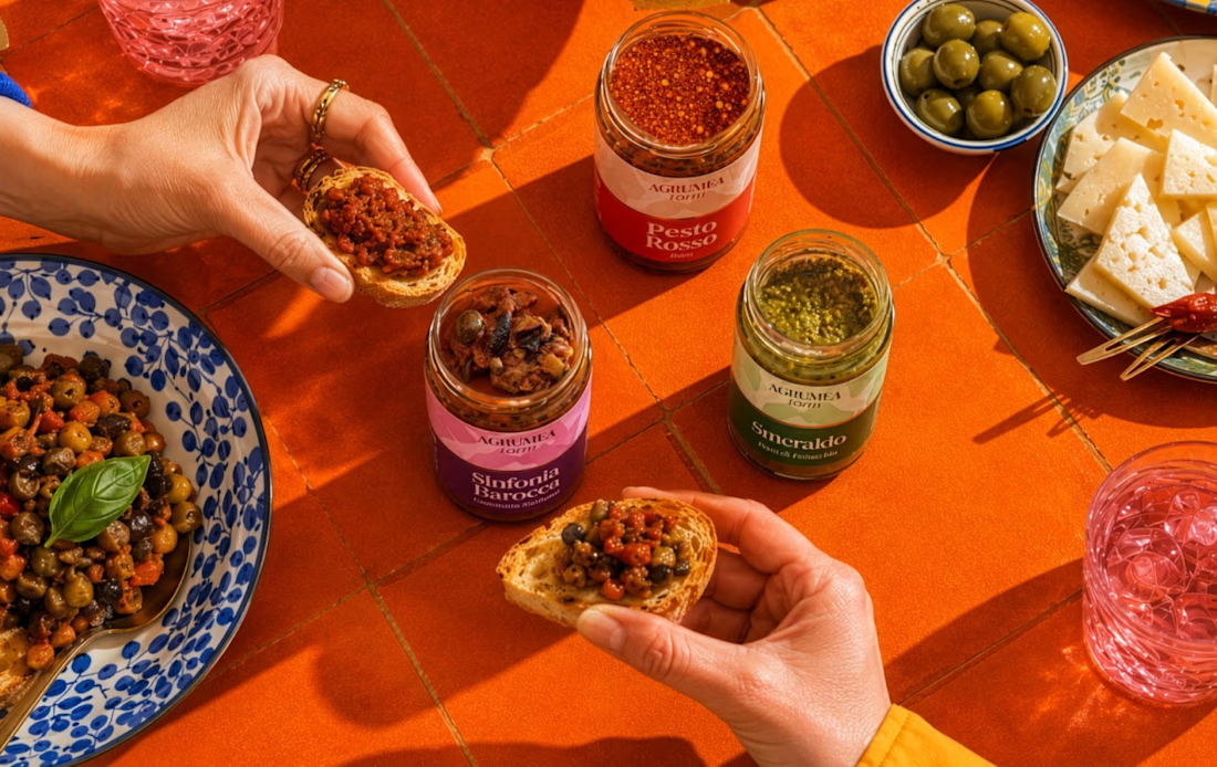
This image showcases a premium food packaging design for AGRUMEA Farm, featuring a collection of gourmet sauces and pesto products in transparent glass jars. Each jar has a metallic gold-colored lid and a beautifully designed paper label with elegant typography, colorful backgrounds, and a refined artisanal aesthetic.
The composition uses a warm burnt-orange background and matching tabletop to create a cohesive, luxurious atmosphere. The largest jar is positioned in the foreground, while three smaller jars are arranged behind it to create depth and perspective.
Design style: Premium Food Packaging, Minimalist Branding, Gourmet Product Photography, and Luxury Product Mockup.
Key Design Elements
Packaging: Transparent glass jars with metallic gold lids.
Label design: A combination of cream-colored upper sections and bold, colorful lower sections.
Typography: Elegant serif fonts for product names, paired with smaller italic text for product descriptions.
Color palette: Burnt orange, cream, red, green, purple, and gold.
Lighting: Warm studio lighting with realistic reflections on the glass and metallic lids.
Composition: Multiple products arranged at different distances, with the largest product in the foreground.
Background: A seamless orange studio backdrop with a matching surface and soft shadows.



Fantastic

What if "living water" could come alive?
An unofficial AI concept for Borjomi, built as a 10-second visual story: a can opens, mineral water becomes a stag, then returns to the product.
The goal was to make the effects feel like one cinematic transformation — not a series of disconnected shots.
AI-generated stills + image-to-video workflow + art direction by me.
Not affiliated with Borjomi.
#AIAdvertising #AIVideo #CreativeDirection #VFX #BrandConcept

Mineral water becoming a stag is a beautiful brand image, Alexander. Aiming for one cinematic transformation instead of disconnected shots gives the concept real art direction. Lovely VFX storytelling.