The network for creativity
Join 1.25M professional creatives like you
Connect with clients, get discovered, and run your business 100% commission-free
Creatives on Contra have earned over $150M and we are just getting started
Back to feedPost

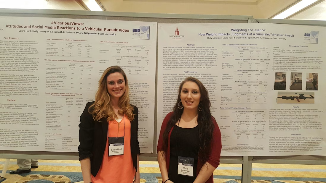
A criminology research presentation examining how perception, interpretation, and professional viewpoints can shape understandings of justice-related issues. Presented at the American Society of Criminology conference in New Orleans.


The network for creativity
Join 1.25M professional creatives like you
Connect with clients, get discovered, and run your business 100% commission-free
Creatives on Contra have earned over $150M and we are just getting started




Related posts

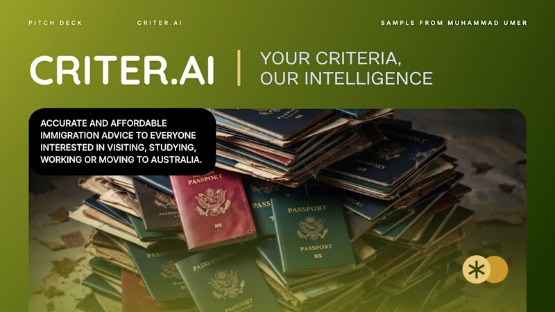
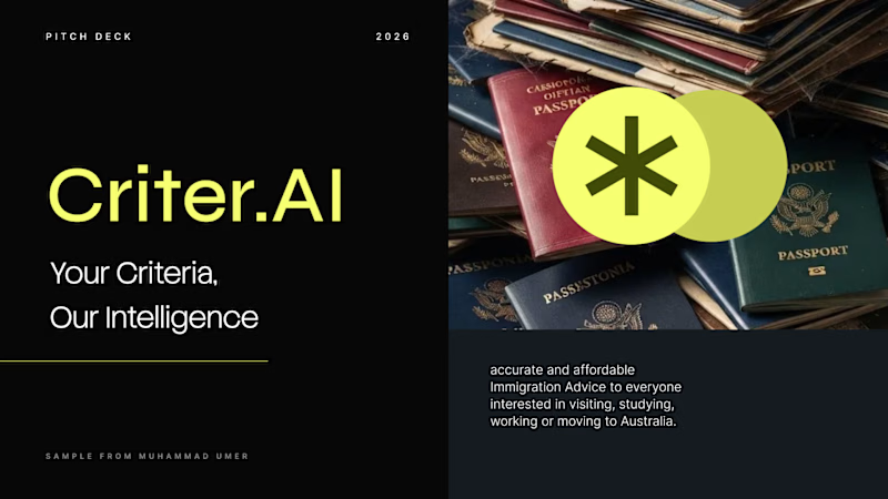
Criter.AI: Pitch Deck Cover, Two Design Directions
For an AI immigration advice platform serving Australia, I explored two cover directions to test how tone changes perception.
Direction 1, Olive gradient: warm, human and trustworthy, with a rounded image card and gold accents.
Direction 2, Dark and neon: high contrast, modern and investor-ready, with a bold split layout.
Both keep the brand mark, the tagline "Your Criteria, Our Intelligence" and the hero imagery, so the difference is purely in the design language.
Scope: pitch deck cover design and visual direction
Tools: Figma, PowerPoint, etc.
Available for pitch decks, presentations and brand design. Open to new projects.
Contra tags: , Presentation Design, Graphic Design, Branding, Startup Design
3 voted
50%
3 voted
50%
6 votes
Closed

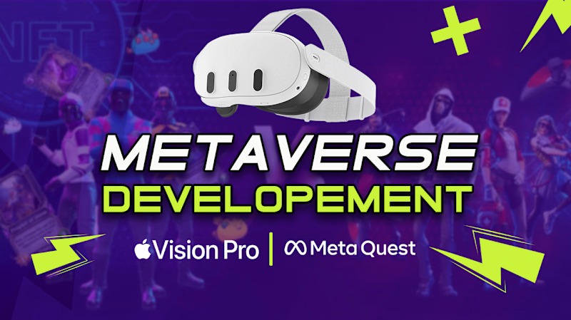
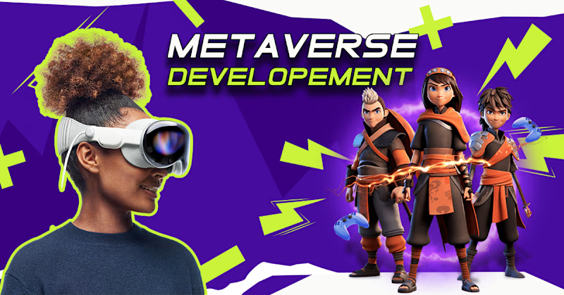
Fiverr Thumbnail Design — Visual Direction Exploration
Overview
Designed two visual directions for a Fiverr thumbnail, exploring different approaches to composition, typography, imagery, and visual hierarchy.
Direction 01: Centered Impact: A bold, center-focused layout that places the main message at the visual focal point for immediate readability and impact.
Direction 02: Dynamic Balance: A more dynamic composition using side-positioned typography with supporting imagery to create visual movement and stronger balance.
Both variations were created from the same core concept to explore how different layouts can influence attention, readability, and overall engagement.


3 voted
75%
1 voted
25%
4 votes
Closed

centered for me

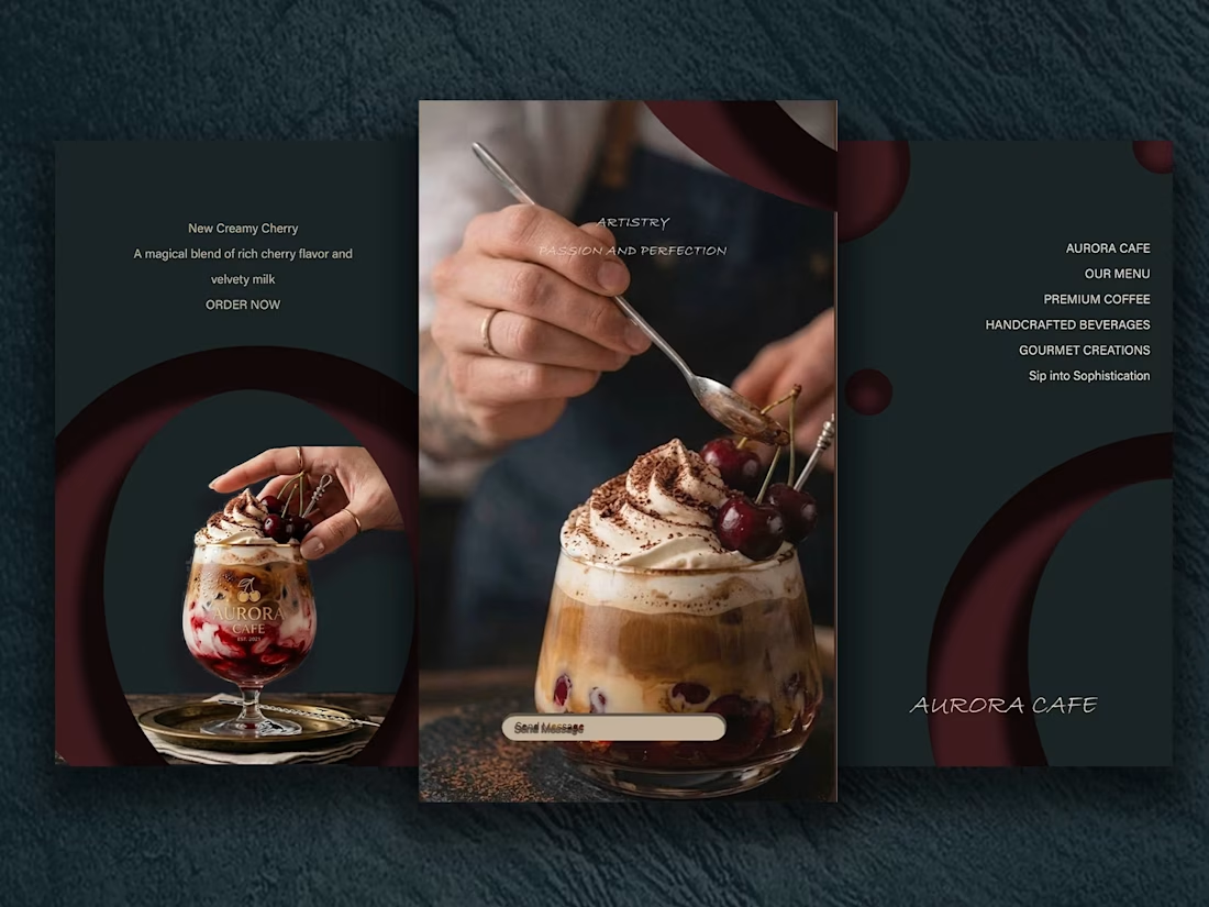
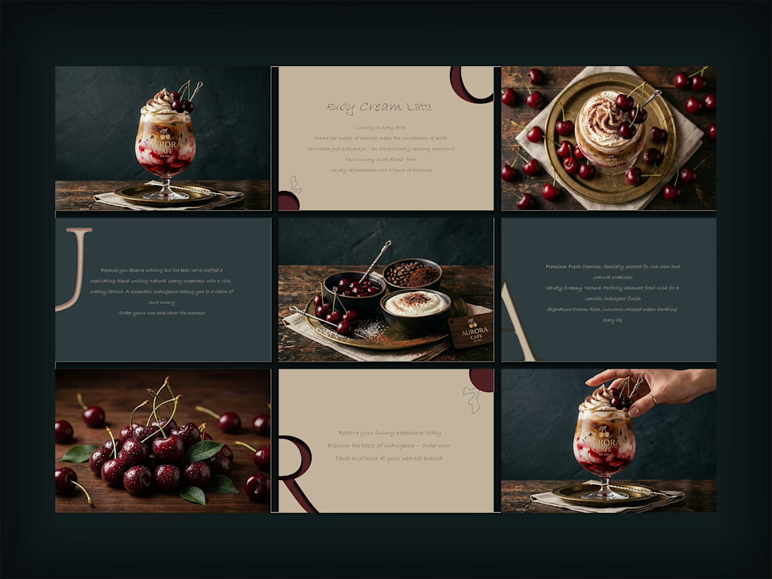
AURORA CAFE — Cherry Drink Presentation
Here is how I presented our new cherry and milk drink across multiple formats.
The dark background was used simply to highlight the drink and make the rich cherry and white milk pop out clearly.
I split the presentation into different styles: a main cinematic shot, a 3x3 grid showing texture details, and swipeable slides.
Which format do you like the most?