The network for creativity
Join 1.25M professional creatives like you
Connect with clients, get discovered, and run your business 100% commission-free
Creatives on Contra have earned over $150M and we are just getting started
Back to feedPost

A UI on paper is a promise. A UI in motion is proof.
After completing Rian full rebrand, I Worked on the UI-UX for Rian's website translating their visual identity into every screen.
I kept pain points they are solving, platform's key features and real use cases at the centre of every decision.
Building something and need this kind of clarity? DM me.


The network for creativity
Join 1.25M professional creatives like you
Connect with clients, get discovered, and run your business 100% commission-free
Creatives on Contra have earned over $150M and we are just getting started



Related posts

Happy to share a little piece of what I've been working on lately: Nexus.
Nexus is a concept for a network that moves money and data as fast as the internet moves information. Payments, tokenized assets, AI agents that pay for things on their own, apps that need privacy by default.
The full website is coming soon.



Big idea and it looks great. Excited to see where you take Nexus next.

Torna-te quem tu és. Become who you are.
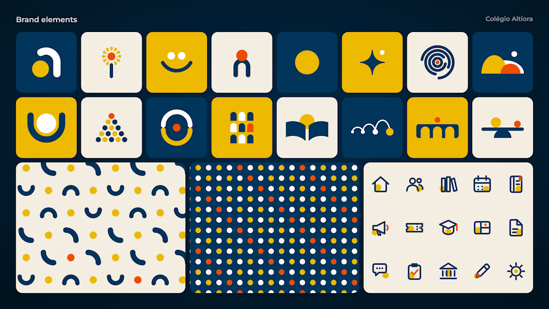
That is the motto of Colégio Altiora, and the whole identity starts from it. Altiora is Latin for "higher things", so the symbol is a small "a" built from two pieces, an arch that rises and a yellow ball.
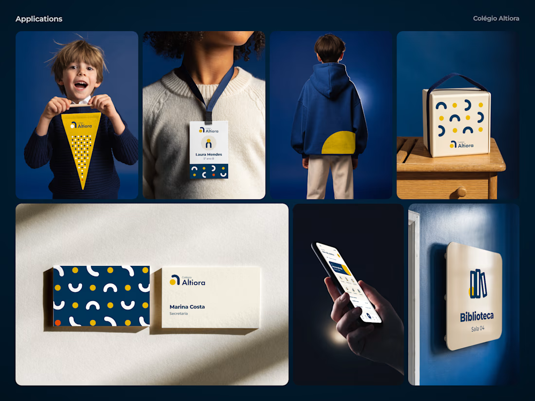
From those two pieces came everything else. The patterns, the brand elements, the icons for the school app, the classroom signs and the uniform all share the same arch and the same ball.
A school for those who always reach higher.


Great job nice icons

Website & Branding for Blockchain Payments Consortium (Mysten Labs)
