The network for creativity
Join 1.25M professional creatives like you
Connect with clients, get discovered, and run your business 100% commission-free
Creatives on Contra have earned over $150M and we are just getting started
Back to feedPost

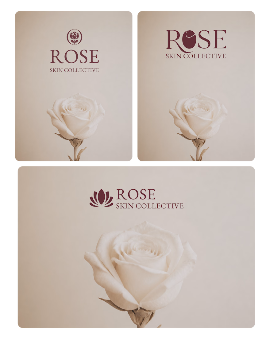
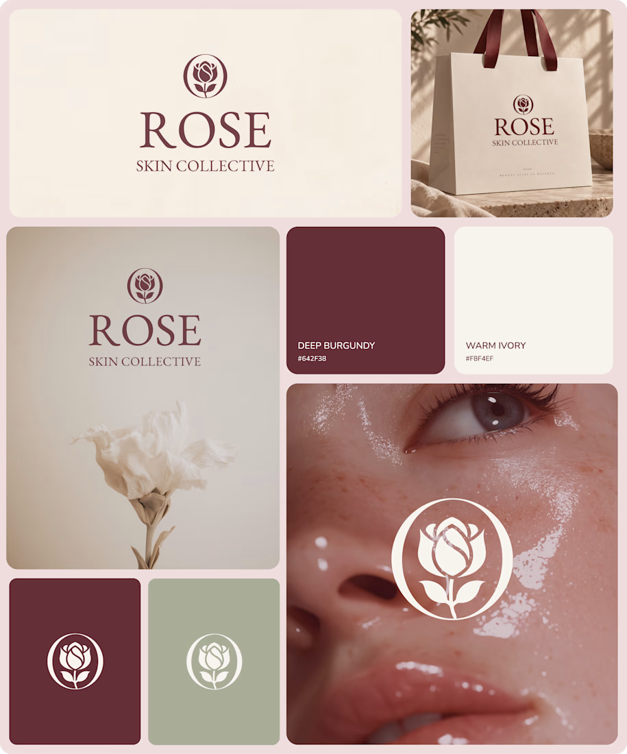
Recently completed the branding for a beauty & skincare brand.
Just wrapped up the branding work, and now moving on to the website design. Excited to see how it all comes together!
The network for creativity
Join 1.25M professional creatives like you
Connect with clients, get discovered, and run your business 100% commission-free
Creatives on Contra have earned over $150M and we are just getting started






Related posts


Creating 2 concepts for a project, this is the first one.
I’m really enjoying the process!
Right now, we’re defining the strategy and visual direction, which will later serve as the foundation for developing the final brand identity.
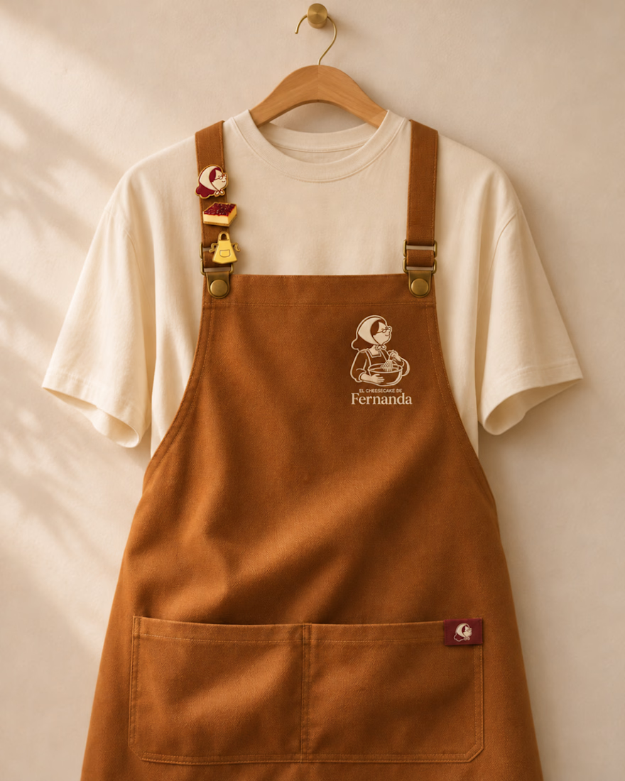
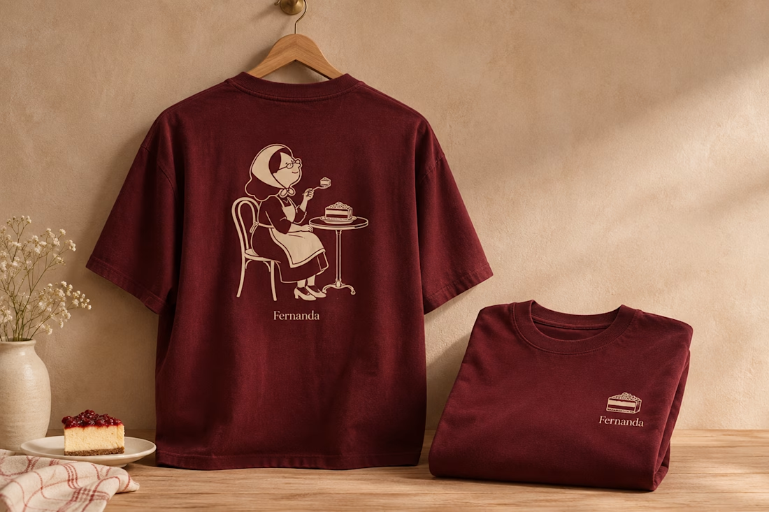

Nice logo design I like how logo is placed in clothes


Working on a revived product we did branding for a while back. Excited to show more

The big percentages with the thin progress bar make the odds readable at a glance. Did the green carry over from your original branding?

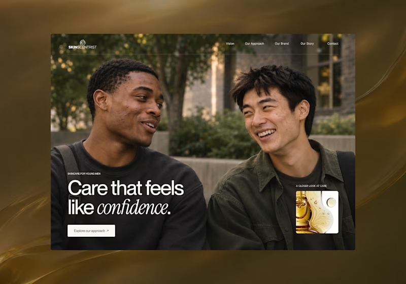
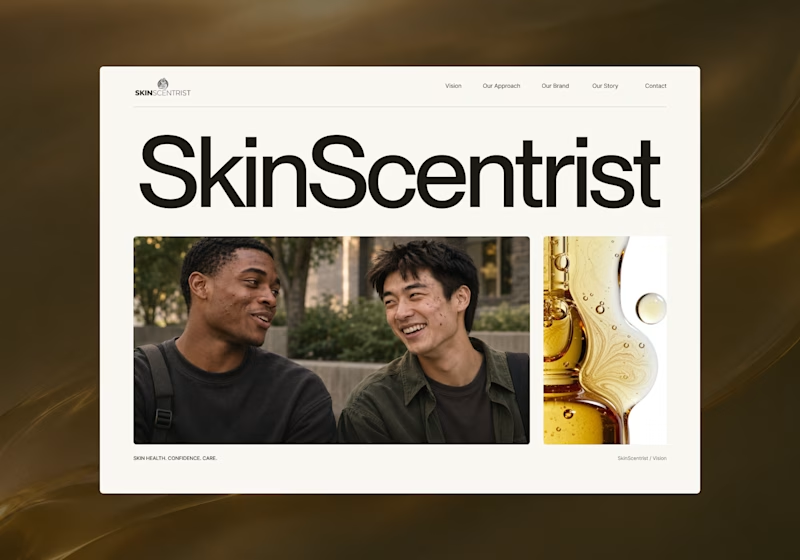
I’m exploring two homepage hero directions for SkinScentrist, a skincare brand focused on helping young men feel more confident in their skin.
Both concepts use the same imagery but take very different approaches to storytelling and visual hierarchy.
Direction 1 feels more emotional, immersive, and lifestyle-driven. The full-screen photography and bold messaging create a stronger connection to confidence and self-care.
Direction 2 feels more minimal, editorial, and brand-focused. The oversized typography, clean layout, and product imagery give it a more refined, contemporary skincare feel.
Direction 1: immersive, personal, emotional
Direction 2: minimal, editorial, premium
Which direction feels stronger for a modern skincare brand?

14 voted
93%
1 voted
7%
15 votes
Closed

Direction one — the full-screen photo feels warmer.