The network for creativity
Join 1.25M professional creatives like you
Connect with clients, get discovered, and run your business 100% commission-free
Creatives on Contra have earned over $150M and we are just getting started
Back to feedPost

Nice


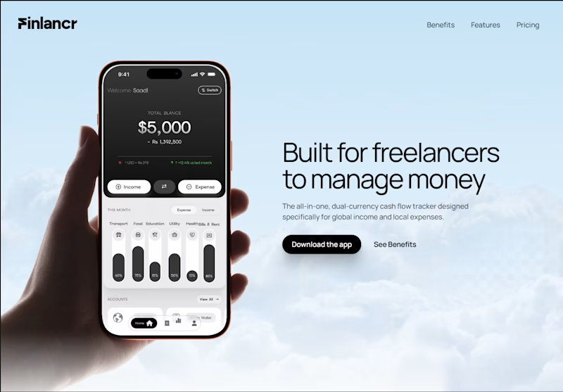
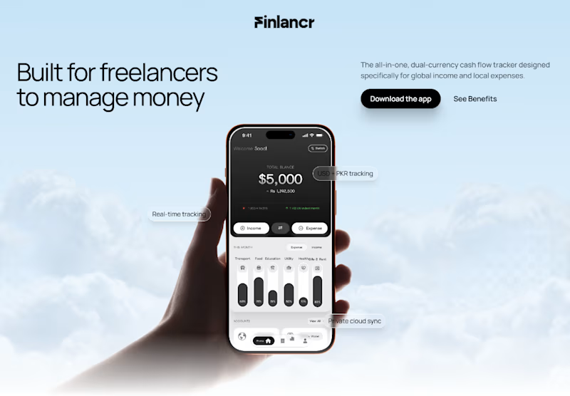
Designing the hero section for a freelance finance app.
Which hero design would make you download the app?
30 voted
64%
17 voted
36%
47 votes
Closed

I’d go with the right hero it gives the content more room to breathe and makes the value proposition easier to scan.
The network for creativity
Join 1.25M professional creatives like you
Connect with clients, get discovered, and run your business 100% commission-free
Creatives on Contra have earned over $150M and we are just getting started





Related posts

Same product, two first screens. Jockey by TwelveLabs, dark neon or clean white. 1 or 2.
8 voted
17%
38 voted
83%
46 votes
Closed


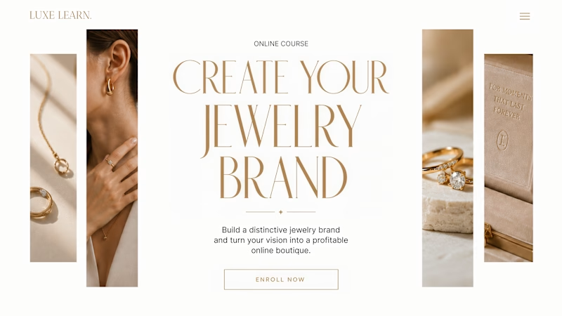
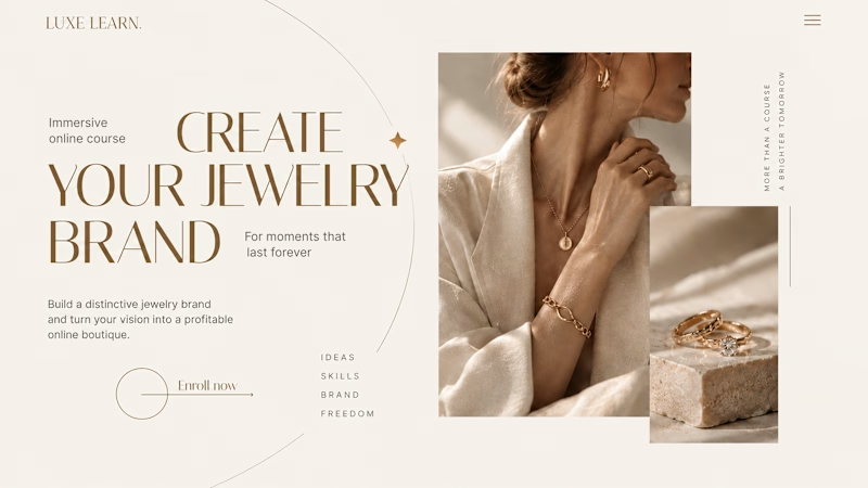
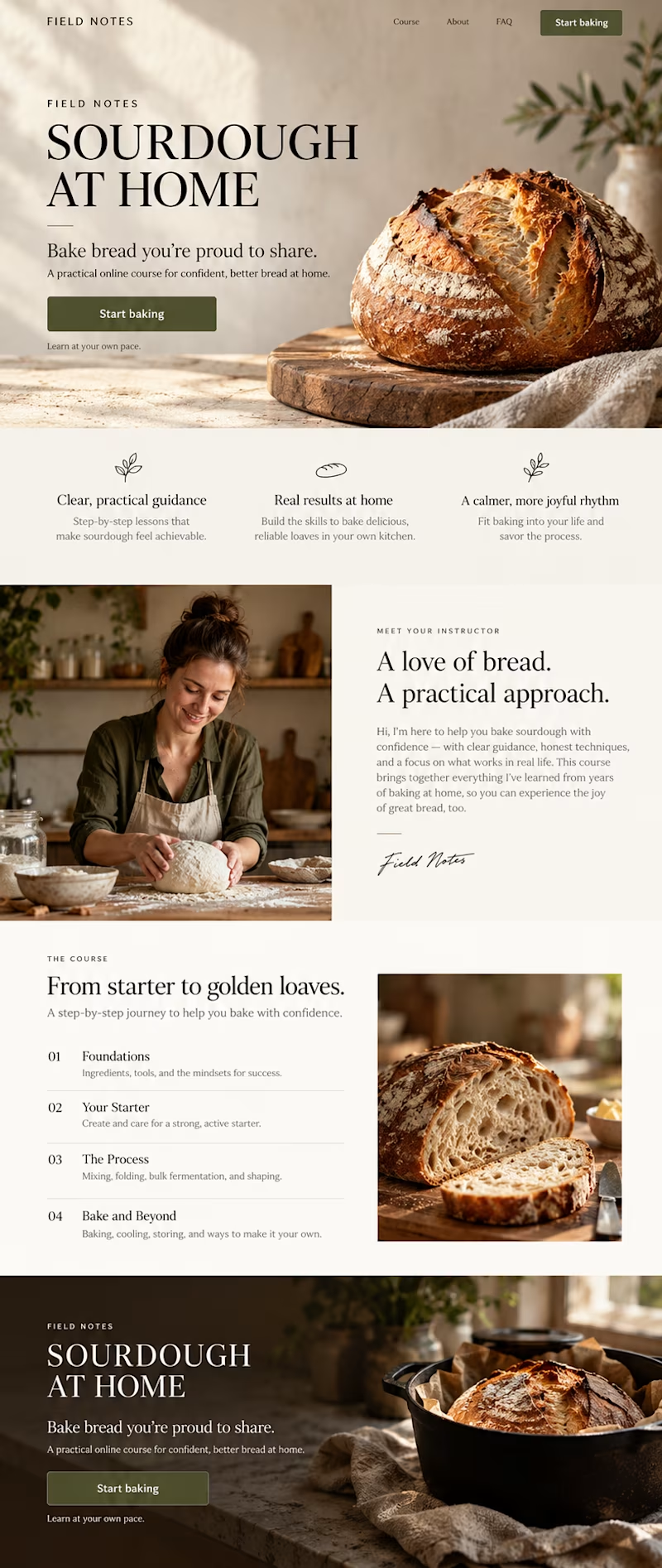
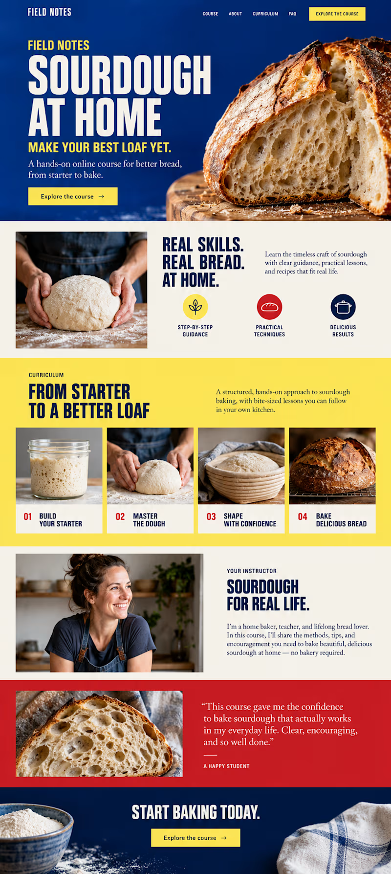
Same course. Same content. But two completely different feelings ✨
Which version would you choose?
27 voted
59%
19 voted
41%
46 votes
Closed

Option 2 is more practical ❤️❤️


Which direction would you choose for a sourdough course sales page in Kajabi?

34 voted
59%
24 voted
41%
58 votes
Closed