The network for creativity
Join 1.25M professional creatives like you
Connect with clients, get discovered, and run your business 100% commission-free
Creatives on Contra have earned over $150M and we are just getting started
Back to feedPost
Taste Test
Two leaderboard designs. One clear winner.Guess which one
48 voted
84%
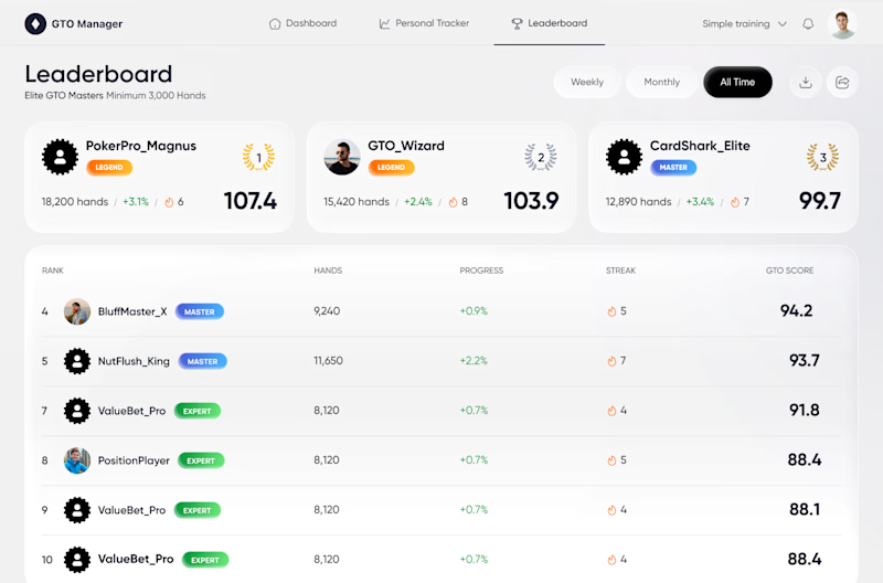
9 voted
16%
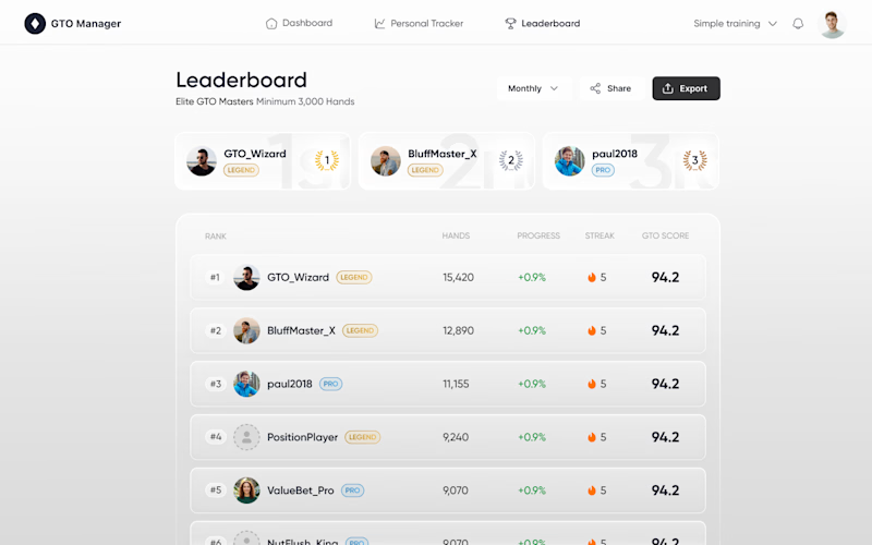
57 votes
Closed

option works best, the structure the details works well

🙌

Option 1
Thank you for voting ! Our team as well chose Option 1, but unexpectedly, the client chose Option 2.
That is cool as well bro!

Creative !
Thank you, Sahil 🙌

Option 1 for sure!
It was obvious for us as well. But, to our surprise, the client chose option 2.
Really?
Wow, it's interesting.
Yes, it really did come as a surprise to us. We had also opted for Option 1. We developed Option 1 in accordance with the client’s references.


Option 1
Thank you for voting! Our team also chose option 1, but, to our surprise, the client chose option 2.


I pick option 1
We also picked option 1, but not our client

Option 1 for sure. Looks more immersive
Thank you for voting ! Our team as well chose Option one, but unexpectedly, the client chose Option 2.

Option 1 for me — the glassy dark panel makes the top ranks pop way more. Was the flatter option 2 your original client-approved direction, or is this an internal redesign push?
It was a real taste test based on the client’s reference. We tried to recreate the glassy effect from their reference, exactly as you noticed (good eye, Maty👍 ).But made it more obvious and put more accent on contrast to help that effect read clearly. Unexpectedly, the client chose Option 2.
Ha, that's a fun twist — proof that our "obvious" read isn't always the client's. Good sign you tested rather than just shipped your gut pick though.
Exactly, a personal point of view can sometimes really take a designer by surprise 🙌

option 1
Actually, for us it was a big surprise when client has chosen Option2

Option 1
Yes, our whole team, and you too, but not our client.

1st one seems more clearer
Unexpectedly, client chose option 2

Option 1

Option 1 is the clear winner. The top 3 layout packs way more useful context with the direct score visibility and the table lines below keep the ranking clean and easy to scan.
We also prefer Option 1 the score visibility, context density, and clean scanned ranking make it stronger. However, the client didn’t go with that; they chose Option 2.

Option 1 looks great!
We also prefer Option 1 ,but, the client chose Option 2.
I would like to thank you all for voting. Our team was also very keen on Option 1, but, unexpectedly, the client chose Option 2.
The network for creativity
Join 1.25M professional creatives like you
Connect with clients, get discovered, and run your business 100% commission-free
Creatives on Contra have earned over $150M and we are just getting started
Trending
retrofuturism
Share your favorite designs from the past exploring the distant future. Or your own take on the aesthetic 🚀
halftone
Dots. Texture. Grain. Let's see your designs using the halftone technique.

Midjourney
Creatives are showing off what they're making with Midjourney.
colorgrade
Video editors sound off: How do you enhance the mood of your video in color grading?


Related posts


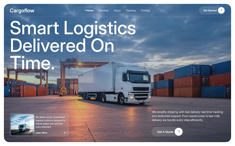

I’d go with 2. The cinematic image makes the brand feel more established.

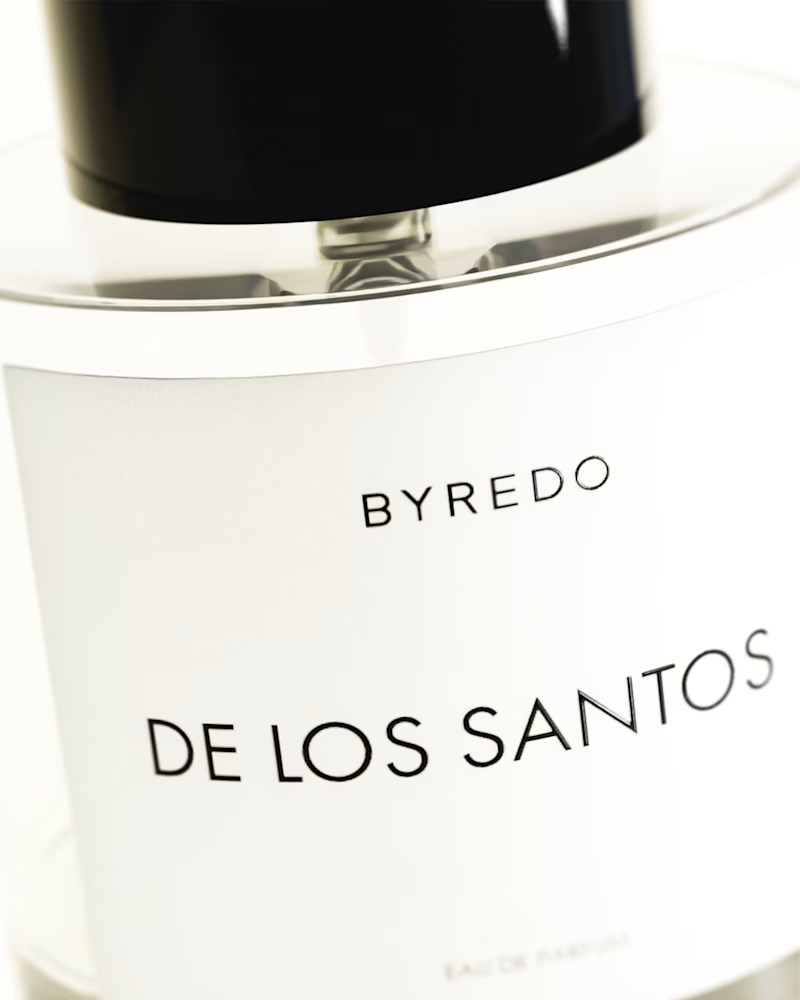
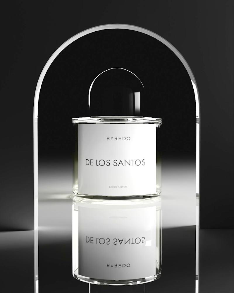
Deep in Blender lately.
Byredo bottles, built from scratch, spent most of this one chasing lighting and reflections until they felt real.
Two versions, two different lighting setups. Vote for your favorite 👇

2 votes
Ends in 1d

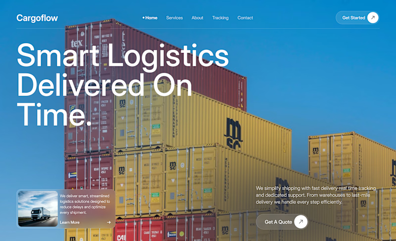
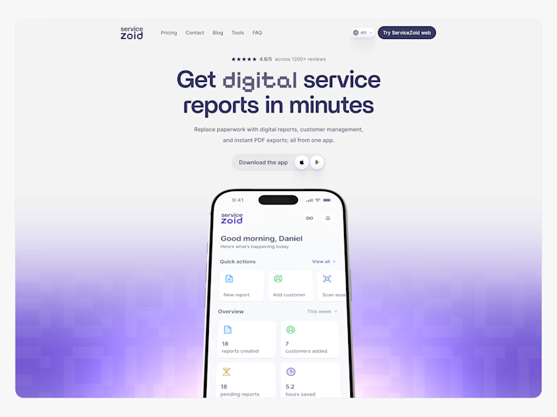
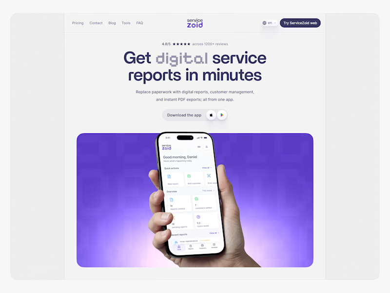
Two directions for this hero section.
Which one's winning for you, v1 or v2?
15 votes
Ends in 1d


Both are strong! I like the subtle detailing in V2.
But I guess the liquid background of V1 feels extra immersive.