The network for creativity
Join 1.25M professional creatives like you
Connect with clients, get discovered, and run your business 100% commission-free
Creatives on Contra have earned over $150M and we are just getting started
Back to feedPost

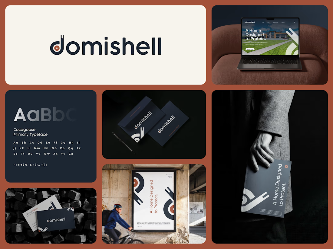
Domishell is a residential brand built around a simple idea: a home designed to protect.
The identity takes inspiration from one of nature’s most enduring shelters, the snail shell. The custom “D” mark abstracts the protective form of the shell into a clean, architectural symbol, representing security, resilience, and the feeling of having a safe place to call home. domishell-brand-identity-design.
Rather than relying on familiar real estate symbols such as rooftops or buildings, we wanted the identity to feel distinctive while still connecting naturally with residential living. The visual direction brings together nature and architecture through simple forms, balanced proportions, and a warm, grounded character. domishell-brand-identity-design.
The color system combines deep Anchorfish Blue with earthy Truffle Trouble, warm Burning Flame, and soft Palladian. Cocogoose was selected as the primary typeface, supported by Sora for a clean and contemporary communication system. domishell-brand-identity-design.
The identity was then extended across signage, stationery, posters, digital applications, and other brand touchpoints, keeping the system consistent and recognizable throughout.
At its core, Domishell is built around five values: Protection, Trust, Longevity, Quality, and Community.
A Home Designed to Protect.
Would love to hear your thoughts on the identity and the concept behind the symbol.
The network for creativity
Join 1.25M professional creatives like you
Connect with clients, get discovered, and run your business 100% commission-free
Creatives on Contra have earned over $150M and we are just getting started





Related posts

A 16-bit signal has 65,536 steps. No waveform in this brand is allowed to be a curve.
SINE/16: pixel type, a staircase slash, one cyan light per frame, hands on everything.
Full case study ↓

No curves allowed is such a fun rule to build a brand around. The staircase slash is clever.

Infinite Games — A Playful Interactive Experiment
Check it out
Meet my little bioluminescent amoeba!
A playful experiment in character design, motion, and interactive UI.
She floats through space and lights up when you hover over her.


Such a cute and creative concept! The glow and interactive movement give this little character so much personality. ✨