The network for creativity
Join 1.25M professional creatives like you
Connect with clients, get discovered, and run your business 100% commission-free
Creatives on Contra have earned over $150M and we are just getting started
Back to feedPost
Taste Test
Need your help ! which picture would make you stop on instagram ?
3 voted
23%
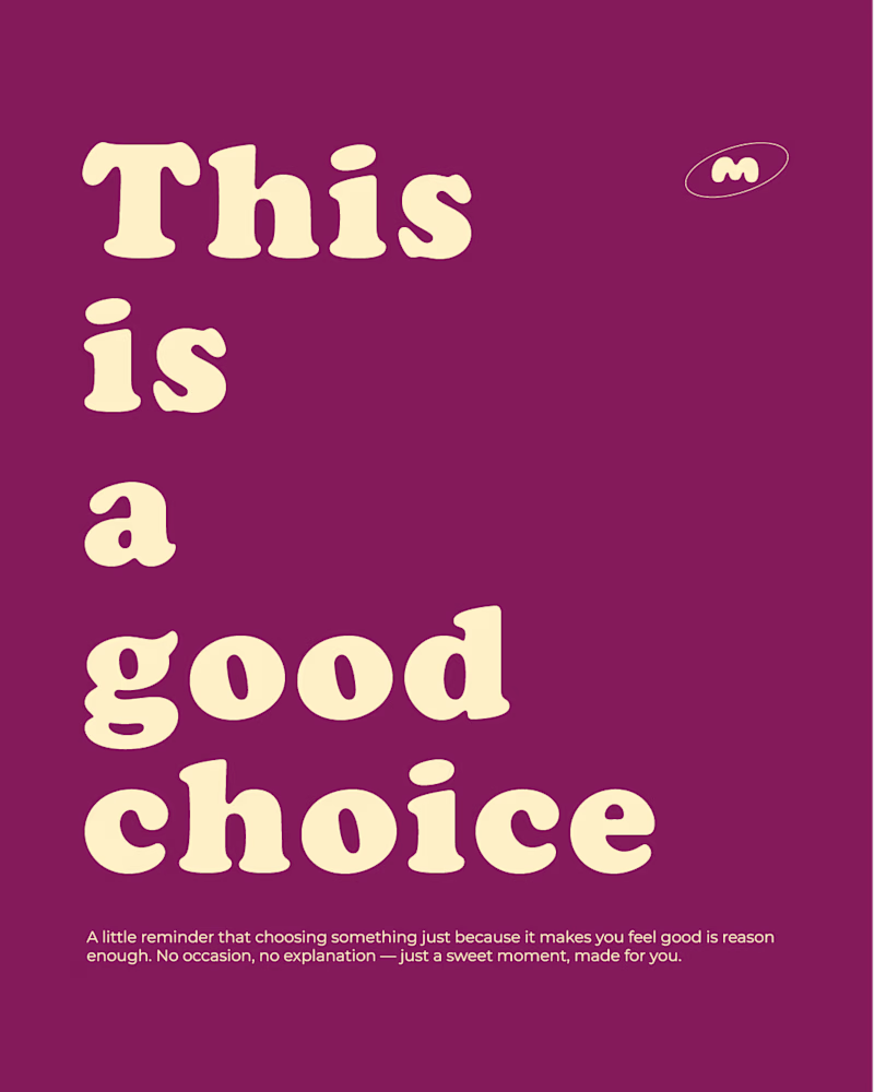
10 voted
77%
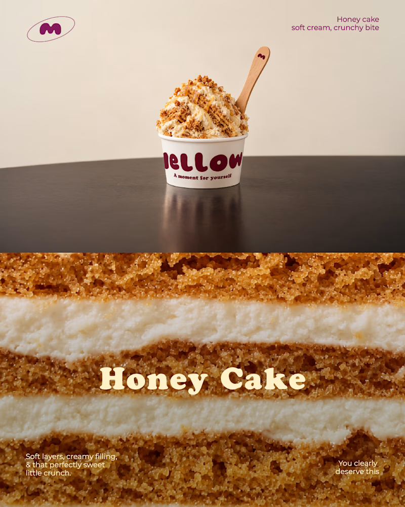
13 votes
Closed

1 will do that."
Typography style works well on Instagram

Honestly the honey cake one, that drip catches my eye before I even register there's text on it. The purple one reads more like a quote card I'd scroll past. Is this for the same client or two different brands you're testing styles for?

thanks for the feedback ! I get you.
It's for the same client
have a look if you want ! tell me what you think :)

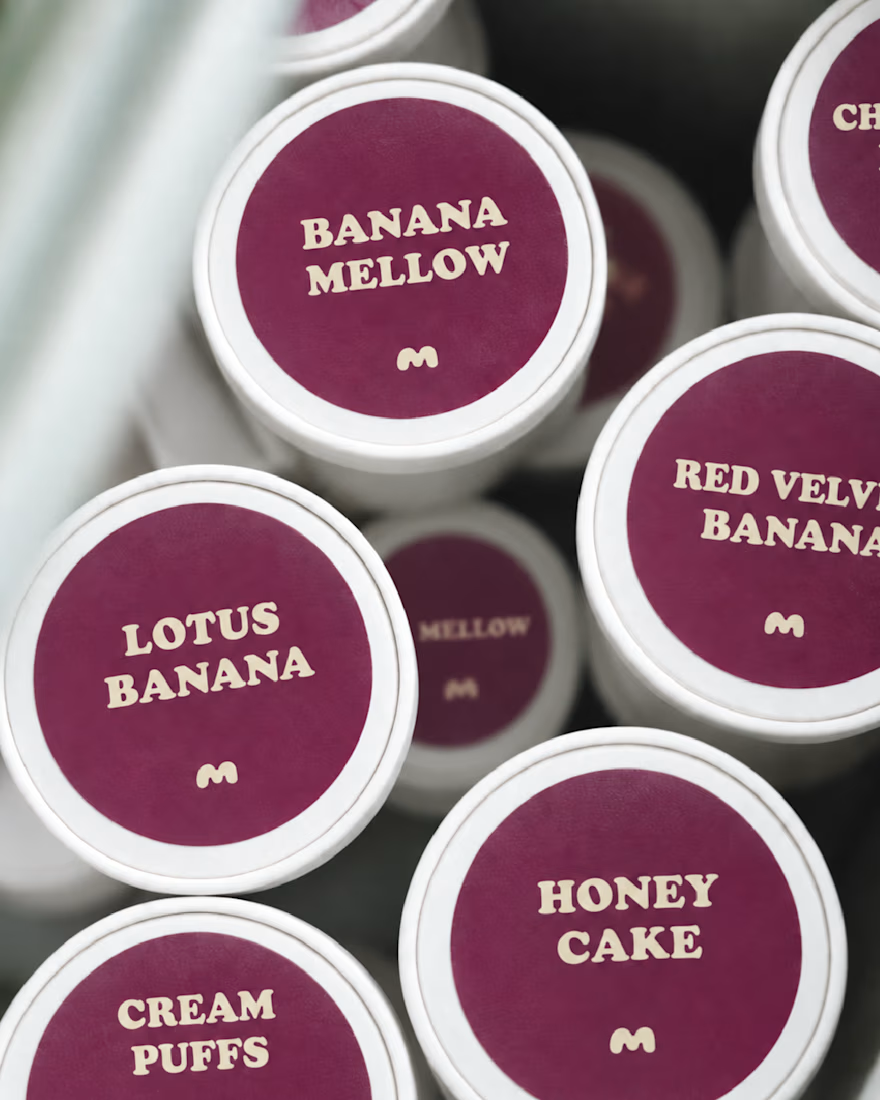
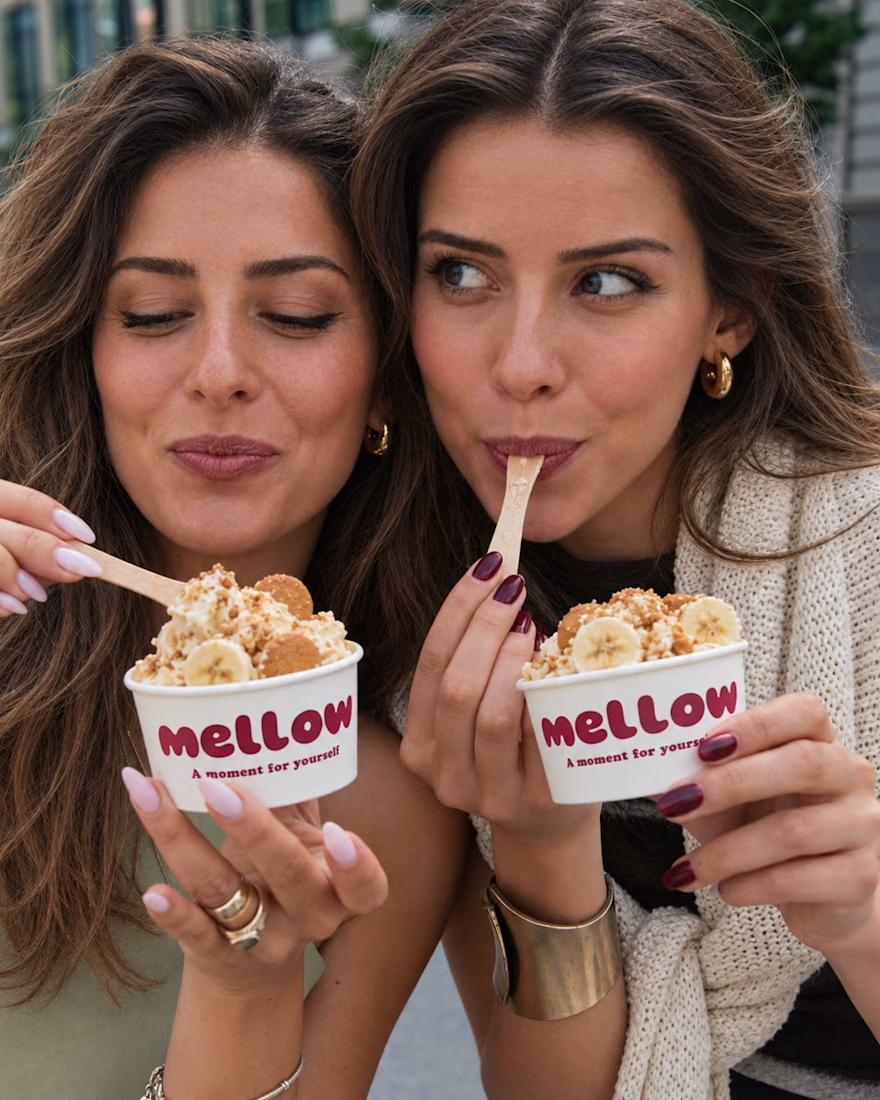
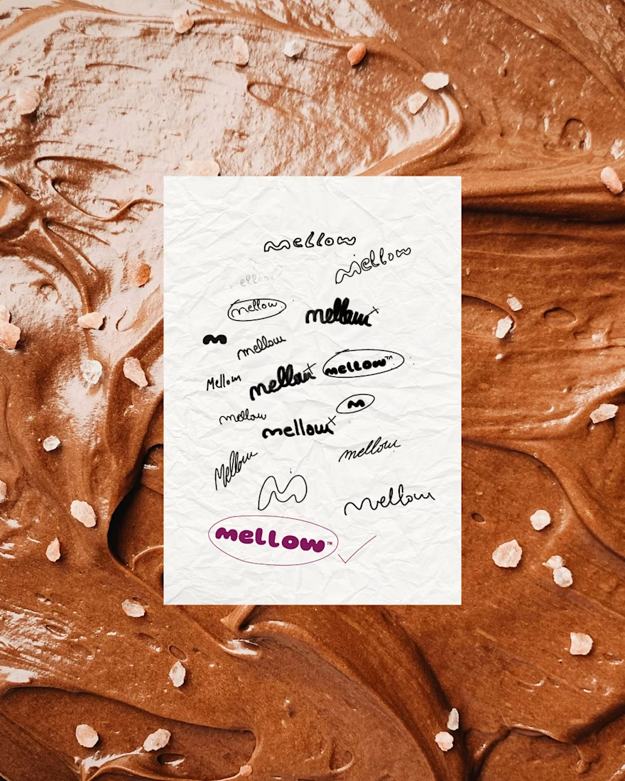

the honey cake! the layers are such a nice contrast on the eye.


Went with the honey cake. Food and drink content that shows texture or motion tends to stop a cold scroll on instinct, while a quote card usually needs the viewer to already trust the brand enough to read it.
The network for creativity
Join 1.25M professional creatives like you
Connect with clients, get discovered, and run your business 100% commission-free
Creatives on Contra have earned over $150M and we are just getting started





Related posts

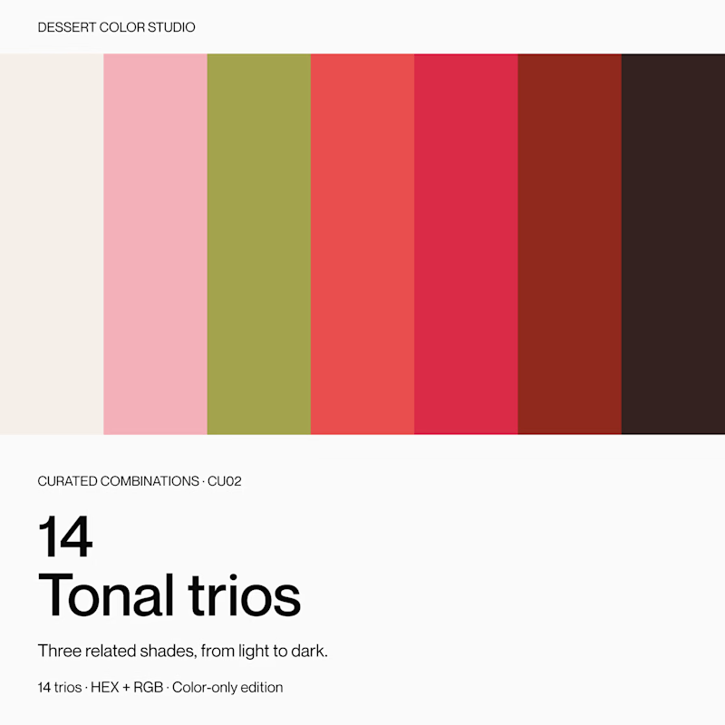
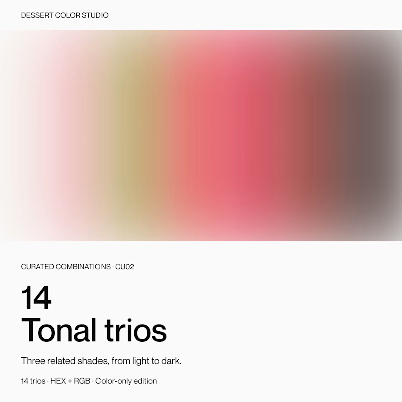
If you were browsing color resources, which cover would make you click to see more?
Same product inside: 14 tonal trios, with three related shades in each.
A or B? Curious what makes you choose one over the other.
9 voted
56%
7 voted
44%
16 votes
Closed


I’m exploring different concepts for a project. Which proposal did you like the most?
5 voted
42%

7 voted
58%

12 votes
Closed

Geometric one looks better good job🎉🎉❤️❤️

I'm experimenting with two responsive designs for mobile bottom navigation and would love to hear your thoughts.
Which approach would you prefer? 👇
A — Multi-row Grid
Navigation items wrap into multiple rows to accommodate smaller screens.
B — Horizontally Scrollable Bar
A single-row navigation bar that users can scroll horizontally to access more options.
Which feels more intuitive, accessible, and user-friendly?
Vote for A or B and let me know why in the comments. I'd love to hear your perspective! 🚀

2 voted
50%
2 voted
50%
4 votes
Closed
Multi-row Grid is more practical I like it great job 🎉🎉🔥🔥